I am trying to add some reviews to a website. In the past I did this with the “trustindex” plugin and it worked/works great. However, when I try it now on this website the reviews are centered in a weird way.
Can somebody have a look at it?
What did the layout look like before and how do you want it?
I guess an overflow: hidden on the surrounding container solves the overflow problem, right?
Well, actually I already inserted the shortcode of the Trustindex plugin in another website. (check the Review section)
On that website the reviews are shown in a good way, everything is well centered which is not the case on the website this topic is about.
How would you explain this difference. I think I have made verything similar, but on the painting site it does not look like it should be.
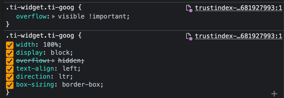
it’s a CSS conflict between that Trustindex plugin and themify icons, which unfortunately share the same ‘ti-’ prefix on class names and use rather generic selectors.