Browser: Chrome 112.0.5615.137
OS: macOS
URL: It’s a private page
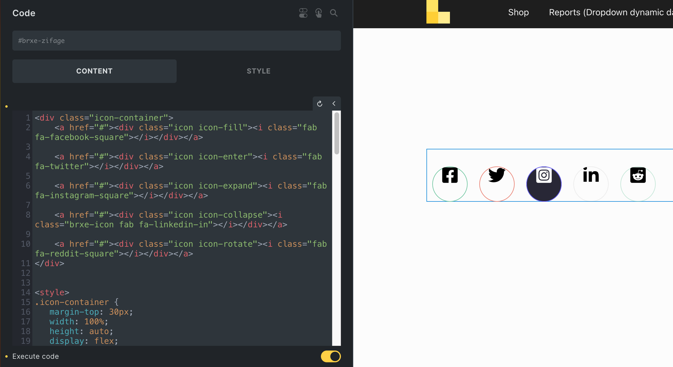
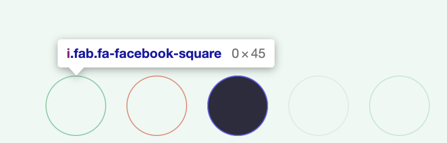
I can’t share the page, but I noticed today that some footer icons I’m working on are showing up fine in the Bricks live editor, but when I view on the frontend the icons disappear. I think it’s because they have no width as you can see in the screenshots below, live editor they are 26.25x45 and frontend they are 0x45. What I can’t figure out is why? I’m not even sure it’s a bug so much as something I did wrong. It was working though and I noticed today it is not. Here’s the code:
<div class="icon-container">
    <a href="#"><div class="icon icon-fill"><i class="fab fa-facebook-square"></i></div></a>

    <a href="#"><div class="icon icon-enter"><i class="fab fa-twitter"></i></div></a>

    <a href="#"><div class="icon icon-expand"><i class="fab fa-instagram-square"></i></div></a>

    <a href="#"><div class="icon icon-collapse"><i class="brxe-icon fab fa-linkedin-in"></i></div></a>

    <a href="#"><div class="icon icon-rotate"><i class="fab fa-reddit-square"></i></div></a>
</div>

.icon-container {
	 margin-top: 30px;
	 width: 100%;
	 height: auto;
   display: flex;
   flex-flow: row;
}
  .icon-container .icon {
	 cursor: pointer;
	 position: relative;
	 display: flex;
   flex-flow: row;
   justify-content: center;
	 width: 6rem;
	 height: 6rem;
	 margin-left: 1rem;
	 margin-right: 1rem;
	 border-radius: 30px;
	 overflow: hidden;
}
  .icon-container .icon::before,  .icon-container .icon::after {
	 content: '';
	 position: absolute;
	 top: 0;
	 left: 0;
	 height: 100%;
	 width: 100%;
	 transition: all 0.3s ease;
	 border-radius: 30px;
}
  .icon-container .icon i {
	 position: relative;
	 color: #000;
	 font-size: 30px;
	 transition: all 0.3s ease;
}

 .icon-container .icon-expand i {
  color: #fff;
}

 .icon-container .icon-fill::before {
	 transition-duration: 0.5s;
	 box-shadow: inset 0 0 0 1px #78cca8;
}
  .icon-container .icon-fill:hover::before {
	 box-shadow: inset 0 0 0 60px #78cca8;
}
  .icon-container .icon-enter::after {
	 box-shadow: inset 0 0 0 1px #ec8879;
}
  .icon-container .icon-enter::before {
	 border-radius: 0;
	 margin-left: -100%;
	 box-shadow: inset 0 0 0 60px #ec8879;
}
  .icon-container .icon-enter:hover::before {
	 margin-left: 0;
}
  .icon-container .icon-expand::after {
	 box-shadow: inset 0 0 0 1px #6b63f6;
}
  .icon-container .icon-expand::before {
	 background: #6b63f6;
	 box-shadow: inset 0 0 0 60px #2d2c3e;
}
  .icon-container .icon-expand:hover::before {
	 box-shadow: inset 0 0 0 1px #2d2c3e;
}
  .icon-container .icon-collapse::before {
	 border-radius: 0;
}
  .icon-container .icon-collapse:hover::before {
	 box-shadow: inset 0 30px 0 0 rgb(102,103,102,.1), inset 0 -30px 0 0 rgb(102,103,102,.1);
}
  .icon-container .icon-collapse::after {
	 box-shadow: inset 0 0 0 1px rgb(102,103,102,.1);
}
  .icon-container .icon-rotate {
	 box-shadow: inset 0 0 0 1px rgb(121,205,170,.4);
}
  .icon-container .icon-rotate::after, .icon-rotate::before {
	 border: 0px solid transparent;
}
  .icon-container .icon-rotate:hover::before {
	 transition: border-top-width 0.3s ease, border-top-color 0.3s ease;
	 border-width: 60px;
	 border-top-color: rgb(121,205,170,.4);
}
  .icon-container .icon-rotate:hover::after {
	 transition: border-left-width 0.3s ease, border-left-color 0.3s ease;
	 border-width: 60px;
	 border-left-color: rgb(121,205,170,.4);
}
  .icon-container .icon-rotate:hover {
	 transition: background 0.001s ease 0.3s;
	 background: rgb(121,205,170,.4);
}
  .icon-container .icon-rotate i {
	 z-index: 1;
}
