NO BUG: Differences on desktop and mobile on Nav Menu and Form widget

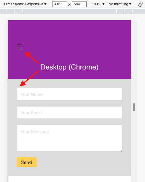
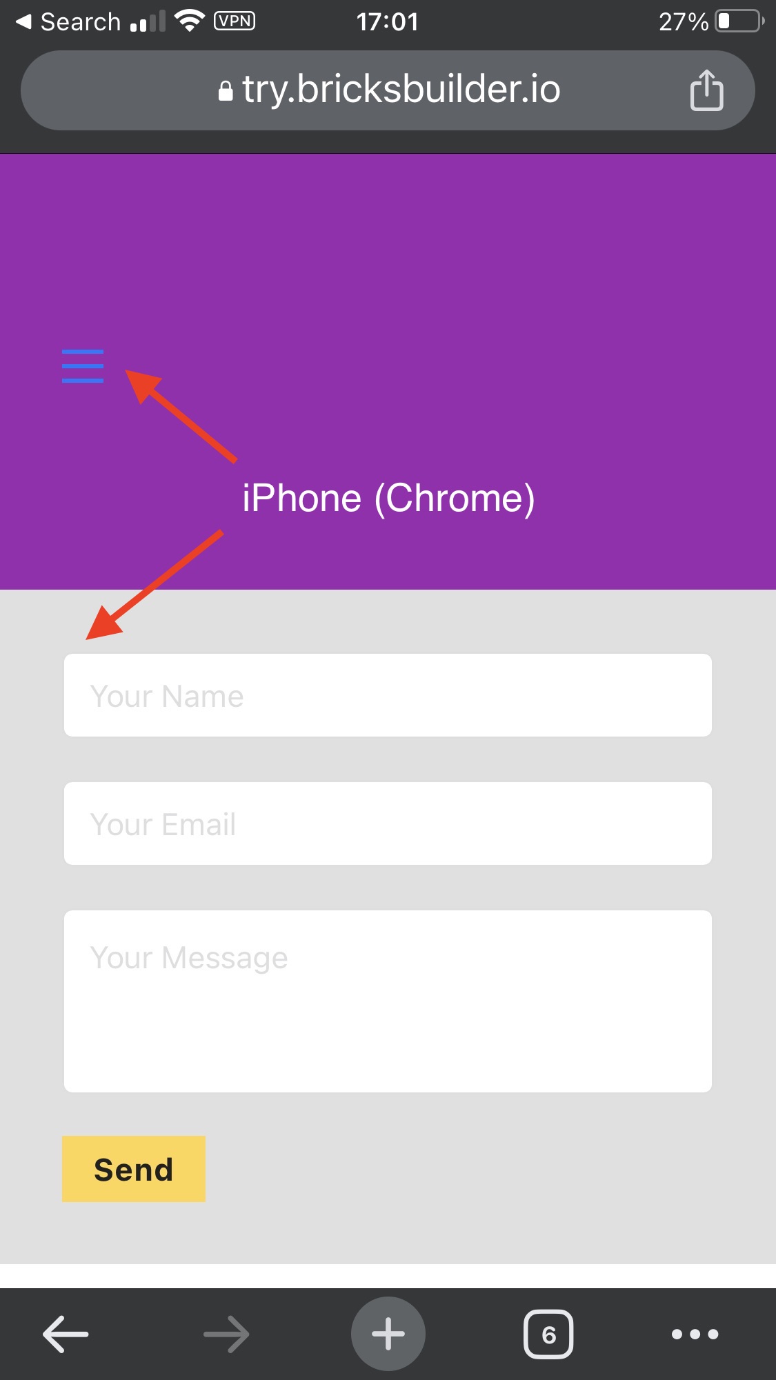
Just to point out a couple of items that do not display the same on desktop as they do on mobile.

Nav Menu hamburger icon (unstyled): Color black on desktop, blue on actual mobile.

Form widget fields (unstyled): Do not have border radius by default when placed on a page and look fine when inspecting in responsive mode (Chrome on Mac). However, when viewed on actual mobile the form fields have a border radius.

Not sure if it’s considered a bug, but it’s unexpected behaviour.

Hi Simon,
Thanks so much for your report!

However, I’m sorry to disappoint you: both problems are not Bricks bugs, but system (iOS) defaults:

1. Toggle color
Just give it a color. That solves the problem.

2. Form field border-radius
Explicitly set the border radius of the form fields to 0 if you want it to be uniform.

Best regards,
timmse

1 Like

Ah! I’m not disappointed. Thanks for confirming. :slight_smile: