Not sure if this is a bug but the Component Toggle UI is a bit confusing visually. You would expect the True state will be the one where the toggle is in the enabled side. I know the label makes it clear that the True state is when the switch is in the disabled side but like I said it just looks confusing visually.
Hi @schubertz,
to which component toggle are you referring to? Can you add a screenshot, so I can see which one your mean?
Matej
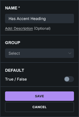
Just to be clear, I’m using this toggle for visibility. Am I using it wrong? Is it that when enabled the visibility is hidden instead?
Thanks for the screenshot and clarification. I’ve marked the topic as no-bug, because I believe it works correctly/as intended.
You are toggling the visibility. The default value is “visible,” but you need to toggle it to become hidden, that’s why when it’s “enabled,” it will hide the element.
Don’t think of it as “enabled/disabled”, but more like “Hide this element”.
I hope it’s clearer now.
Matej
1 Like
Ok got it, thank you for the clarification.
1 Like
Just want to add that I also found it confusing.
Even if you flip the label and call it Disable X element, the toggle still has to be turned off in order for it to be true.
It’s definitely a UX issue—not a major one, but still confusing 
1 Like
Greetings, I just want to bring this up again because I didn’t want to create a new topic with the same issue.
I have been creating more components now and I really think that the Toggle switch is confusing. As @jboldsen said it’s a UX issue. You expect the “true” state of the toggle is when the switch is toggled.
Thank you for your time.