I am having issue with the offCanvas element at mobile breakpoints - it would appear that the contact form i want to slide - works on desktop, laptop, and iPad - BUT - not mobile!
Working with the latest version of all things as of 23/3/25 - bricks, wordpress, and all browser software!
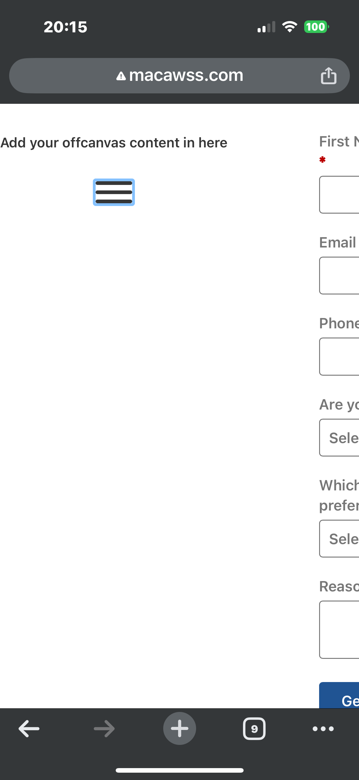
Image attached where you can see the ws form appears off to the right instead of being centered below as per the others.
I tried a basic version of the page with minimal elements - and it does the same thing.
Any ideas to how I can fix this please? mobile is probably the one format I would have preferred it to work on besides laptop!!
can you try to apply flex-wrap: nowrap; to the Offcanvas inner? It’s because the content is vertically higher than the available space, and that’s why it breaks to the next column. By adding flex-wrap: nowrap;, you will tell the browser to not wrap it into the next column.
It did work - thank you … however I have a question … it was grey’d out as the same in the boxes indicating that it was flex-wrap and nowrap - so why did it make a difference hard selecting it.
And why do the other breakpoints not need it selecting to work?
Thanks for the help though - in the end i had time constraints and went for a second page with the form on - not ideal but worked.
I think it’s because by default, on mobile landscape and lower breakpoints, we change it to “wrap” automatically.
Most of the time, this is what we need, but sometimes, you need to manually change it back.