Browser: Chrome 112 / Safari 16.4 / Blisk 19.1.122.126
OS: macOS
URL: Link to a page that illustrates this issue
Hi @timmse and the other Bricks experts,
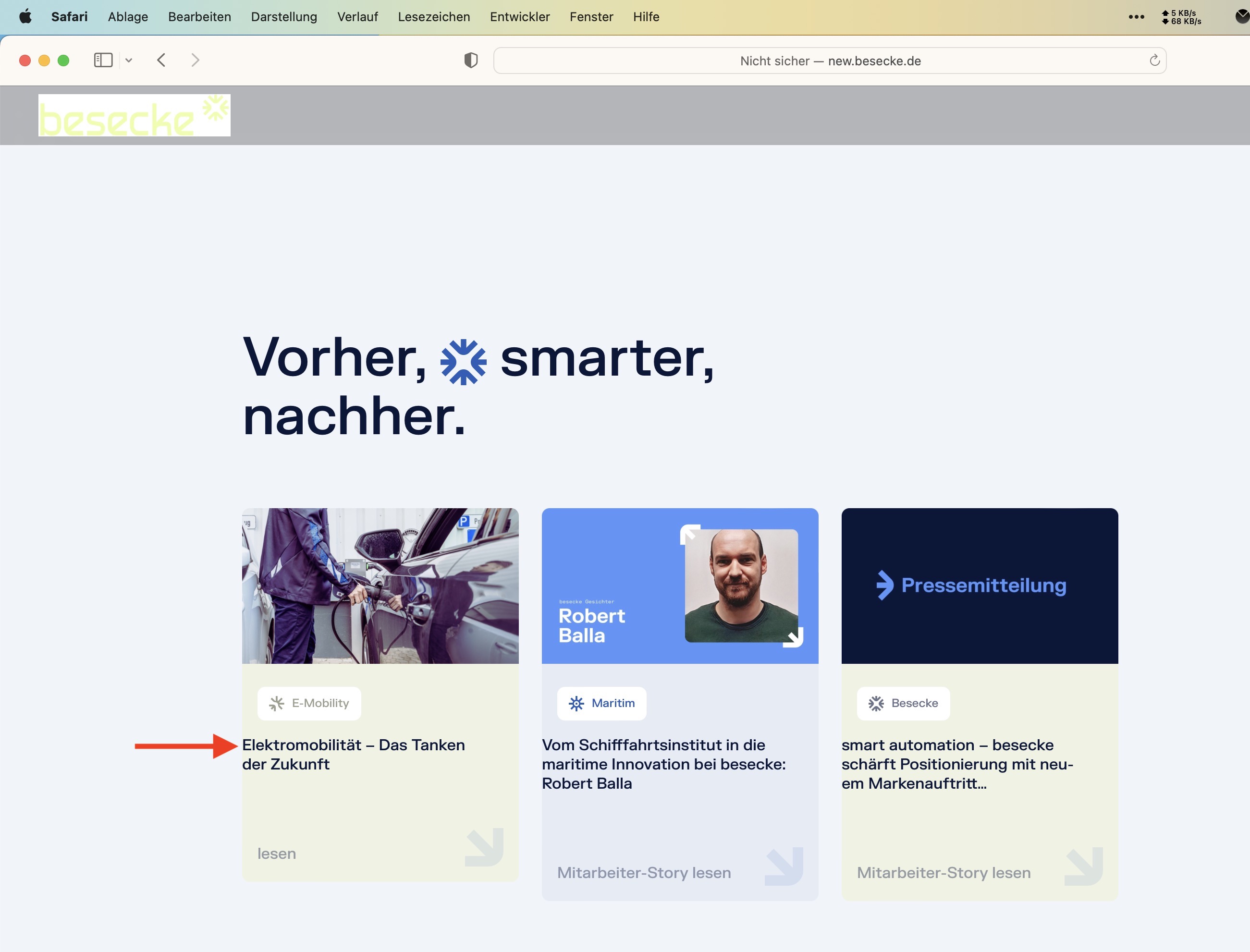
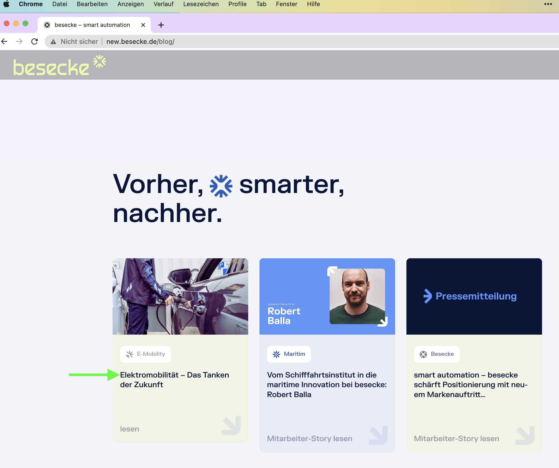
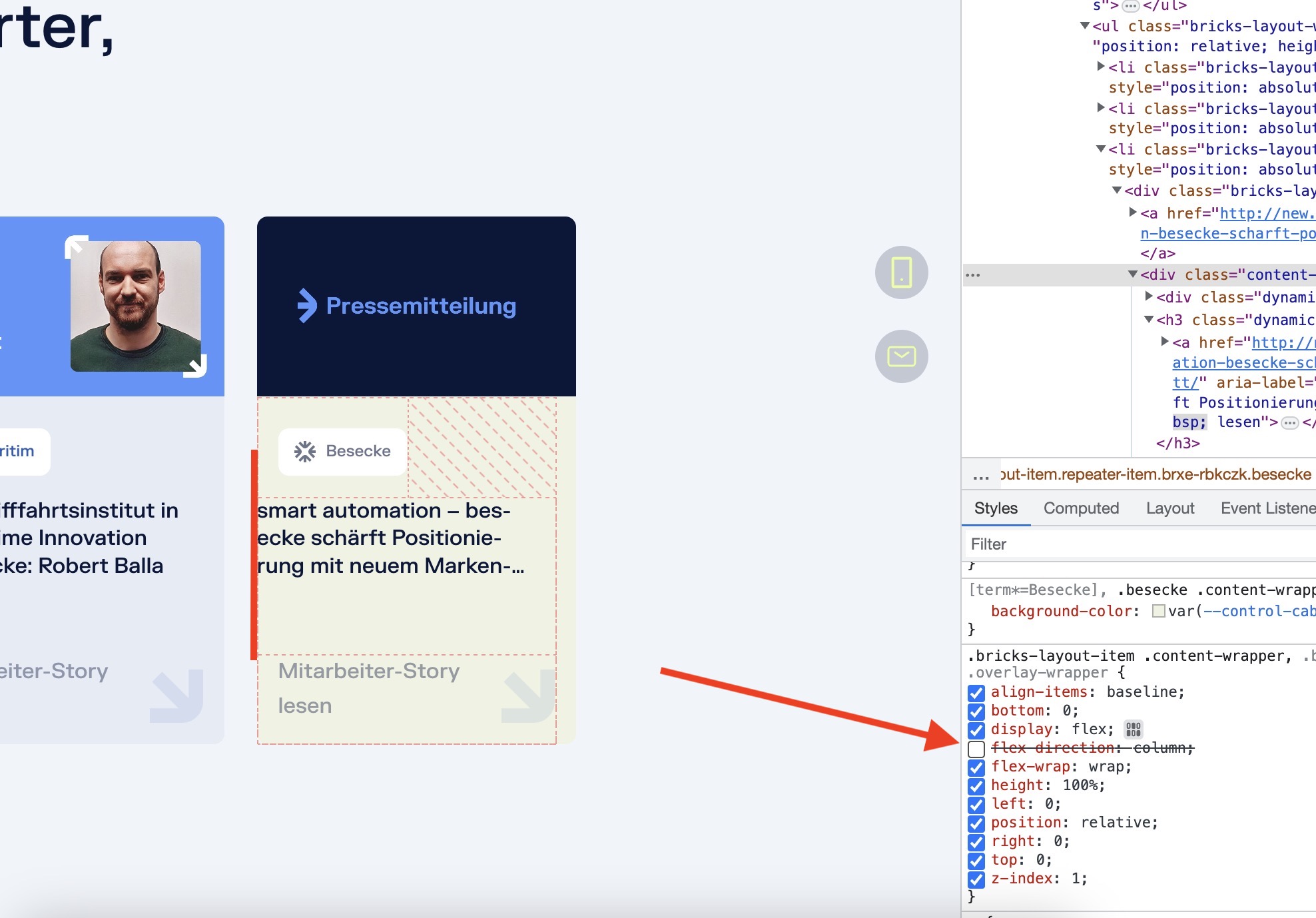
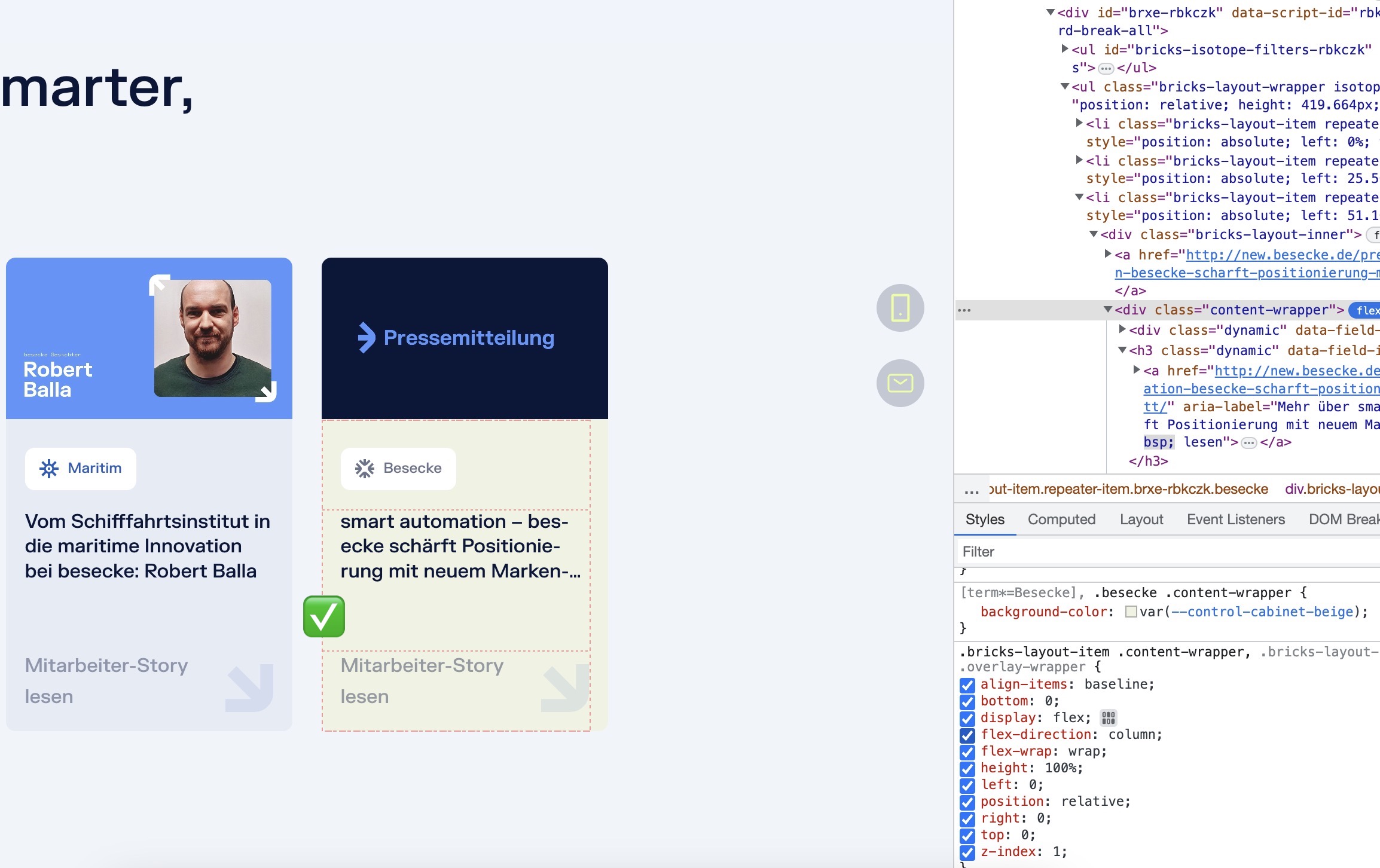
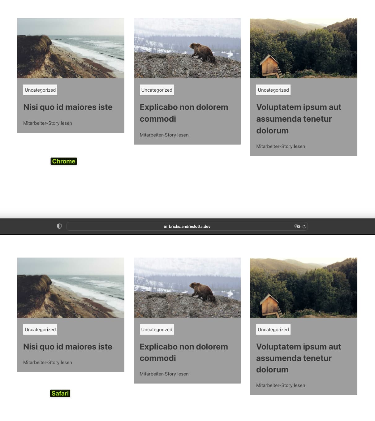
I see a possible bug in the blog post widget. The h3 (see screenshot) has no left padding in the card, although is aligned perfectly in Chrome (and that’s how it should look like). Whereas in Safari or Blisk it looks off - positioned totally left in the card. It seems to have something to do with Flex-Direction: Column. When I turn it off and on, the effect is replicable.
What could be the problem here?
Thanks in advance,
Heiko
Hey @heiko.dietze,
thanks for your report.
We are talking about the native Posts element, right?
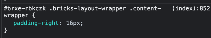
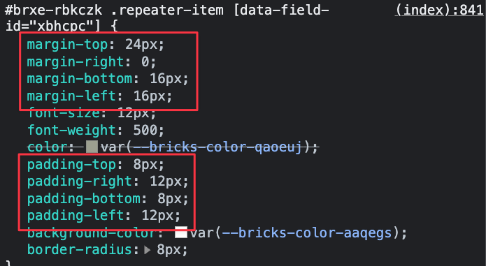
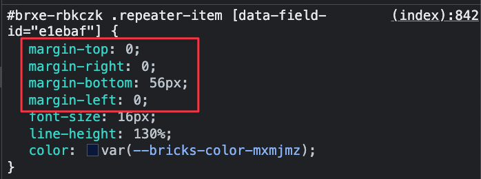
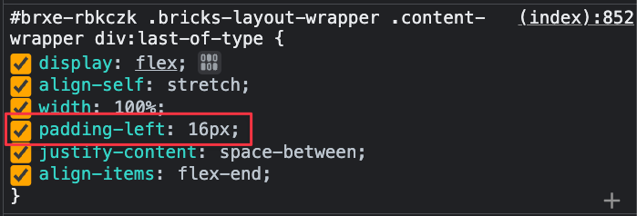
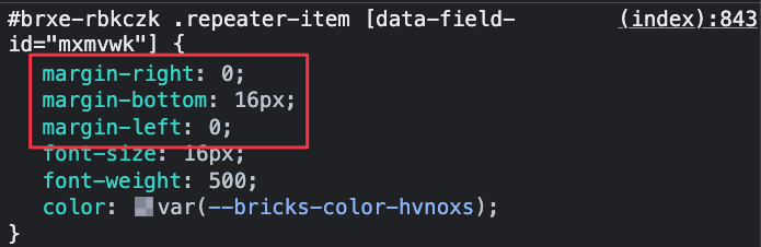
There are lots of custom settings applied to your setup – sometimes a margin-left, but no margin-right. Sometimes padding-right, but no padding-left (see screenshots attached). I can’t see a real structure at first sight to be honest.
I created a test site and with the correct settings everything looks fine for me – no matter which browsers I use.
Let me know if I can help any further.
Thanks,
André
1 Like
Thanks very much, André for looking into it! 
I’ll begin with a better structure 

And try to find my error from there.
Bricks regards,
Heiko