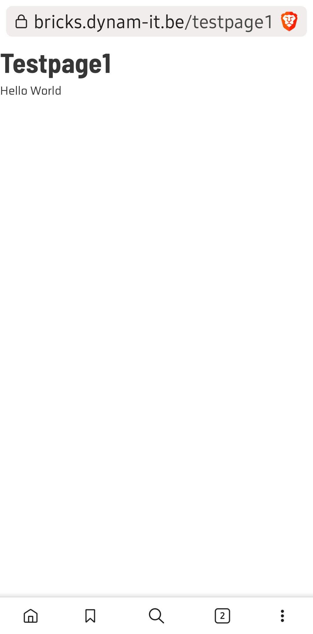
When there is only one basic text element with short text font-size is smaller then it’s supposed to be.
(Testpage 1 screenshot)
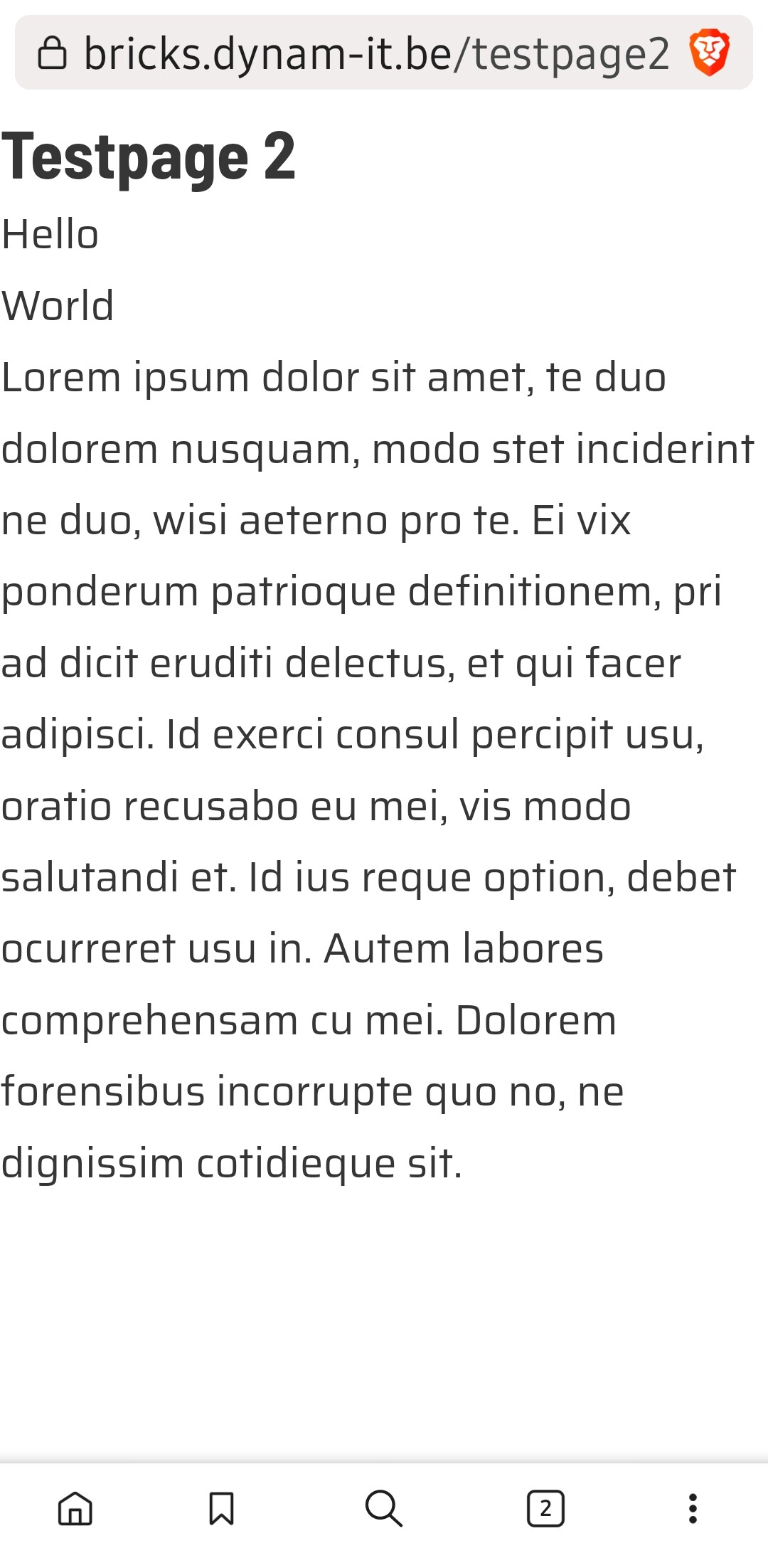
After adding another basic text element with longer text in the same container, font-size of both elements increases to the expected size and the text of the first element wraps on 2 lines.
In both cases no additional styling is applied, no changes have been made to default settings in bricks
I also noticed that when adding the 2nd basic text block in a new section/container font-size is not changed.
It looks like the behaviour depends on the fontsize set on the device. When I set a larger textsize for my device the result is as shown in my first 2 screenshots.
If I set it to a smaller fontsize, it’s like in you screenshots.
Weird that a larger fontsize on device seems to behave differently depending on the length.
Guess it’s an Android bug rather than a Bricks bug