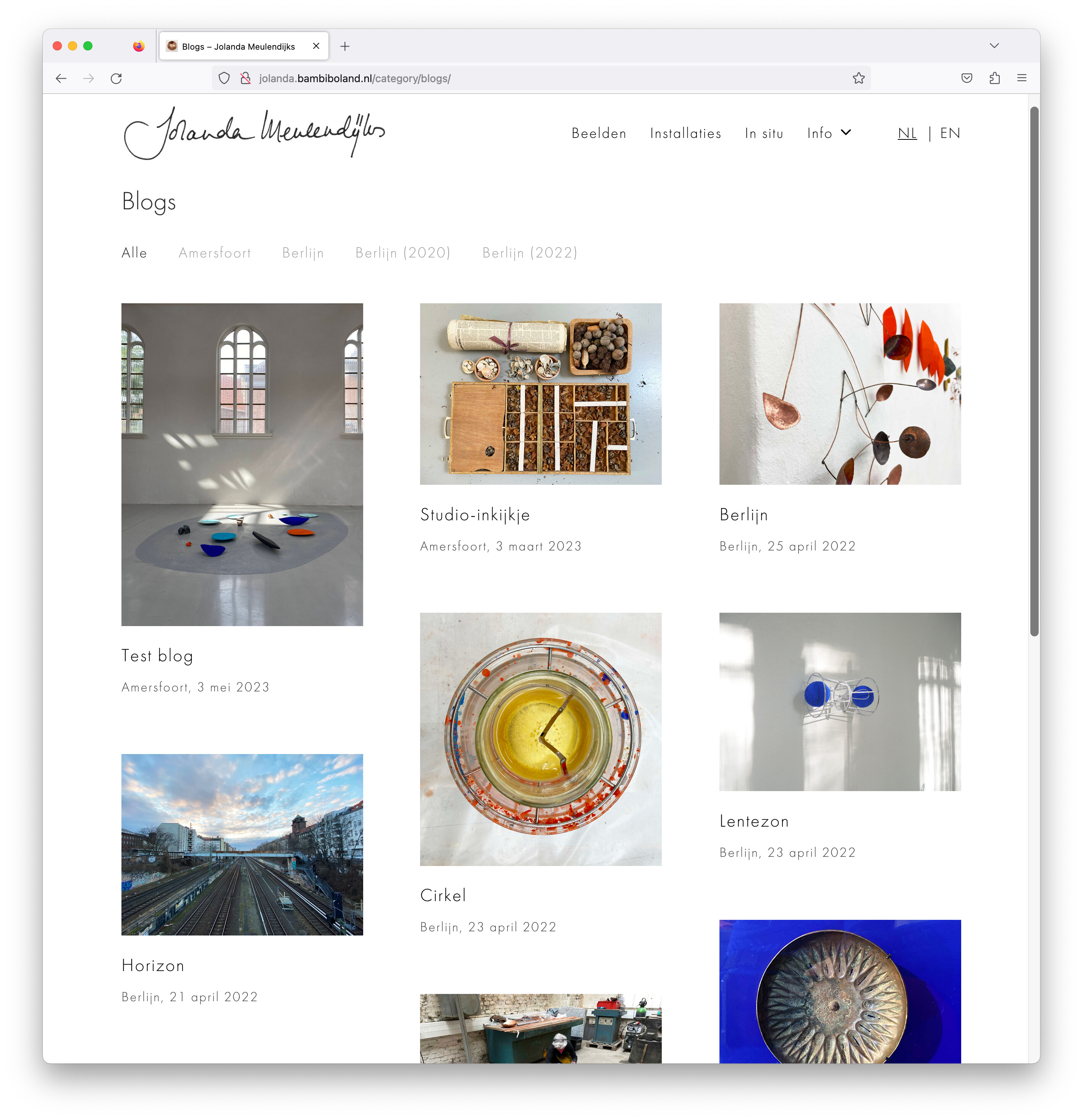
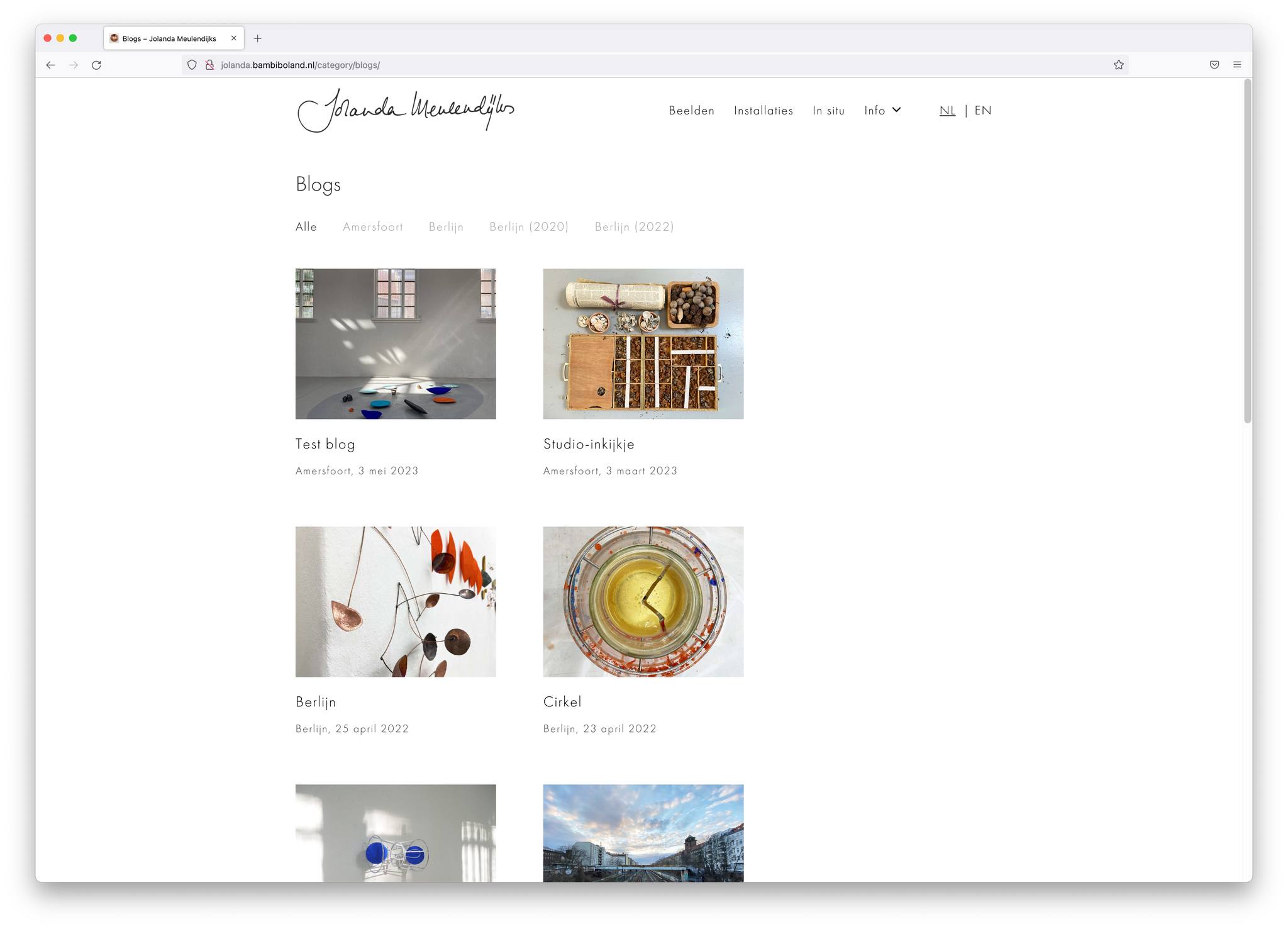
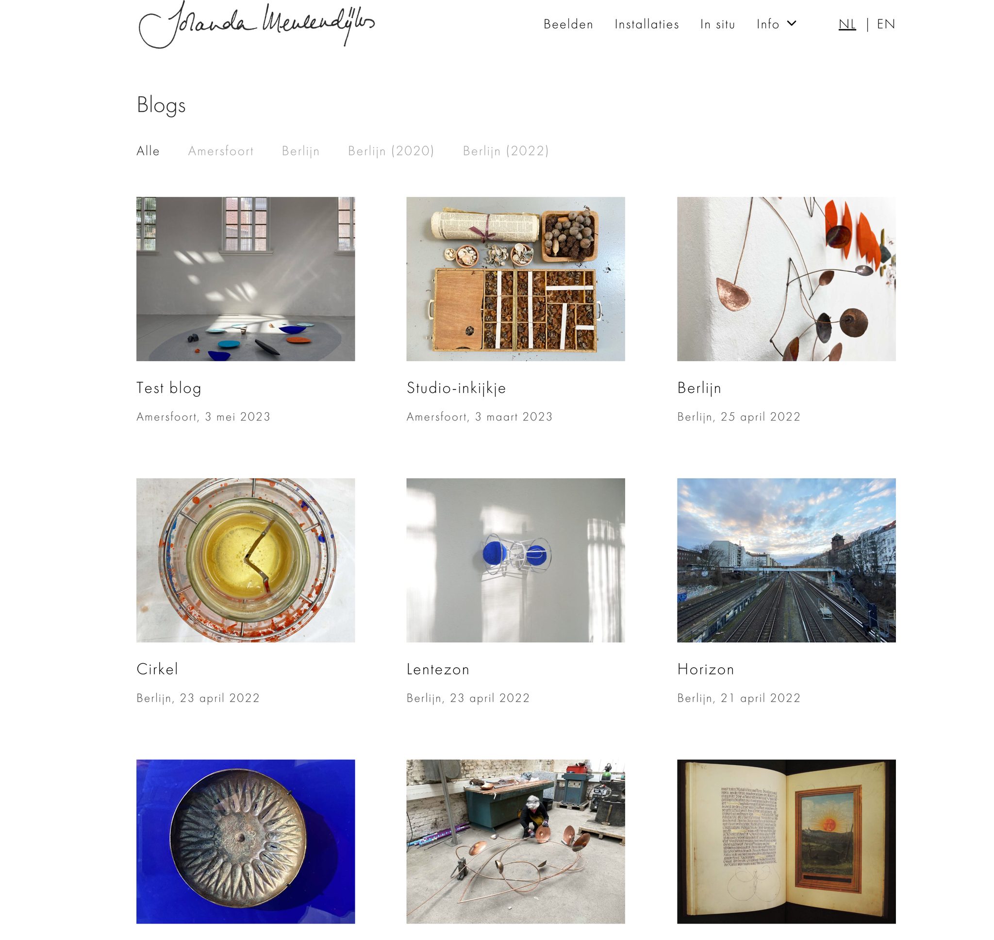
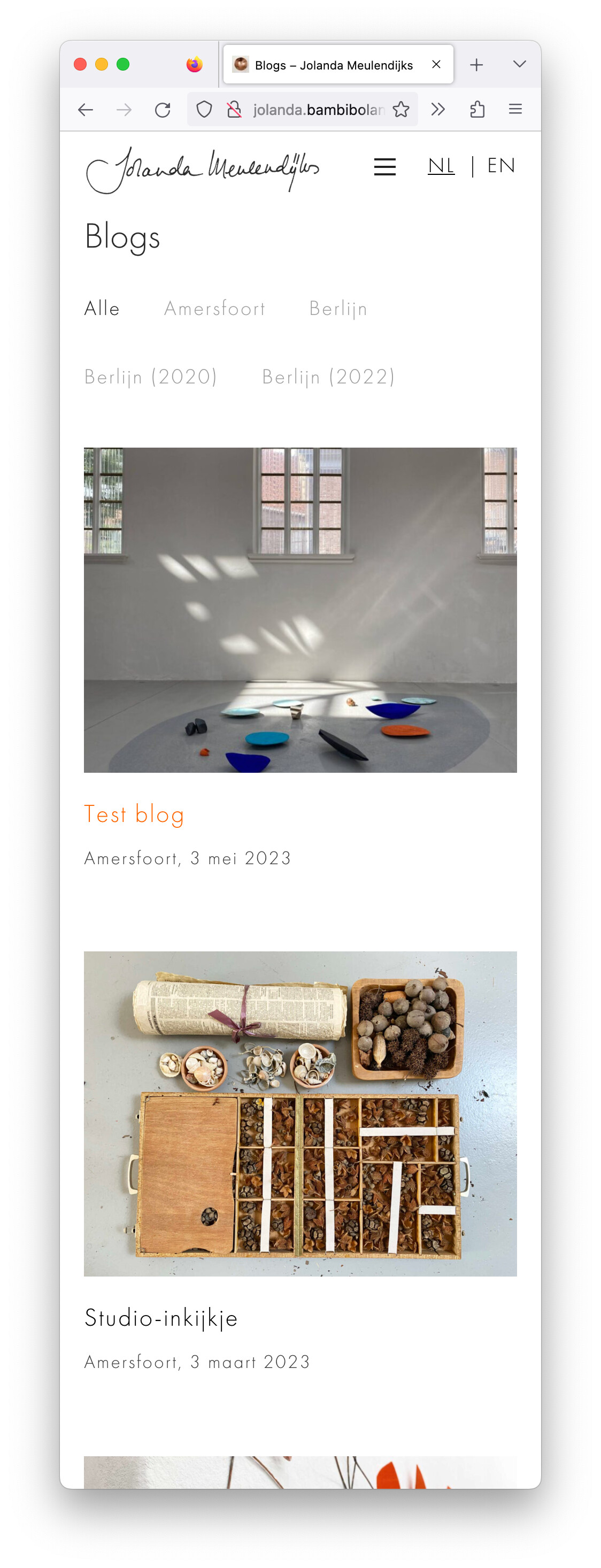
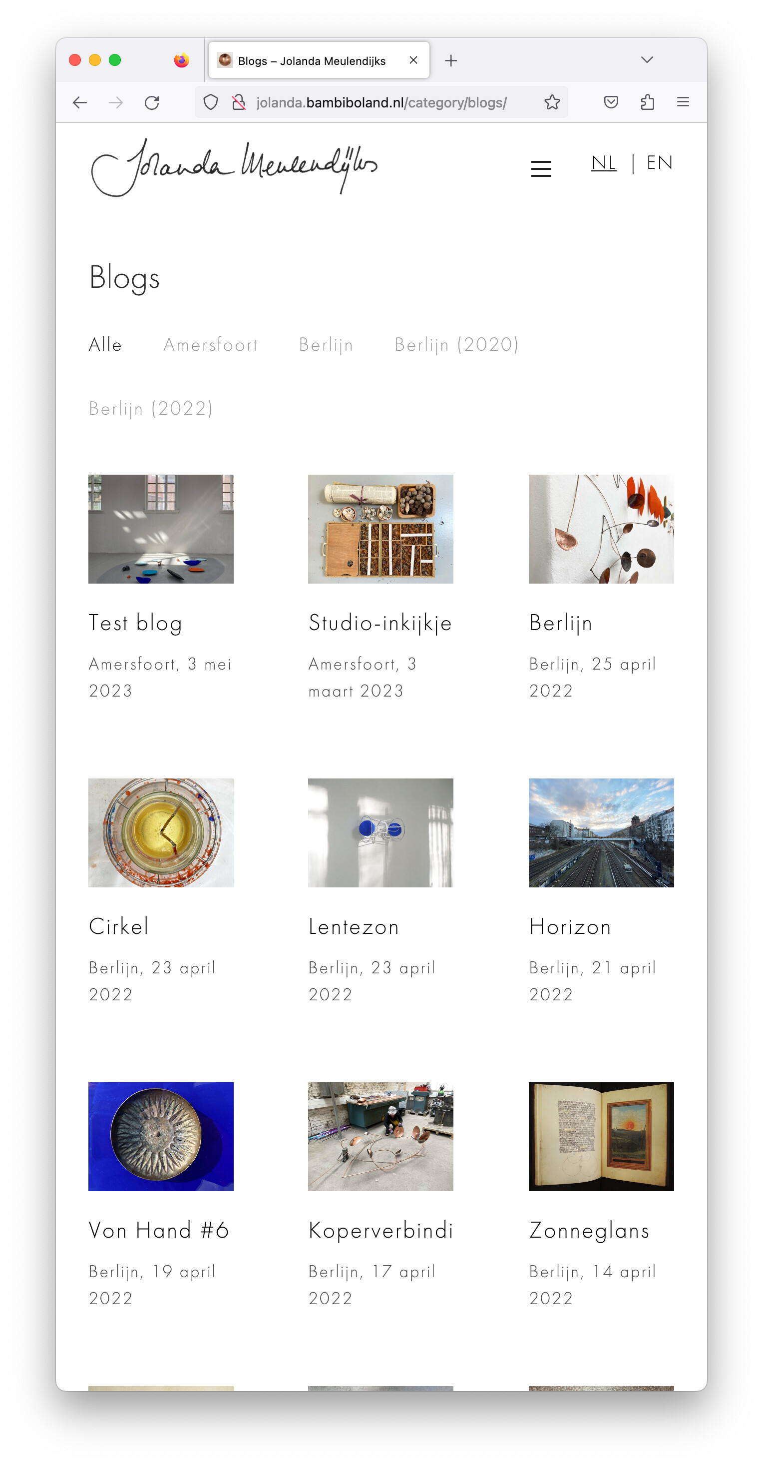
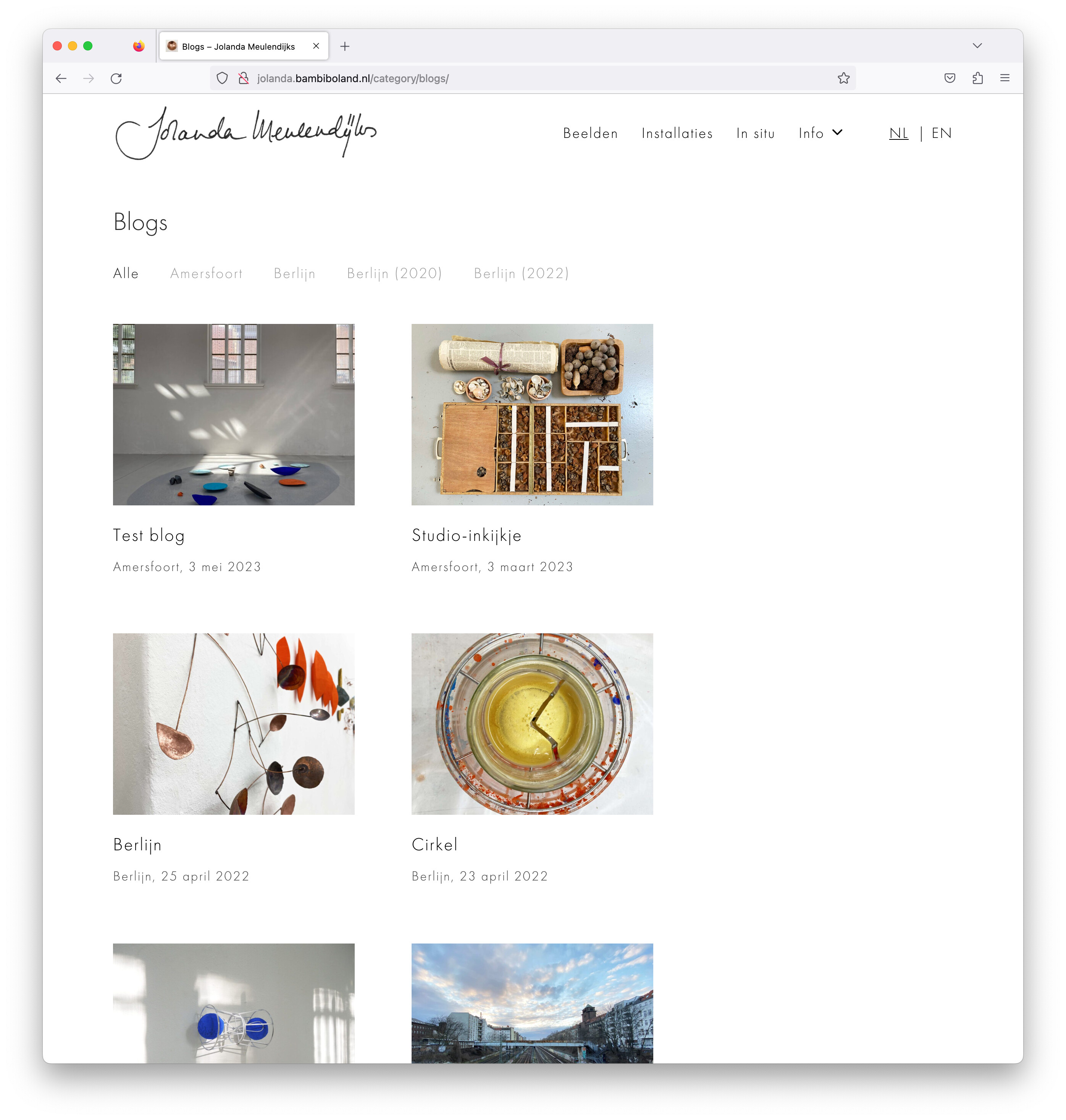
I’m working on this website and this query of blog posts shows up perfectly on all devices I’ve checked so far except for Firefox, where it puts it into two columns, as seen below:
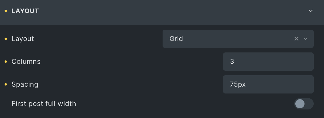
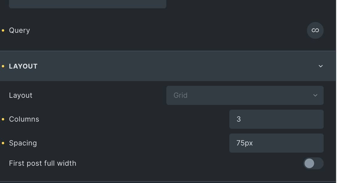
It’s set to 3, except for smaller devices in which case it’s set to 1 column, so 2 should actually never be an option.
Other than this I can’t find any other weird things happening in Firefox so hopefully this is the only problem. Anyone have a clue what is causing this and how to fix it?
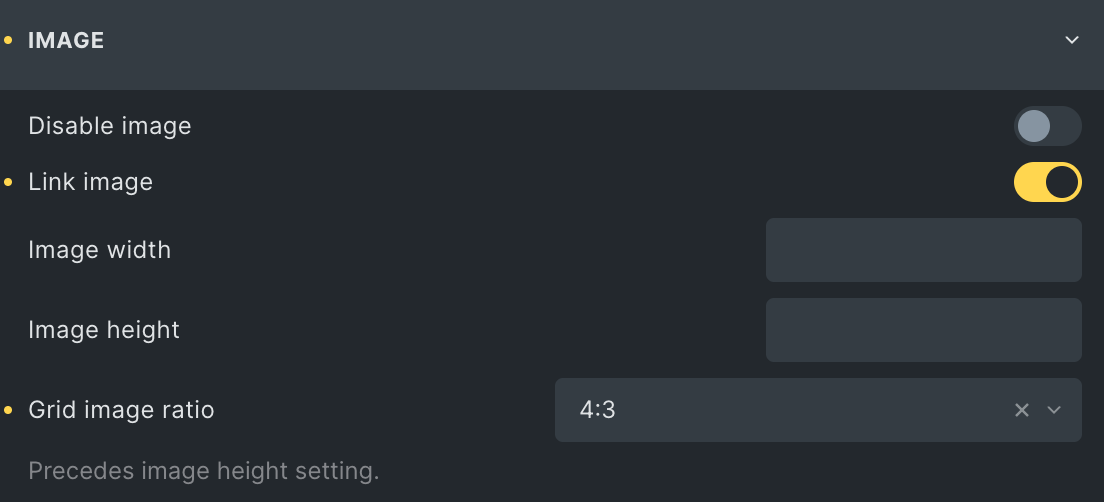
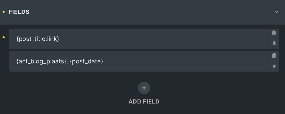
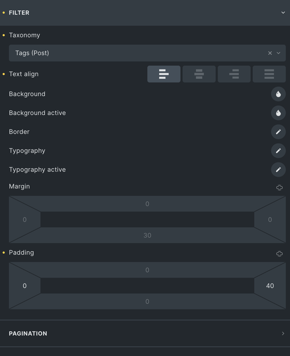
I’ve got it set up in Bricks as follows, until the ‘mobile portrait’ breakpoint which is where it changes to 1 column.
Additionally, it seems like there’s a (break)point where Firefox does actually agree that it should be three columns, but above a certain point it makes it two? Doesn’t make sense to me, at all…
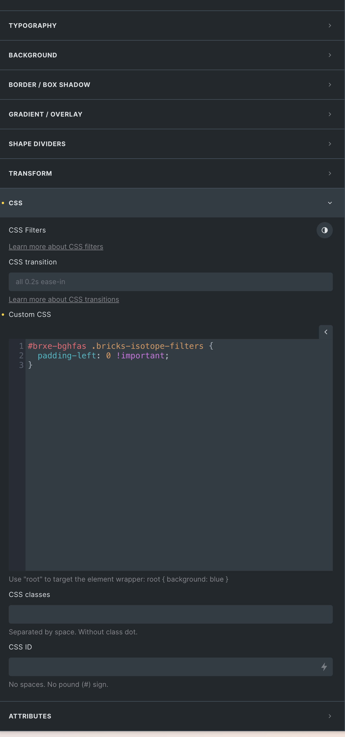
Changed it to 10px and then it seems to work as it should (3 columns), but if I change it to ANYTHING other than 10px it’s doing the same weird behaviour again!
I think on the larger screen your images or your items get too wide and then together with the large space between there is not enough screen width to show 3 columns. Or Firefox does not correctly calculate the item width.
Can you put a max-width on the images or on the items and test?
I am usually making my own grids so that I have full control over the spacing. But I don’t use Firefox, so I have no experience with that browser…
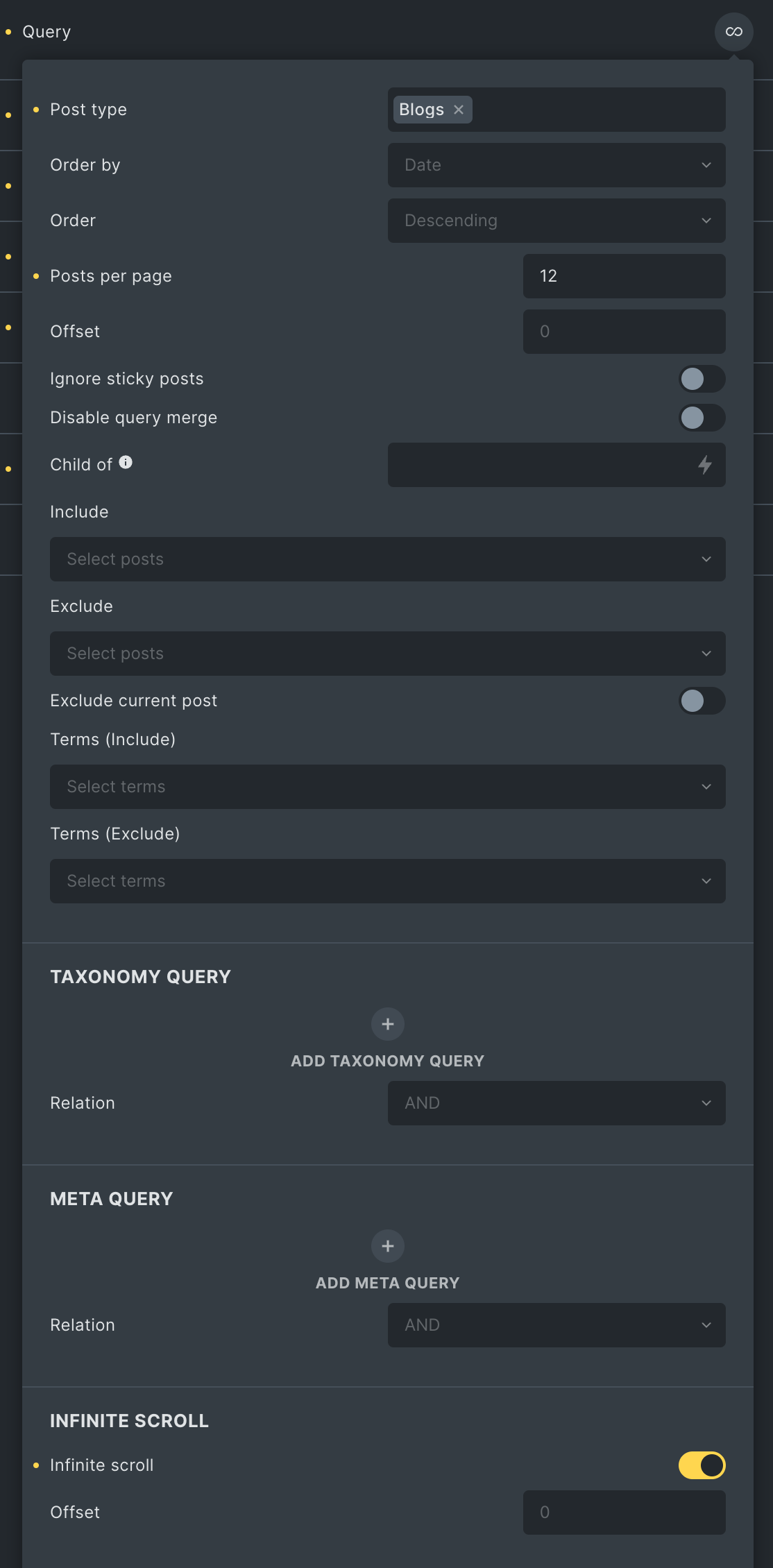
As it is right now I can’t find a setting to add a max-width to try if that makes a difference I’ve got other query’s that are custom instead of the built in ‘Posts’ element, so I guess I could convert it to a custom one butttt can I still add the filter part like that? I’m mostly using the pre-built one because that was already an option.
The images/block that repeats is actually the perfect width even when it shows the wrong amount of columns, that makes it extra weird to me… It’s not like it’s stretching the whole thing to fill the container with 2 containers instead of three, nor is it erasing the right column.
The weird thing is that it ONLY does this in Firefox; I’ve tested on multiple devices and in multiple browsers, and so far I’ve only seen it in Firefox (which coincidentally is my client’s main browser, otherwise I would’ve probably never known bc I don’t use FF either).
Update:
I tried making a bunch of changes to see if anything fixes it, like the grid image ratio, image size, layout width etc etc. Nothing seems to change it except for the 10px, which seems to literally be the only gap size that allows Firefox to show three columns consistently…
Yeah weirdly it really seems to be exclusively a problem in Firefox. Really wish my client weren’t using that browser because she’s never gonna let this slide now haha.
Except for the filter-part I just tried to re-build the query without the posts element and couldn’t really get it the way I wanted it, the ratio-setting for the thumbnail is something else I can’t get working with my limited CSS skills.
Anyway, thanks a lot for your answering & your suggestions! I’ve tried a bunch more settings but so far nothing helped… Hopefully someone else has an idea!
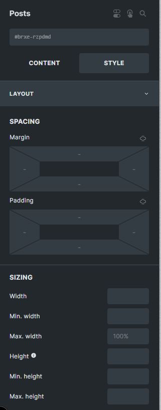
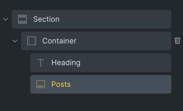
The only part I’m using the Styles tab in this page is within the Posts element, nothing else has any added style except for the bit of CSS. Nothing in the Content tabs either.
I’m assuming that the problem is really within the posts element, anywhere else wouldn’t make sense right?
I tried changing the Posts’ Layout setting from Grid to Masonry and even though this is not what I want it to look like, now it does correctly show the 3 columns!
Is there an easy way to make the masonry to look like the grid? The images should all have a 4:3 ratio (cropped) and a row of posts should all align at the same height (even if the post above it has a longer title or something), if that makes sense?
Oh yeah this looks exactly like what is happening to my posts! Great find, thanks!
When they say “Add this custom code (CSS) to your before body open custom code area.”, what would be the best placement for this within Bricks? In my header? In my child’s stylesheet?
 I’ve got other query’s that are custom instead of the built in ‘Posts’ element, so I guess I could convert it to a custom one butttt can I still add the filter part like that? I’m mostly using the pre-built one because that was already an option.