I understand that it takes a little time to get used to the new changes. Because the color control has changed completely after a few years. But I find the new control much more efficient than the previous versions (especially 2.2 beta). For several reasons.
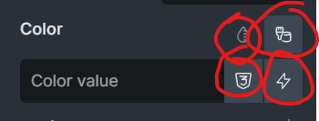
1- The color value now has enough space to display the full value.
2- The color picker is now available with one click. In the previous version, it took two clicks to get to it.
3- Dynamic data and variable buttons are also available with one click.
my thinking is instead of adding more buttons how could be less buttons and more intuitive
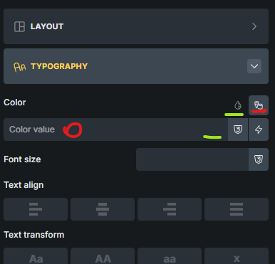
maybe eliminating the color palette button but making the input itself as default place when clicked can open the color palette and maybe we put the color picker in the input just like 2 other button in the input we can move it to left of it 3 icon side by side
when we think about functionality perspective this control is perfectly fine but that is not the issue
“control is not intuitive and feels cluttered” this was my thinking when i first started using it
That would take away the ability to enter a value directly.
That would indeed be desirable, but how can the current functionality be maintained?
We can’t answer that question at the moment, but who knows what the future will bring
I also dislike the new color control interface. I typically choose colors impulsively and make small changes to a color several times. This is a nightmare with the new interface.
In the previous version, I could edit global colors directly in the color palette in list view and immediately see the results of my changes. Now I have to open a window that covers everything, make changes, save, and close the window. If it’s not what I want, I have to start the whole procedure over again… This greatly increases the time required for the work and reduces efficiency.
I would like the editing option to be returned to the color palette list view!
“Én szintén nem kedvelem az új szín kontroll felületet. Jellemzően impulzívan választom a színeket és többször végzek egy-egy színen apró változtatásokat.
Ez az új felülettel egy rémálom.
Az előző verzióban a kolor palettán, lista nézetben közvetlenül tudtam szerkeszteni a globális színeket és azonnal láttam a változtatások erdményét. Most emiatt meg kell nyitnom egy ablakot, ami mindent kitakar, változtatást végezni, lementeni, bezárni az ablakot. Ha nem olyan, mint szeretném kezdődik elölről a teljes procedúra… Ez rendkívüli mértékben megnöveli a munkaidőt és csökkenti a hatékonyságot.
Szeretném, ha a kolor paletta lista nézetébe vissza kerülne a szerkesztési lehetőség!
Köszönöm!“