I have just upgraded from Elementor (right!) and am setting up my website using bricks builder. I have created some templates but am unable to right justify the main menu in the header.
What I am trying to do is:
LOGO Menu items
adjaacent to the left edge of the page last item adjacent to the right of the page (or near enough).
The logo is perfect but I cannot get the menu items to move over to the right side and hence have a larg gap between the last menu item and the right edge of page. You can see from the screenshot below …
Thanks for the suggestion, @timmse — I appreciate your help!
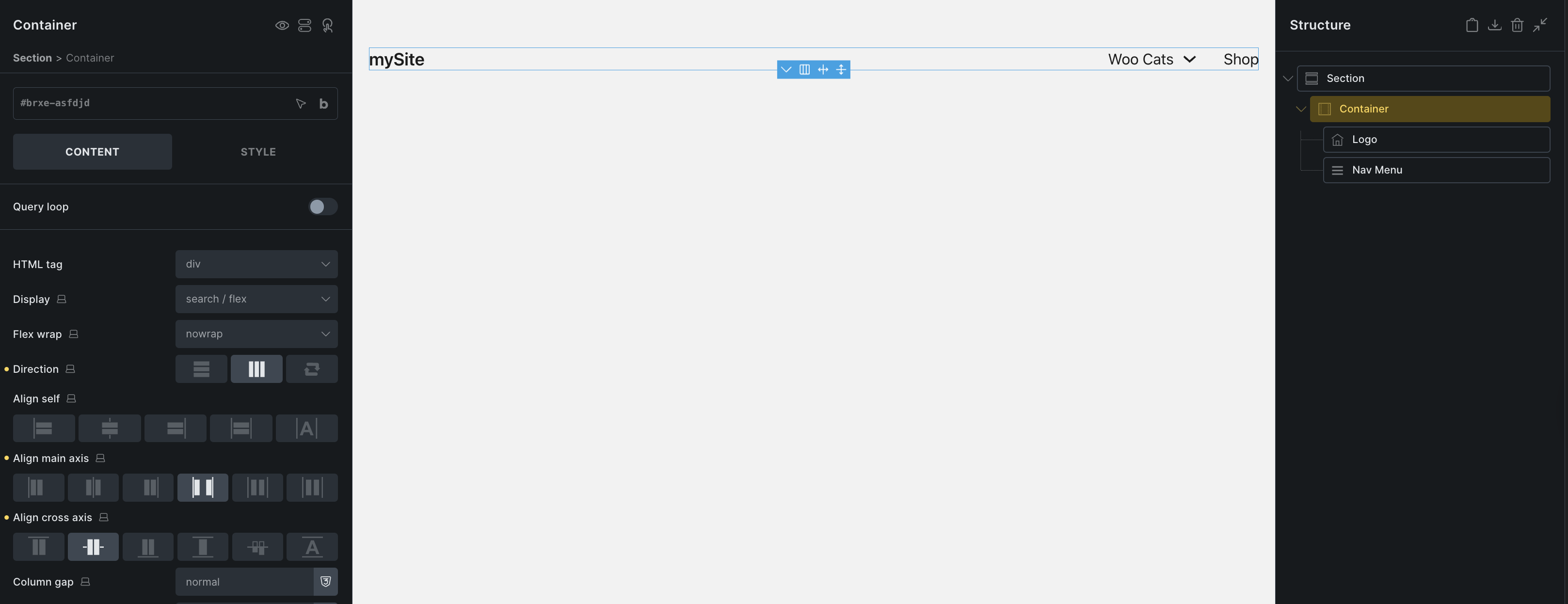
Unfortunately, that particular fix hasn’t resolved the layout issue with the header.
Here’s what I’ve tried since:
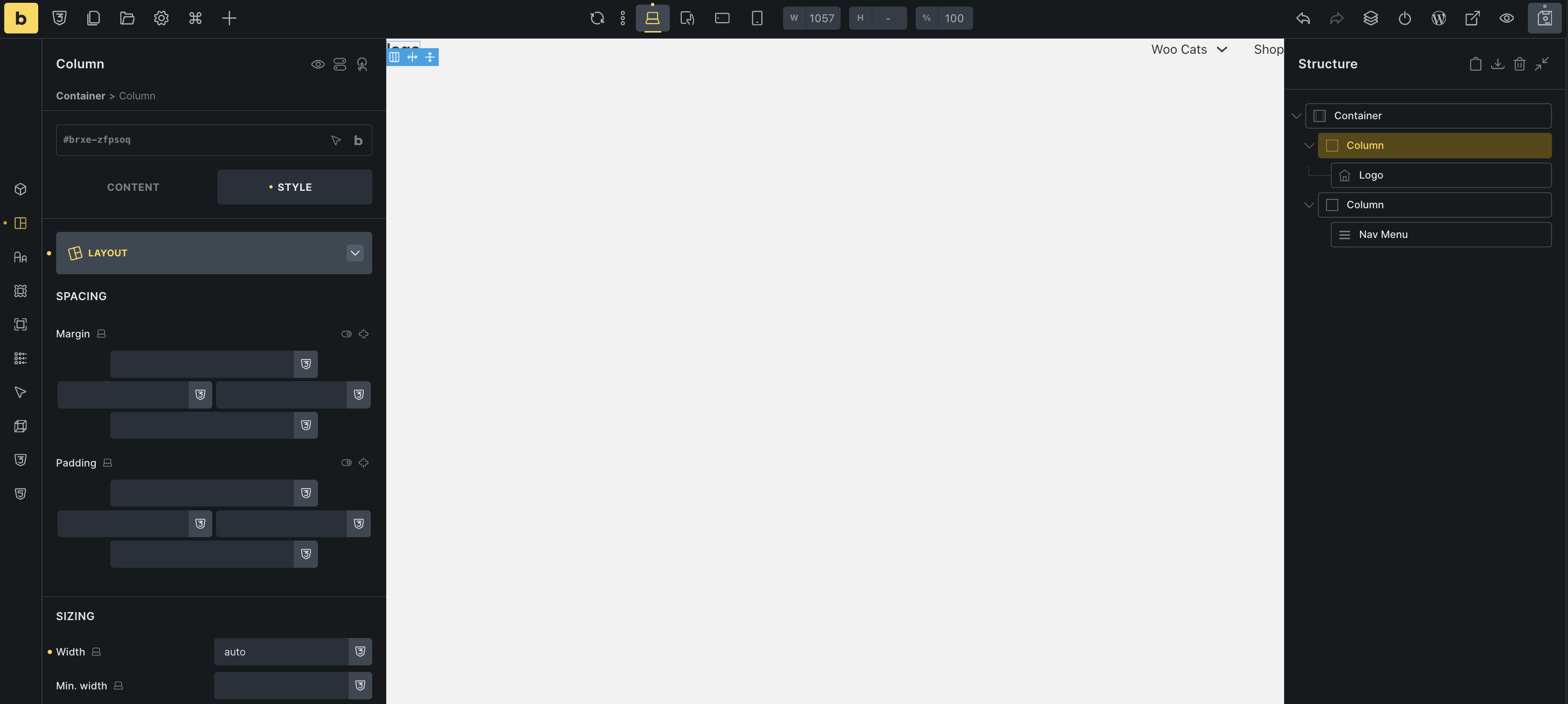
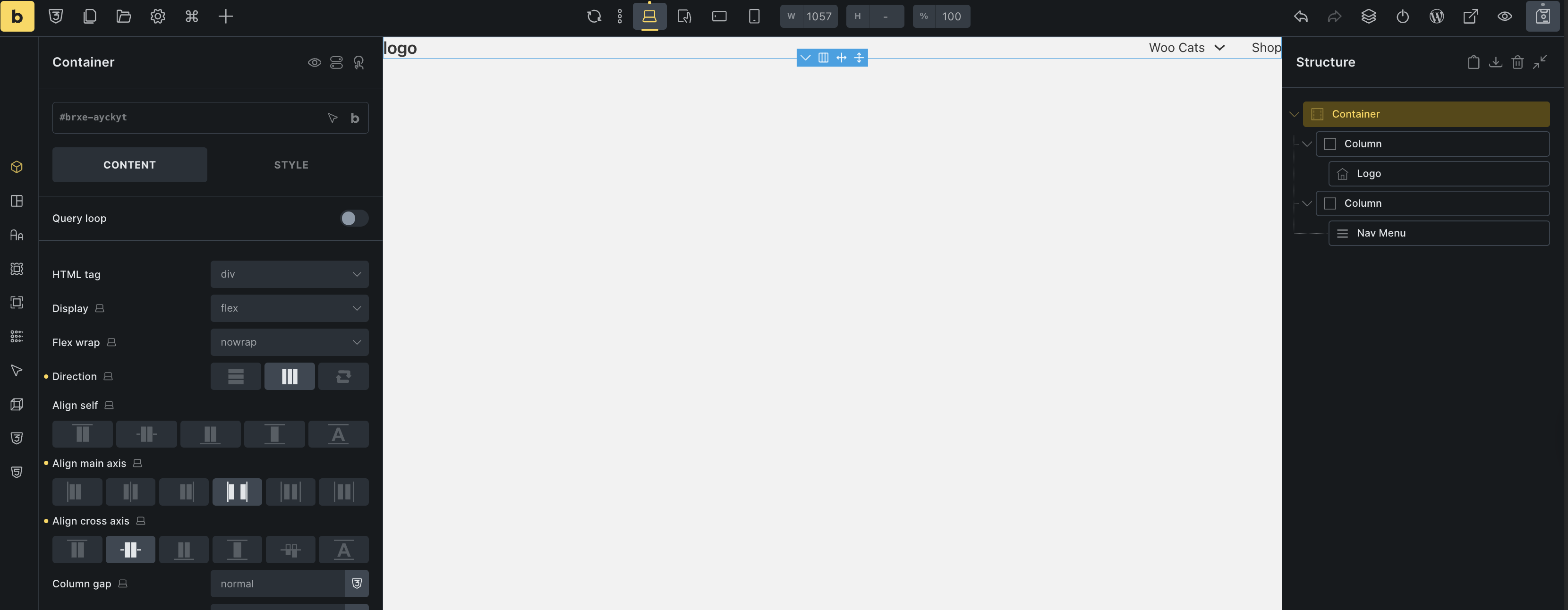
I created a new container with two columns, which does now stretch the header across the full width of the page — so that part’s working well.
However, what seems to be happening is that the menu automatically expands to take up all available space, based on the logo size. If I reduce the width of the menu column, some items disappear rather than wrapping.
The two columns behave dynamically, meaning that resizing the logo causes the menu column to adjust accordingly, and vice versa.
What I’d ideally like to achieve:
The logo aligned to the left , near the edge
The menu aligned to the right, near the opposite edge
All menu items visible , even if they need to wrap onto a second line
I’m happy to experiment and learn — I do spend time testing, reading, and researching before posting here. While I’m new to web design, I’m a former programmer and picking things up quickly. I just don’t always know what certain Bricks settings are doing behind the scenes.
Thanks again for your support — it’s greatly appreciated!
Set the block’s (columns) width to “auto”. Otherwise, they will expand and share the available space equally. Also, apply the container settings I shared in my previous reply: