So I’m using the nav nestable for a very simple menu, 3 items. But on mobile I need to have a different design so I used the offcanvas element as well.
The toggle button is set to open the offcanvas and it works fine, the hamburger shows up and the offcanvas opens because I linked the ID to it.
The problem is, there seems to be some kind of weird overlap with the default mobile off canvas menu that would normally appear if you did not use an offcanvas element.
Inside my offcanvas I’m trying to do the layouts and colors the way I want, but at certain break point all the colors disappear and the layout changes entirely. I believe it may be doing the layout from the default mobile menu as if I wasn’t using an offcanvas. In fact I cannot make my menu items appear no matter what CSS I try to use in dev console to troubleshoot!
I watched the original video about this:

Even he accidentally got the default menu instead of the new offcanvas at first.
He mentions in passing “because we didn’t disable it, but that’s ok cause I want to show you…”
So do I have to disable the default menu somehow? I tried disabling it by setting mobile menu to never appear, but of course if I do that, the hamburger icon never shows up either.
Here’s the structure panel:
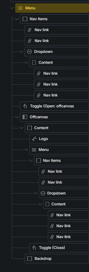
Note that I have two menus since one of them is the main menu and one is the menu inside the offcanvas. Both of these use different classes entirely for styling so it’s not the case that styling from the outer menu is overlapping the offcanvas one.
Also this is structure Thomas used in the video, placing the offcanvas inside the menu under the toggle. I also tried to do this with the offcanvas on its own at the bottom not under anything.
I have cleansed every element top to bottom of styles across every breakpoint trying to reset and start over many times.
On the documentation page:
It gives this warning “IMPORTANT: Make sure you are editing the “Mobile menu” and “Nav items” element settings on the breakpoint at which the mobile menu starts to display at (default: Mobile landscape).”
I’m doing that, but I’ve also done my styles at desktop size as well and it makes no difference.
I can’t give links on this one, new private project. I’m just wondering if anyone else struggled with this.
At the end I had to disable the hamburger in the main menu completely, and put separate toggle bottom and offcanvas elsewhere on the page (not as child elements of menu), and then set them to display none/flex at the breakpoints explicitly. Only be completely disconnecting from the nav nestable could I actually style the darn thing consistently.
Having a default off canvas mobile menu with its own settings, is quite confusing when you also want to put in your own offcanvas, cause now you have different settings that may overlap or not be needed. I don’t know what settings in the menu element are needed except for what breakpoint the hamburger shows up. All the other settings shouldn’t matter if I use my own off canvas. But they seem to affect things just the same.
In any case, this was really not pleasant! There shouldn’t even be a default off canvas system built-in to the nav nestable if we can just put an offcanvas element on the page and use that easily just by linking the toggle. Or else the mobile settings within the menu need to be greatly enhanced to give us much deeper ability to style and change content inside the mobile menu.