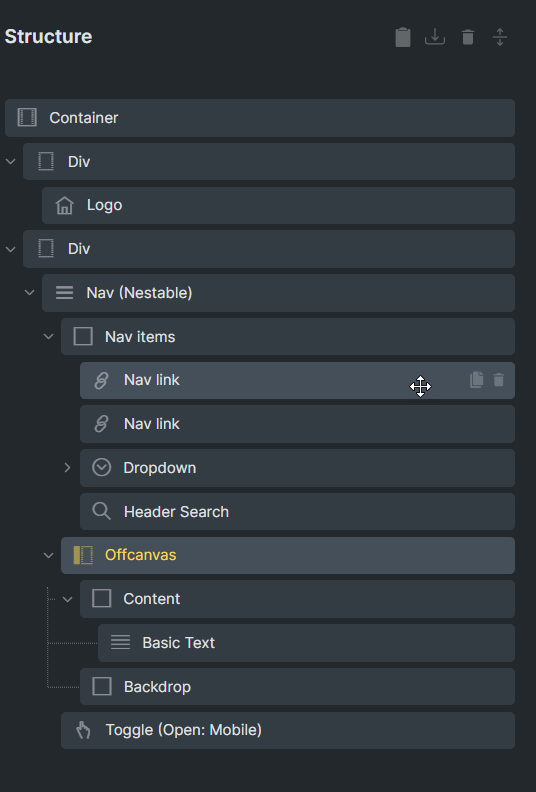
With the Nav Menu Nestable element, I’d like the open and close toggles to be in the same position, but with different icons.
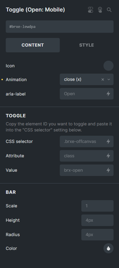
I know I can delete the close toggle element, and just use the open toggle to open and close, though I have to also set its z-index to 1001 to show when the mobile menu is open.
But that’s the SAME icon. And I want a hamburger when open, and maybe an X when closed.
I’ve come up with a solution but wondering if it’s a) the most efficient and b) still accessible.
- I left the close toggle inside the nav menu structure, as it is by default.
- Positioned it absolute, in the same position as the open toggle on desktop (top right for me).
- Then in the CSS panel of the close toggle, added this CSS:
%root% {
	z-index: -1;
}
nav.brx-open %root% {
 	z-index: 1001;
}
This effectively hides the close toggle on desktop, then shows it when the menu is open.
This does work… but is it the best way?
I fear I’m over-complicating something that should be simple. 
Thanks.