I have a nav menu with quite long single items. On mobile they bleed way out of the screen and create horizontal scrolling.
How do I automatically make nav menu items line break on smaller breakpoints?
I’ve ssen a similar topic here: Question how to make a subnav menu do have an automatic line break but no replies on that.
I tried adding word-break: break-all on different parts of the menu but that didn’t seem to have any effect.
Any help is much appreciated!
Hi Daniel,
Sorry for the late reply.
The nav items are indeed quite long 
You can add text-wrap: wrap; to the links and combine it with word-break, so they will wrap at a certain point.
root  .bricks-nav-menu .sub-menu > li > a {
  text-wrap: wrap;
  word-break: break-word;
}
Best regards,
timmse
Thanks for the reply! This works fine when viewing the site on virtual devices e.g. with Sizzy, but on my actual phone the line breaks are not applied.

This is on Safari iOS.
Any idea why this won’t work? Thanks!
@timmse I can’t edit the above post to tag you. Would you take a look? Thank you 
Hey,
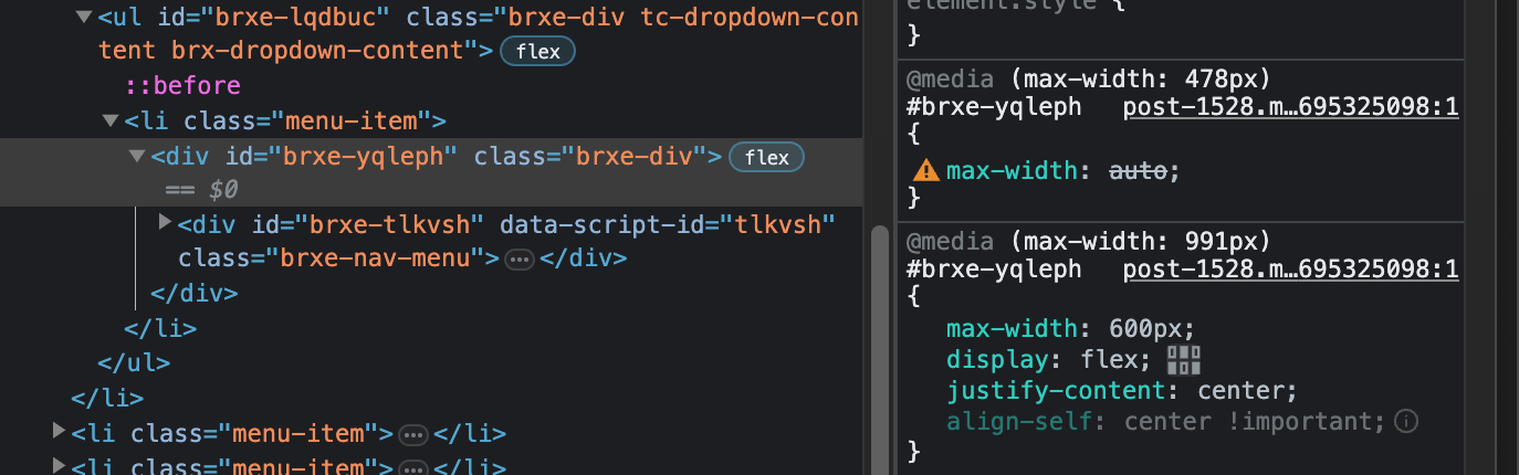
Maybe because max-width: auto isn’t a valid value, the max-width is still 600px, which would also explain the horizontal scrolling on mobile. Try unset for the max-width instead. Just a guess…
That didn’t change anything unfortunately. I am suspecting some sort of interference between Bricks and ACSS. I have now just shortened the link titles, to work around the issue. 
Thanks for your help!