Hi guys,
please have a look on my new website for my business.
How do you like it?
Any problems?
Greetings
Andre
Hi guys,
please have a look on my new website for my business.
How do you like it?
Any problems?
Greetings
Andre
cool concept and good colors.
Hi Andre, 
Excellent design, interesting concept with the borders, colorful overall.
The brand seems on-point, consistent scheme.
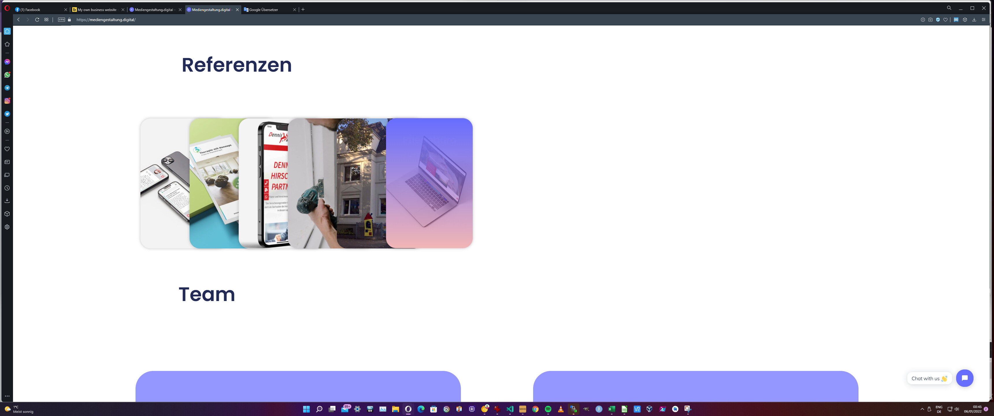
I really like the idea of how you showcase your work using mockups for the phone and desktop views: jonuschies – Mediengestaltung.digital → Not sure if it’s just me or are the images a little pixelated? Perhaps it’s just my screen, but I would double-check this to make sure they are pixel-perfect and as crisp as possible. It’s your portofolio and your work after all 
I am not a fan of animations. I never use it, I feel that it slows down the website. I like it to load instantly . Still, I don’t mind it that much for this particular kind of design. Especially since it’s the main design point in this case, as even the hero section at the top is animated, and you’re expecting it from the beginning.
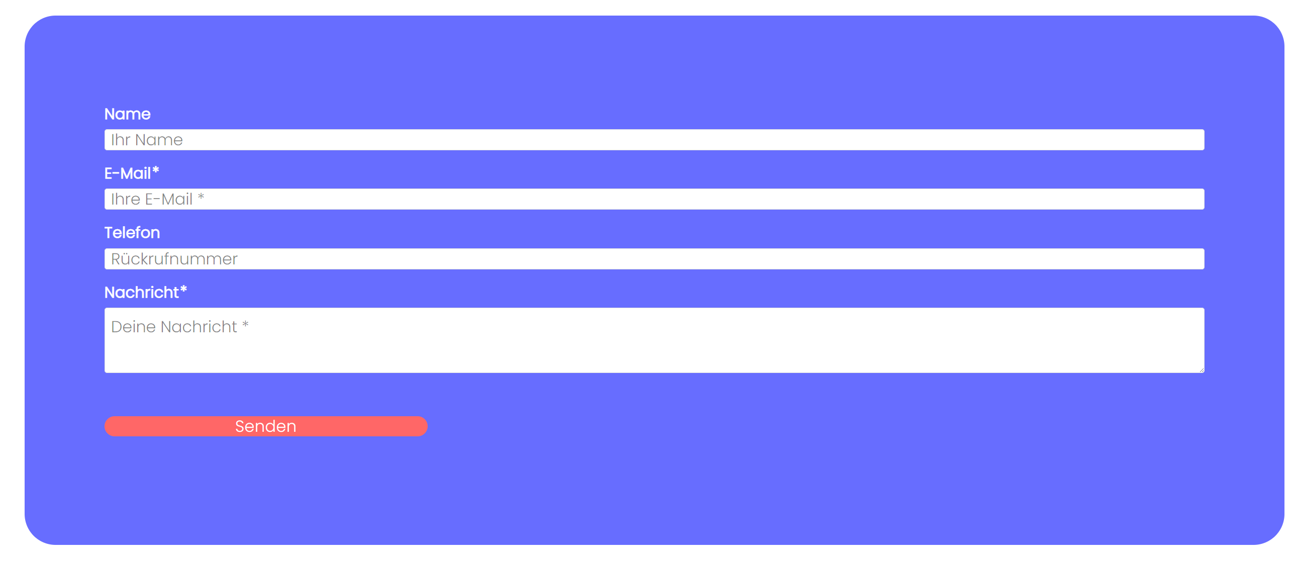
What I would add is a contact form, and even a separate contact page as google tends to show that separately in their results as a sitelink: Learn About What Sitelinks Are | Google Search Central | Google Developers
Another thing I would add on top of the portfolio is some testimonials. I use https://wpsocialninja.com/ for this. It gets them straight from Google or Facebook and shows them in a nice way.
Other than the 2 points above, great work! Congrats 
Cheers,
~Cristian
Thank you Cristian!!
I can remove the animation in the hero section, so it is instant there.
The Macbooks Mockup need a overwork. I converted it from jpg to webp, i think i try another converter.
It is not enough with the direct chatting bubble?, maybe i make a maps/contact form.
Google testmonials following, when i have a couple of them.
I would suggest using Shortpixel for the image optimization as it has a “Glossy” optimization mode that is supposed to be pixel-perfect, hence not lowering the image quality. It also generates and serves the .webp for your images on its own. (after you activated it in the settings).
Weird but for me neither the chat bubble nor the GDPR pop-up is showing on Desktop. Once I visited from mobile I immediately saw the chat and GDPR pop-up. Looking at the Chrome Dev Tools I cannot see any errors or files not being loaded. So perhaps it’s a setting on your end? Not sure about this.
Anyway, the idea with the Contact Form is more 2-fold, one for the people that want to use a contact form, and 2 for Google to show an extra link for your search results.
Quick screenshot to see that there is no chat bubble for me on Desktop:
If u deny the cookies, than the bubble won’t come.
Do you agree oder deny?
Edit: Or maybe you have a plugin in your browser that is blocking?
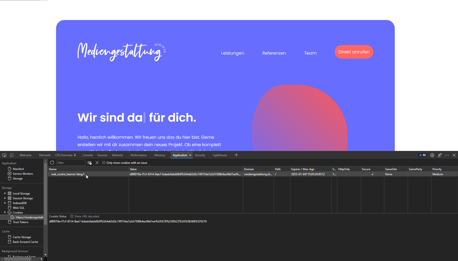
Weird. Cookies are not disabled in the browser. Not sure why I only have a single cookie. real_cookie_banner-blog:1
That’s the same in both, normal browser as well as private mode. The value is different still.
Already disabled my adblocker.
I think it’s the DO NOT TRACK Option, if you have this option on in your browser settings, the cookie banner won’t show up. I changed a option in the real cookie banner, I think now it works every time.
Nice catch. Yes, I had that option active.
Clearing the cache, cookies and local storage now it always shows up the GDPR pop-up and the chat.
One other thing I noticed is there are no GA cookies so you’re not using analytics or it’s not yet configured?
It’s now configured.
How can i mark my business on maps with die maps element in Bricks. So that the business is always to see. Now i have to click on the marker to see it.
And how long does it take, to see in gmaps.com my business as a marker? If i scroll into my street where my business is, i dont see it. If i search for it i find it.
Hi @ARAKZ ,
For your business to show in GMaps you need to use Google My Business. As for how to show the business name on the marker in Bricks Builder I believe you need to configure Infobox Title and Subtitle.
Hi Cristian, ja i already use google my business. Maybe it take some time until it shows directly in the map when you zoom in.
Hi Andre
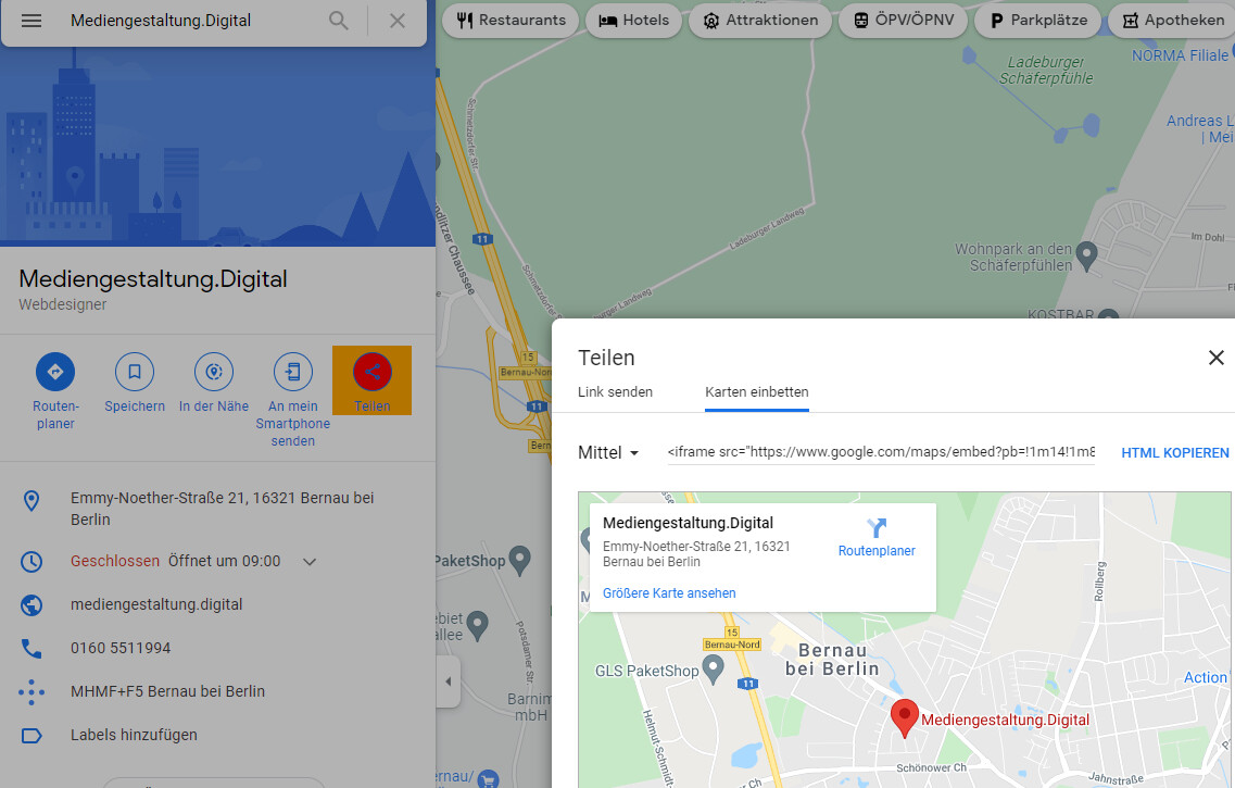
Take this for your Map instead of hiding it:
<iframe src="https://www.google.com/maps/embed?pb=!1m14!1m8!1m3!1d9674.73474061758!2d13.5729865!3d52.6837496!3m2!1i1024!2i768!4f13.1!3m3!1m2!1s0x0%3A0xdae2e05772245720!2sMediengestaltung.Digital!5e0!3m2!1sde!2sde!4v1641425479029!5m2!1sde!2sde" width="600" height="450" style="border:0;" allowfullscreen="" loading="lazy"></iframe>
Some hints about the page:
You should lower the side margin in mobile view to the same than margin-top - otherwise you loose some space:
For my taste, the animated text in the hero section is to fast. And insert a line-break - in some dimensions it breaks (and all the rest of the content) with long text.
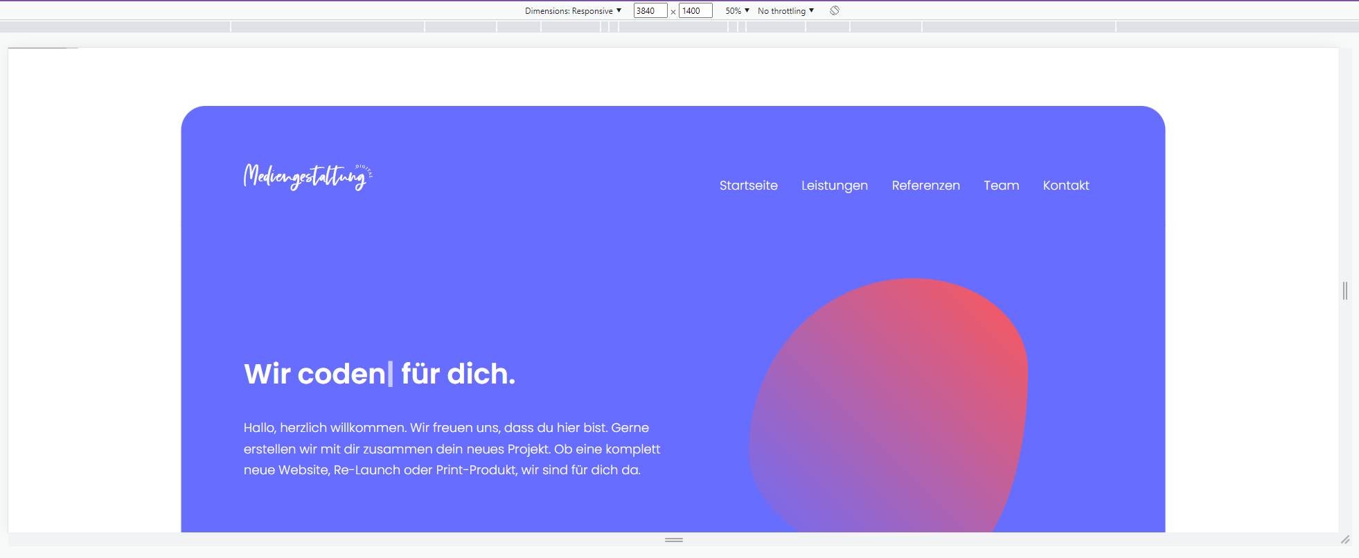
One ultra wide screen everything is a bit to big/wide - I suggest to use always boxed containers
The References doesn’t match with the ultra wide width:
Some odd things happen here to - here at home I have “only” 3440x1440 - with the “normal” ultra wide with 3840x1600 it will be even stranger:
You don’t use the clamp() proper
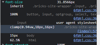
It should be `clamp(min, [dynamic], max);
The Impressum/Imprint isn’t set and the url/slug is ‘impressum-2’. Delete completely the first “impressum”-page, then you the original slug is “released” and ready to use again.
The webpage of your partner is “Under Maintenance”.
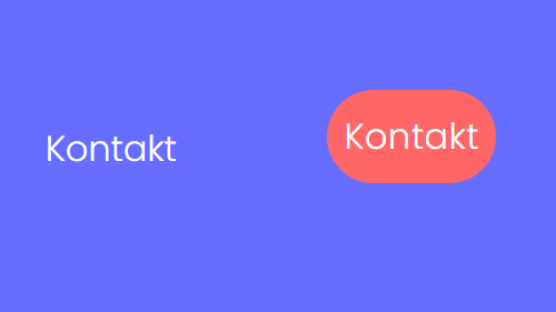
You have two times “Contact” and it doesn’t have the same baseline.
Why don’t you display your phone number?
“Good luck” with the fixed chat button. At Employer Punktplanung (don’t look to closly at the margins and (font) sizes - it’s far from perfect, but I have other stuff to do in the company) the fixed chat/messages button was only used a once in the quarter and we removed it.
Last but not least: I did a quick look at our client page https://pflegebuero-jonuschies.de/ and there are a lot ultra wide screen issues too.
Besides some points: I like your website, the colors and boxes …
Cheers
Felix
Thank you!! I have a look on the issues!
Hey Felix,
ist es ok wenn ich deutsch schreibe?
Ich habe jetzt Google Maps per Iframe eingebunden, wie du vorgeschlagen hast. Ich konnte im Mapelement von Bricks in den anderen Breakpoints nichts mehr ändern, da kam dann die Meldung, dass ich den API Key eintragen soll. Im Desktop Breakpoint geht es aber.
Clamp habe ich korrigiert. Die Referenzen ebenfalls. Danke für deinen Hinweis, hat mich echt weitergebracht es jetzt richtig zu verstehen.
Bubble habe ich erstmal deaktiviert. Meinst du ich sollte eine Bubble nur mit Telefonnummer machen? Oder einfach oben rechts den Button Kontakt zu Anrufen ändern? (oder unten in der Kontaktsektion?)
Der Impressum-Fehler ist korrigiert.
Du schreibst ja das es bei Widescreen zu große Boxen sind. Soll ich die schmaler machen? Wäre das dann auch mit dem Clamp-Befehl?
Danke und schönes Wochenende
[Sorry, lads, we continue in German]
Hi Andre!
Also für die Einbindung mit dem iFrame direkt aus Google Maps braucht man überhaupt keine API.
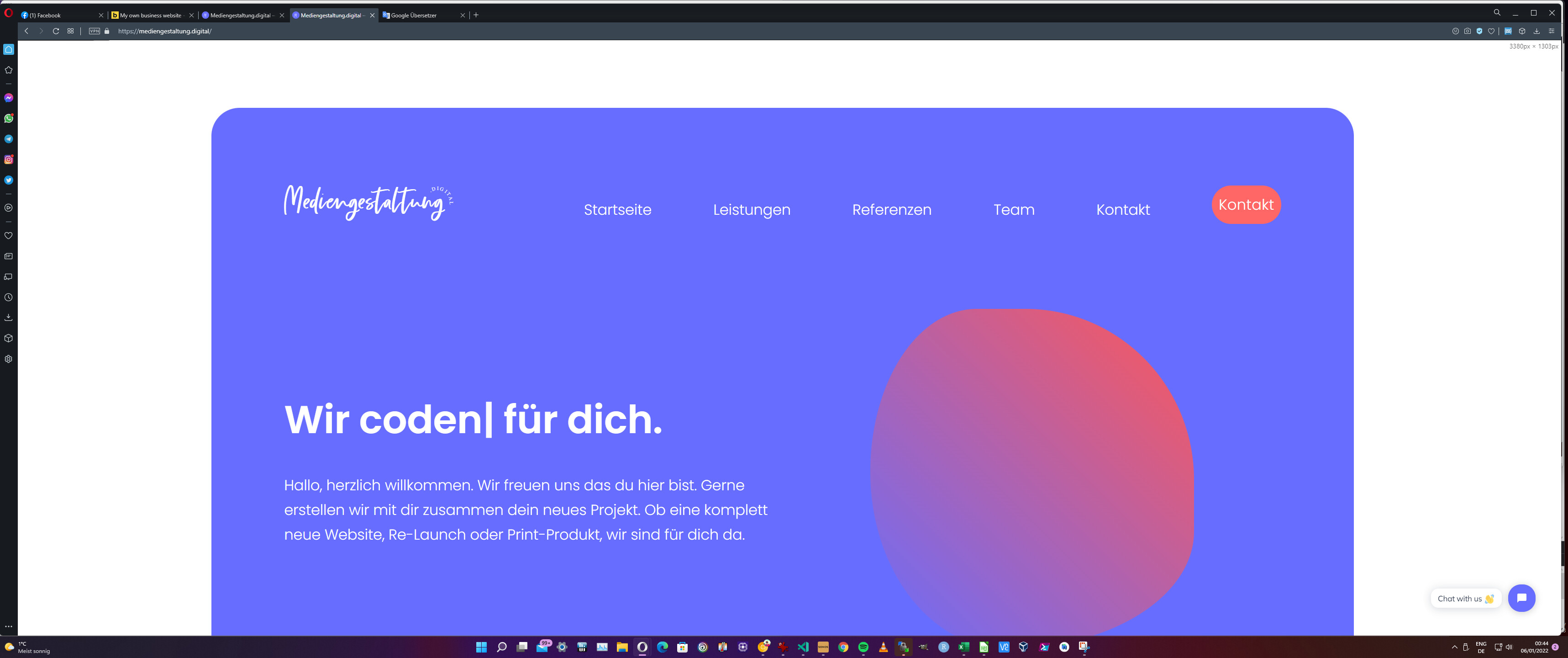
Hier solltest du noch width="3000" height="450" anpassen. Ich gehe mal davon aus, dass 3000 ein Tippfehler ist. Ich schlage hier einfach 100% vor. Bei Mobile Landscape macht die Karte aktuell noch komische Sachen.
Also wir machen es bei den Hotel/Restaurant-Seiten eigentlich immer so, dass bei mobiler Ansicht ein “Anrufen”-Button vorhanden ist. Wenn man auf dem Desktop auf den Telefon-Link klickt, kommt man ja nicht weit.
Breiten, Abstände & Abmessungen:
Alle Container sind mit width: 74vw; max-width: 100%; manuell einzeln festgelegt. Hier wäre die Verwendung von einer Klasse à la .main-container nicht verkehrt - oder du schiebst alles nochmal in einen übergeordneten Container, der den kompletten Inhalt umfasst oder benutzt generelles CSS mit main#bricks-content { }. Meine Empfehlung ist max-width auf um die 1400px zu setzen - das entspricht ca. der Breite bei FullHD (1920px Breite). Und bei width kannst wegen mir gerne mit vw rumprobieren. Den margin-top vom Header solltest du auch nicht unendlich von der Fensterbreite abhängig machen und könntest du mit min(4vw, 80px) beschränken - bei Mobile wird hier auch zu viel Platz verschenkt.
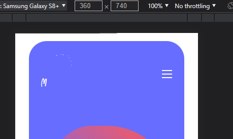
Zwischen Mobile Landscape und Mobile Portrait macht der border-radius einen riesen Sprung.
Insgesamt ist auffällig, dass du sehr viel Unterscheidungen für die unterschiedlichen Breakpoints machst. Eigentlich sollte gerade ein arbeiten mit clamp & vw die gesonderten Einstellungen obsolet machen.
Wenn du über den Inspektor/Untersuchen im Browser eine manuelle Responsive-Ansicht von 3840x1400 angibst, wirst du sehen, was ich mit dem Ultrawide Problem meine (hier wird die gesamte Ansicht verkleinert - d.h. Schriften erscheinen kleiner als in Wirklichkeit)
Mein Vorgehen wäre insgesamt:
clamp(), min() & max() arbeiten.Hier ist ein hervorragender Rechner für clamp (Achtung: 1rem ≙ der root/html/body Schriftgröße):
https://websemantics.uk/tools/responsive-font-calculator/
Hier nochmal abschließend, wie es ungefähr auf einem “UWQHD+” (3840x1600) Monitor aussieht:
Danke werde ich morgen durchgehen.
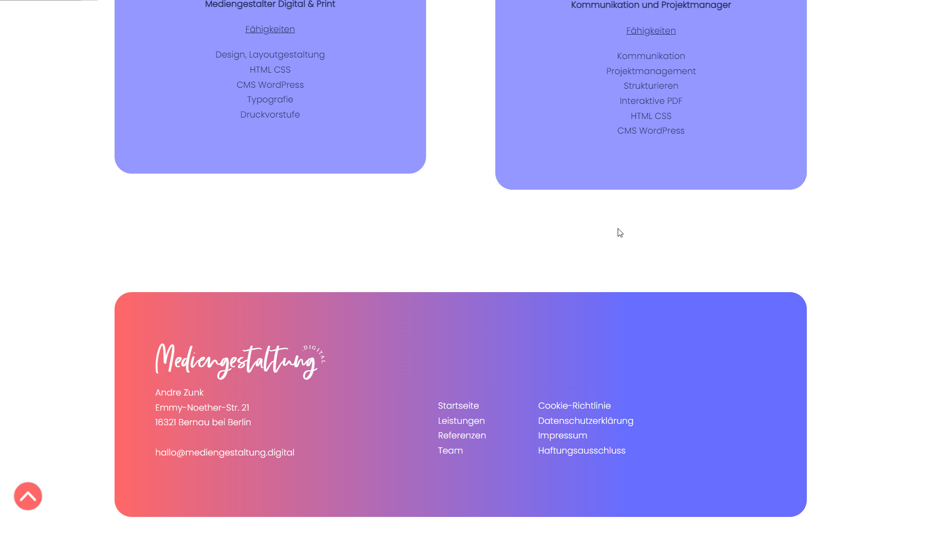
I really like that References section. How did you create that section?
Hey
The references are from css-tricks.com.
You can find them on codepen. Just type in “mini card” in the search field in codepen. There are different versions.
Nice website! Is the animation in the hero section custom css or a bricks feature? I haven’t seen something similar on other bricks sites.