Hey,
- ACSS
- Bricks Extras
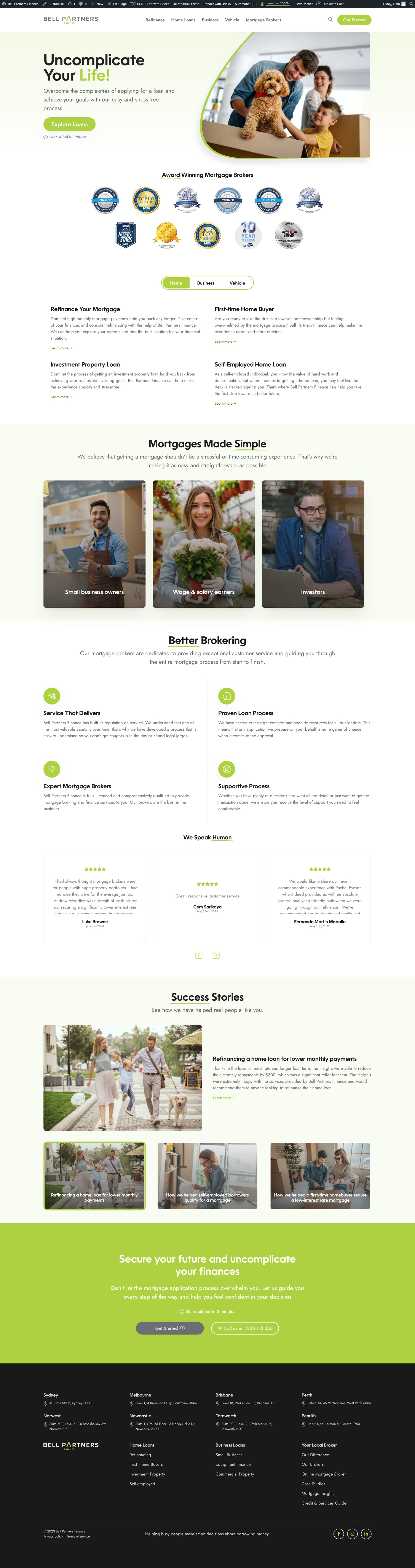
3rd bricks site so far. One of our largest bricks projects so far. Would love some feedback.
Hey,
3rd bricks site so far. One of our largest bricks projects so far. Would love some feedback.
I like the colors.
I’d give sections some more padding, it gives it a cleaner, more luxurious look. Also giving section titles/subtitles a max width (somewhere between 700-800 usually is fine) makes it easier to read and a cleaner look.
Thanks, mate, made a few tweaks there from your feedback.
Looks better, you could do with some more consistency as well. So line out everything to the left for instance, and be more consistent with spacing between sections/blocks. But we’re talking esthetic details.