Tutorials are very welcome in general.
I want to style the Moblie menu:
When I want to change size and the colour of the burger menu, I try with background colour.
I know its not this way.
I go to the Hamburger toggle settings, but cannot se what I do with hamburger. Or is it the wrong place to style the hamburg menu???
What else can I do
https://johnnya41.sg-host.com/?
1 Like
Hi Johnny,
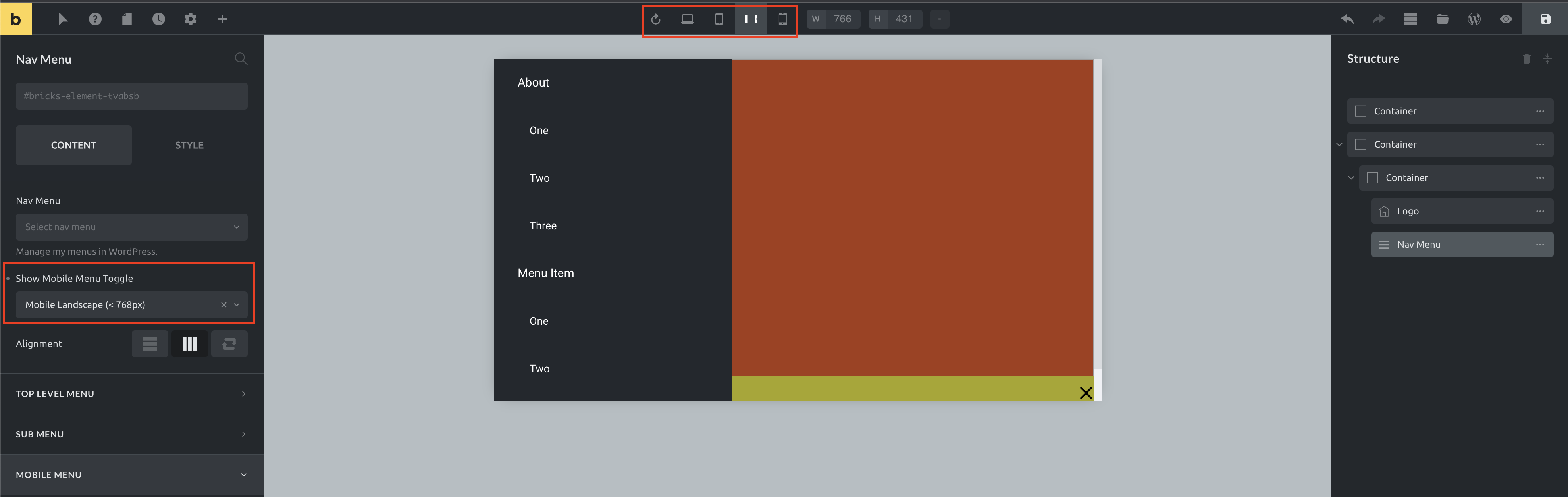
you need to select the Breakpoint, on which the mobile menu should appear (on the left). Then, switch to the specific breakpoint (on the top) and you can see and style your mobile menu and hamburger icon.
Best regards,
timmse
But where do I edit the hamburger menu?
Size clour etc
https://www.loom.com/share/3c9935f4e8b84847aa7a4438de9fa8bb
Hello,
you are currently editing the top level menu, scroll to the bottom, select the “Mobile Menu” tab and there you will find, among other things, the  options and generally all the settings that affect your mobile menu.

2 Likes
I am messing around a lot here…
But maybe its not possible to edit the hamburger separately from the hamburger.
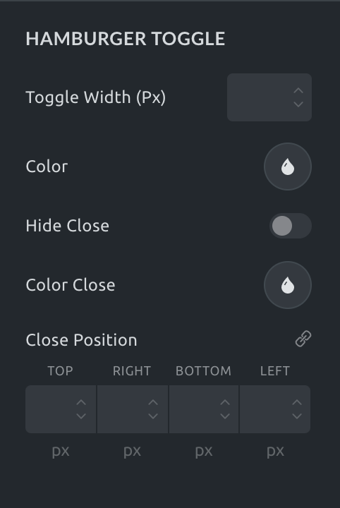
I want the hamburger to be greenish and the toggle close X to be white on the greenish background.
Also I want edit the boldness / or fatness of the hamburger - where?
Hi Johnny,
no, it is not possible to style the size of the hamburger and close button separately because they are basically the same element.
You can change the color of the hamburger, the color of the close icon, and the position of the close icon if you want it to be somewhere else than the hamburger position.
You can override the boldness with custom CSS.
Example:
.bricks-element-nav-menu .bricks-mobile-menu-toggle span {
	height: 4px;
}

.bricks-element-nav-menu .bricks-mobile-menu-toggle .bar-center {
	top: 10px;
}

.bricks-element-nav-menu .bricks-mobile-menu-toggle .bar-bottom {
	top: 20px;
}
Best regards,
timmse
That helped me further.
Thank you, @timmse
1 Like
This is something I am missing from Elementor. The ability to
- Select icon for hamburger toggle
- Having full control over styling toggle and close button each separately
My issue is that the hamburger is tiny and I want to make it bigger so it will be easier to click - I can make it wider, but then it is still just a long skinny target - still hard to click.
BTW, my styling option is to set the hamburger color as transparent and put in a background image in its place… but I still need more than a sliver of that image to be clickable.
2 Likes
Yes, the height should grow with the width - I think it’s a 1:1 ratio by default. The hamburger styling options or default size behavior is still bad in Bricks 1.8.3 and that’s a component that 99,9% will use to get started.
4 Likes
I don’t understand why the creators of Bricks didn’t provide an option to adjust this directly.
 My solution is to use transform: scale:
@media (max-width: 767px) {
    .bricks-mobile-menu-toggle {
        transform: scale(2.2);  /* Scale the entire button */
    }
}
is that customization?
I solved it in the following way. I configured the rest of the settings directly in Bricks for the mobile menu. Of course, I am using the classic NAV (not the nasty one).
@media (max-width: 767px) {
    .bricks-mobile-menu-toggle {
        transform: scale(1.5);  /* Enlarge the entire button */
        background: #0481c9; /* Temporary blue fill */
        margin: 15px; /* Add margin for spacing */
        box-shadow: 0 0 0 5px #0481c9; /* Add an extra blue outline to simulate padding */
        position: relative;
    }
}