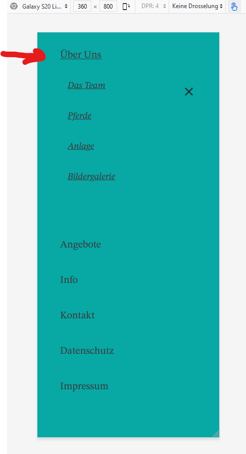
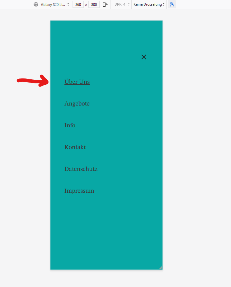
i have a mobile menu with a couple auf subitems. When i push for example the Menupoint “über uns” then this point jumps to the top. It is possible, that the Menupoint stays where it was and the subitems comes under it?
Picutres in attachmend.
Greetings
Andre
The “jump” is probably caused by expanding the submenu. At the moment I don’t see any way to work around this.
You can’t disable the submenu items, but you can create two separate menus, one for desktop including submenus and one that is only displayed mobile, without submenus.
The problem with mobile navigation is that we need to cover two actions: opening the submenu and opening the corresponding page if the parent menu item contains a link. That’s why the two clicks are necessary in that case.
I think the jump comes from the fact that your menu is vertically centered.
Align to top to see if it fixes the issue.
As for the link pb, I think it’s a bad practice anyway to make a parent item a link (even on desktop).
You should better use an empty custom link (’#’) as parent and put the link as the first subitem.