I appreciate menu/mobile menu/mega menu builder is finally here, but it seems it’s been released now because sooo many people were requesting. Without a doubt, there are so many issues regarding ux/logic and how the elements behave (Imran from Web Squadron pointed a few out).
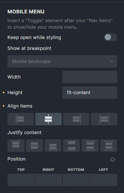
Any one the most annoying things is that you have to use toogle widget twice and it’s very hard to place it exactly where you want it.
I understand that it some cases people may have a need to place z close button in other place, but I guess in 90% of cases, you want a close button to be exactly in the same place as open toogle. It just adds extra work, especially as you have to use absolute positioning.
Would you consider revamping it to make it a single button, which changes function with a simple JS? IF someone needs to use it in other place, you could have a toogle “Disable toogle when active” and then use toogle widget.
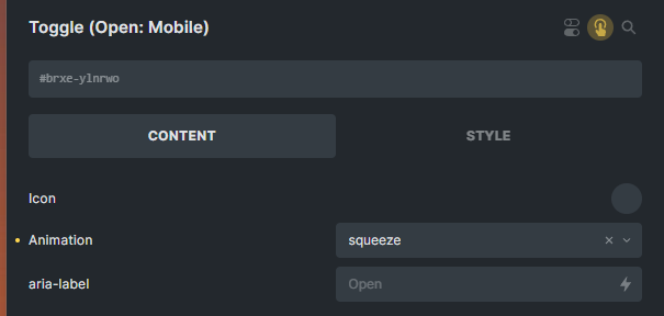
It would be nice, if there was animation on the state change like hamburger changing into cross/X
There is no z-index option for mobile menu canvas.
It’s a very serious feature, perhaps the last 12 months. When introducing such changes, would you consider from time to time to offer Bricks alpha version in order to receive feedback as early as possible? It would be good to create pinned threads for certain features to give feedback and have some conversations/exchanging ideas with others.
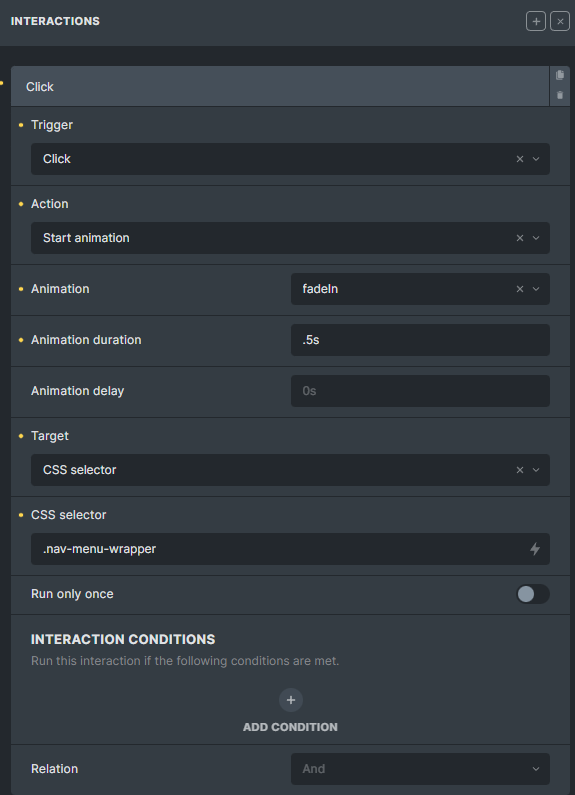
You can already use the same button to close and delete the other. Just gotta add an interaction. Can even add an animation to it to switch to an x. As for z-index that’s one line in css if u wanna keep it on top of the open menu: Dropbox - Record_2023-05-15-22-02-46.mp4 - Simplify your life
Not at PC rn but lemme know if u need more info then I can take some screenshots tomorrow
The close and delete other, but it’s still two different buttons. A prefect solution is one button and option to pick an icon for inactive (default) and active state. Even with your solution, you still have to work on placement of the buttons with absolute positioning
z-index - one line of css? Sure, but you can say this about many css/php/js solutions, many of them are in fact 1-2 lines solutions. You need to find it a class, sometimes it takes time. That’s what you have a page builder for - it saves you a lot of times
z-index of the toggle (my bad, no css needed for this )
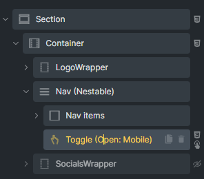
Just noticed though that I think you’re using the regular" nav element. Haven’t used that in a while now so could be that you gotta get your hands dirty with a little css there. I’m pretty sure though it will receive improvements in the future.
As for alpha to get even earlier feedback… Look at how much stuff there is to fix in the beta, if they released an alpha of that, they’d need to hire half the country not to drown in bug reports and support requests.
Bricks as a whole is fairly new and actively being built. I understand it can be frustrating not to have something seemingly simple available in the builder. Honestly if you’re not happy to find workarounds with css or js for some scenarios, either wait a few more months or stick with your previous builder for now. Just my 2 cents though