Hi all, I am having 2 issues with mega-menu. I haven’t posted this in ‘Bugs’ because it is probably due to my misunderstanding, however here are the two problems I am having…
When I view on an actual phone: 1 column (1fr) on mobile portrait:
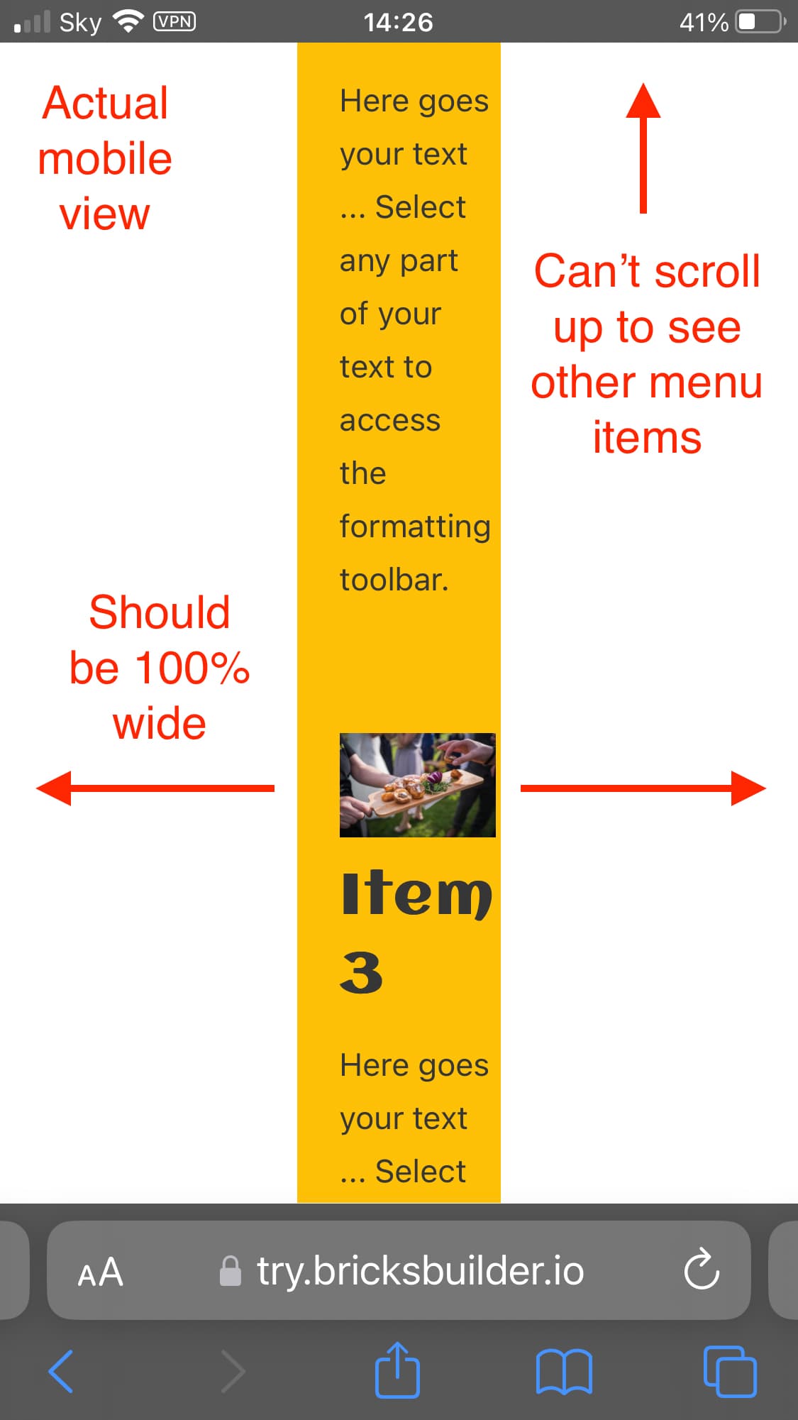
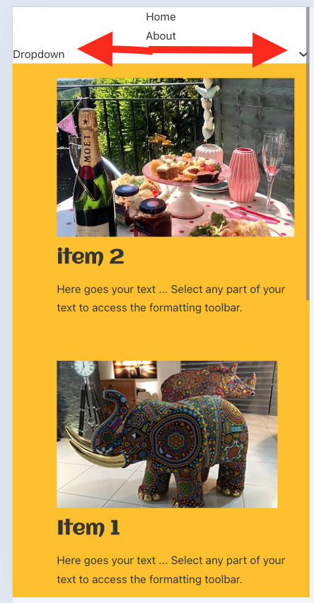
On an actual mobile, the mega-menu is a very narrow column down the middle. Note: it looks fine on Bricks canvas and Chrome tools.
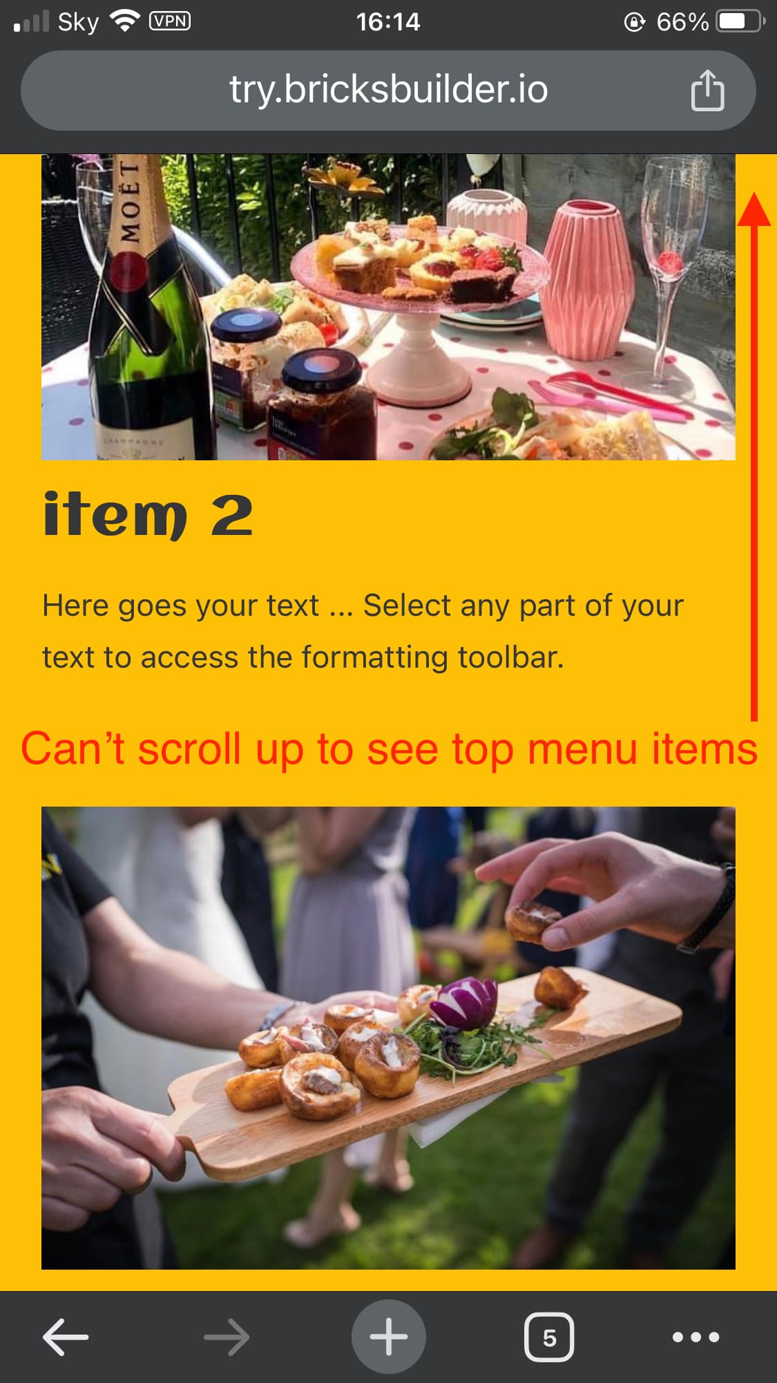
when the mega-menu dropdown is open on mobile, it is not possible to scroll up to see the first menu items.
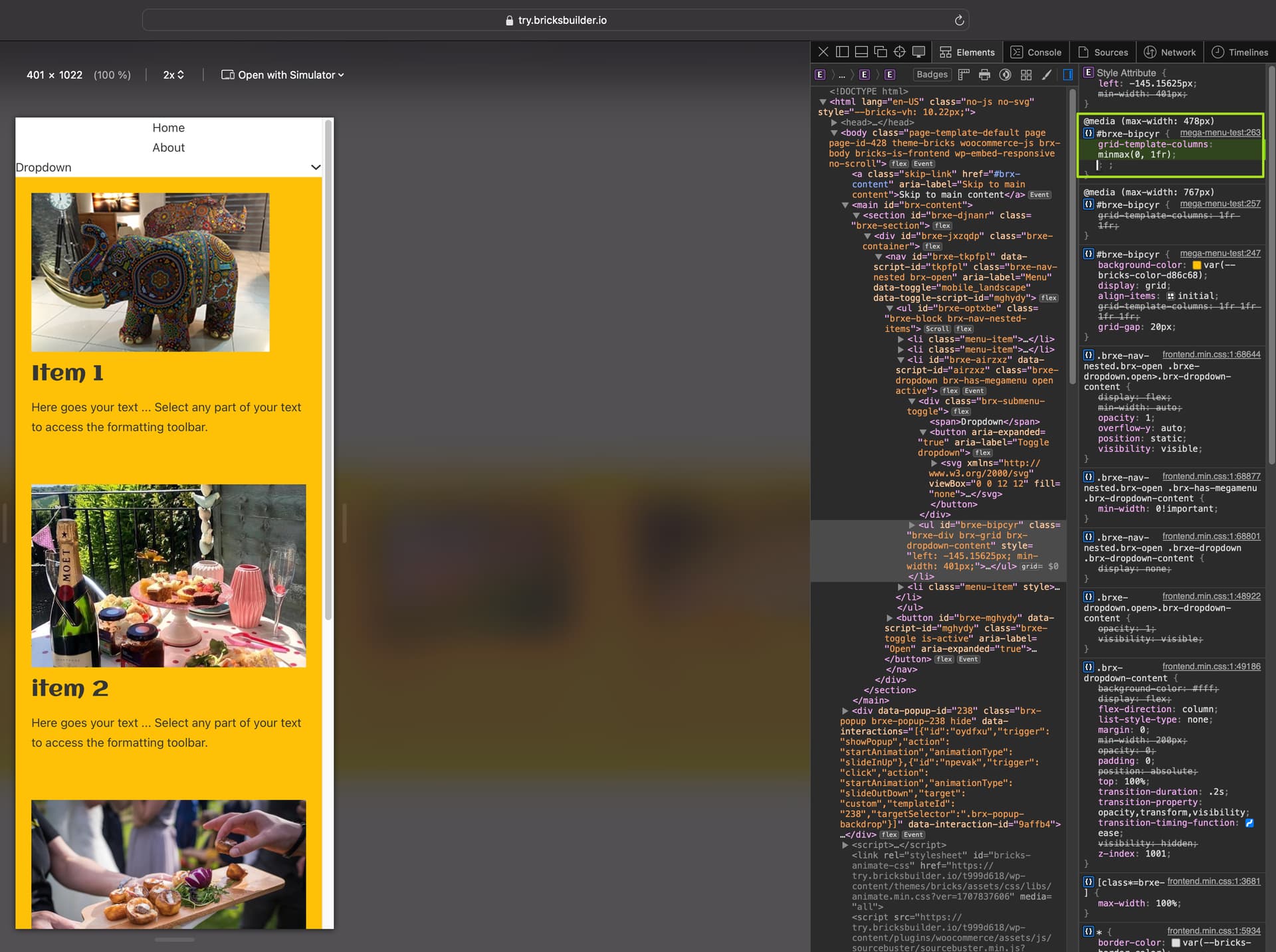
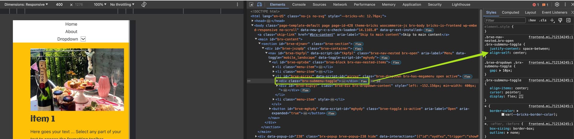
On my iPhone, the grid is still displayed strangely, which is either because you have placed the grid directly on the dropdown content wrapper, or it is missing a width.
Please add width: 100% to the grid or add another block element to the dropdown content and assign the grid to it.
The problem with the height is probably caused by the justify-content: center, which you should change to justify-content: start for the mobile menu. Then it should actually work…
I hadn’t set the Mobile menu to justify-content: center, so it must be that by default? But setting justify-content: start for the mobile menu helped the height problem.
I tried adding 100% to the ‘dropdown > content’ grid. But that didn’t make a difference to the width issue.
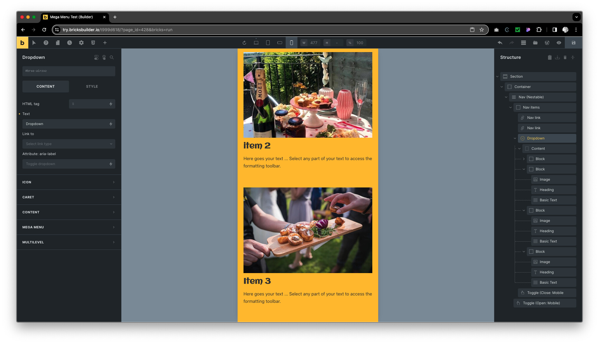
So then I tried removing grid from ‘dropdown > content’ and added a new block within instead.
This worked, although in the menu when the dropdown is activated the ‘Dropdown’ and ‘down icon’ shoot to opposite ends?
Bricks menu builder seems tricky to use. I’d really love to know what best practice is for creating these mega menus, so as to reduce the dev time to create them.
I agree, but making such a complex element “simple” for all possible scenarios is extremely difficult. We are trying to improve the element over time. At the moment, you have to play a little trick here and there… The proof of the pudding is in the eating
 thank you very much for taking the time to help me understand