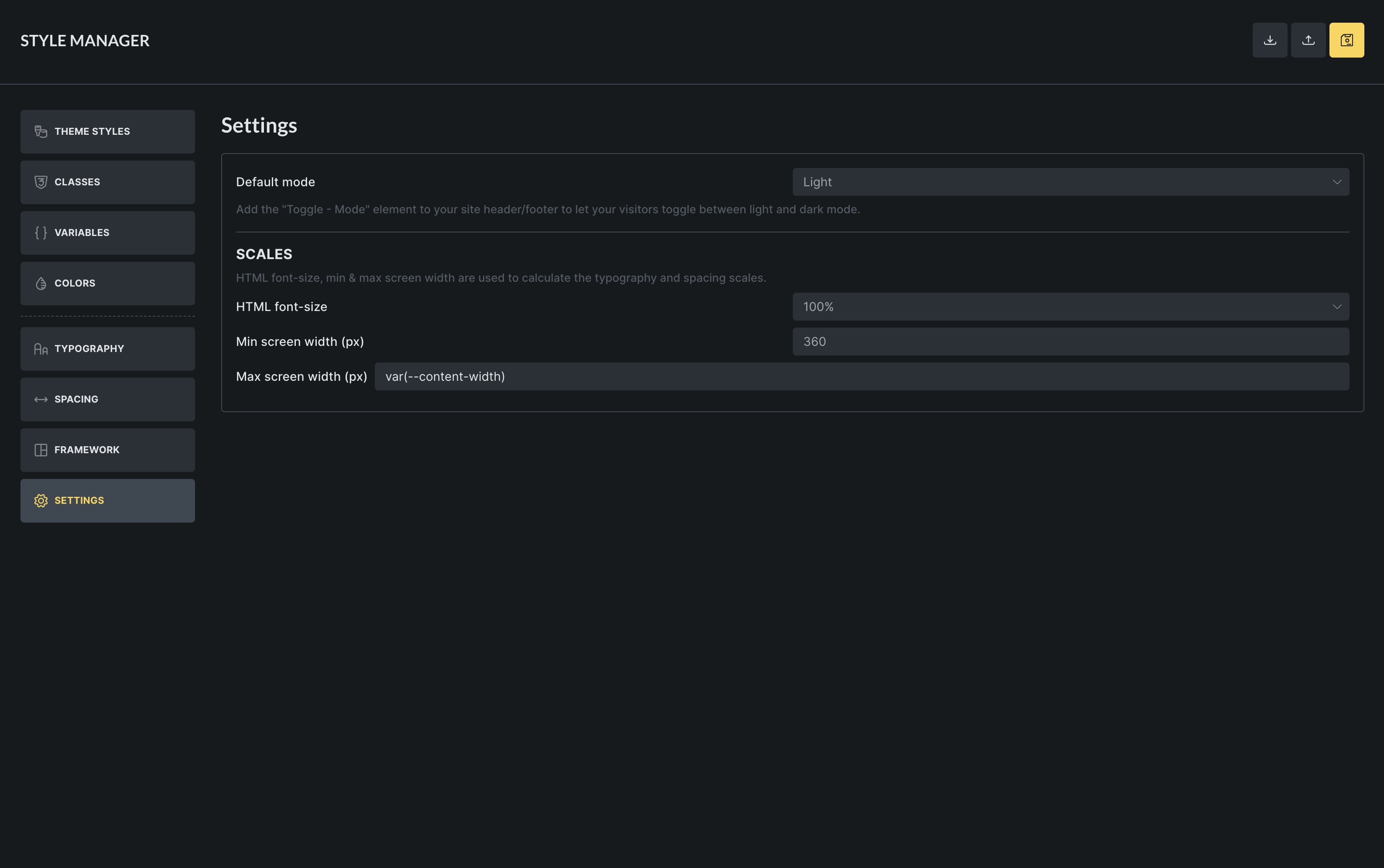
I understand that the Settings tab in the Styles Manager modal are being used for calculating the typography and spacing scales. It looks like is taking the html font size from the one I define in HTML root font size under Typography -that’s good- but it’s not taking the width I set-up for my container elements for the max screen width. My question is if the scales will work if I use a content width token in there (in order to avoid having to remember changing this value in more than one place if I decide to do so).
Also, for some reason the field for the Max Screen size ends up longer than the rest after adding content in it. This whole modal isn’t quite working UI-wise for me tbh. Theme Styles ends up having these extremely long fields, the classes and variables managers have lost some of the width to accommodate the left hand menu, the modal changes width while switching from one tab to the other one…
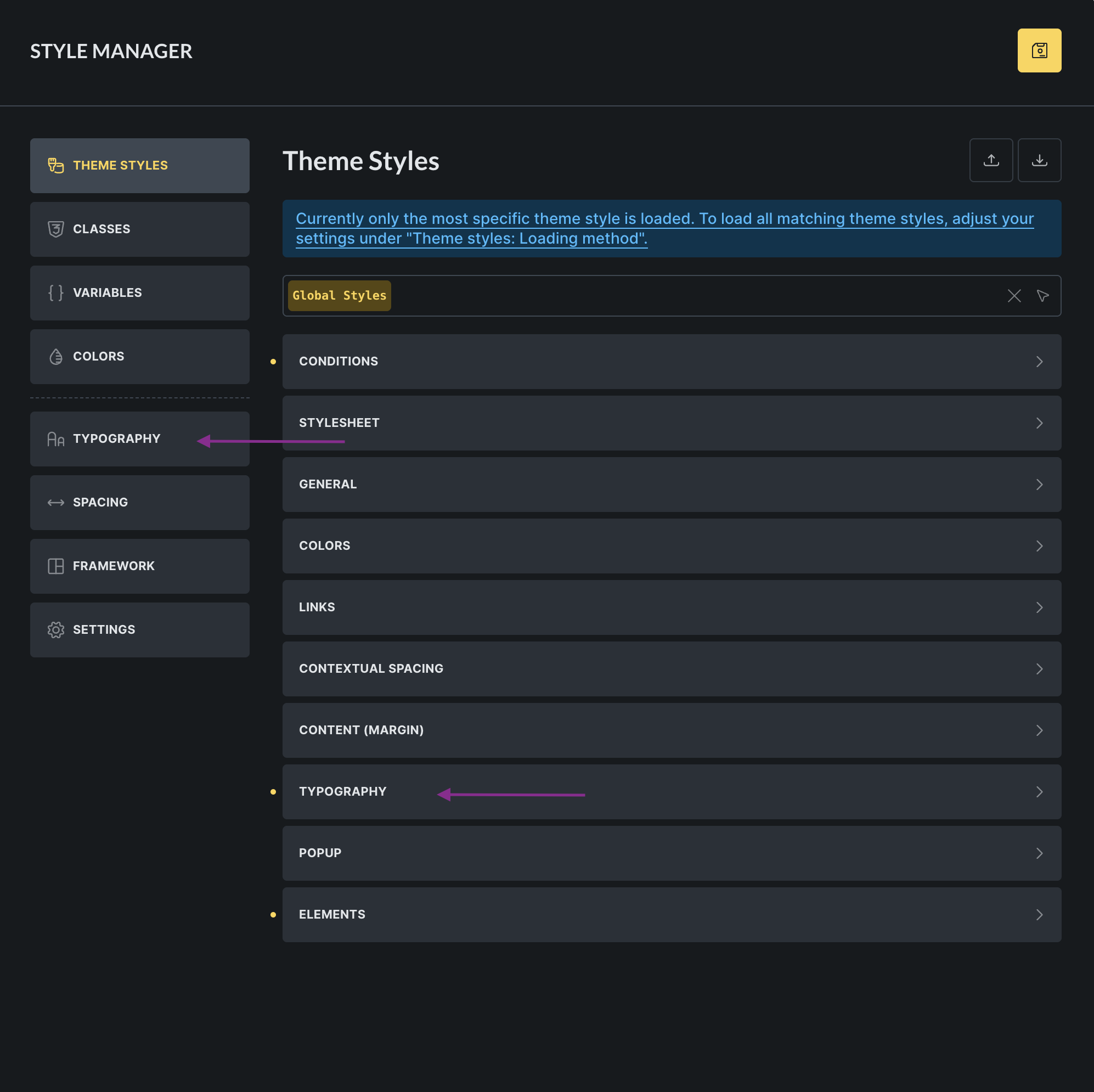
I also keep going to the Typography scales tab every time I want to change something in the typography tab inside the theme styles, width both Typography tabs visible in the modal at the same time. I truly think the Theme styles should remain separate to anything related to variables and classes.