it would be nice if we have this feature with the slider.
thank you
it would be nice if we have this feature with the slider.
thank you
Maybe it can be done with some clever CSS. I have not yet managed to find the appropriate CSS class.
Is there a pro who can help?
It will be awesome if this effect exist in default slider
Maybe you can find a snippet here… https://animista.net/
Until they add it to the slider you can just add some custom css you can add on the slider element
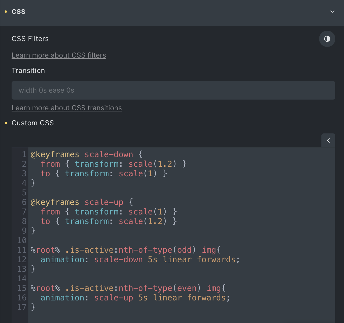
@keyframes scale-down {
from { transform: scale(1.2) }
to { transform: scale(1) }
}
@keyframes scale-up {
from { transform: scale(1) }
to { transform: scale(1.2) }
}
%root% .is-active:nth-of-type(odd) img{
animation: scale-down 5s linear forwards;
}
%root% .is-active:nth-of-type(even) img{
animation: scale-up 5s linear forwards;
}
Hey @markballard . Where to put this CSS code? Please post a screenshot
Thanks @markballard for helping
i tried your code but no luck 
maybe i am messing something
I exported the template as a json file so you can import and play around with
Message from dropbox
This item was deleted
Can you share it via https://wetransfer.com
Thanks in advanced
My bad I made a change and uploaded again but copied the wrong link
Thanks @markballard 
When I use this, for some reason the slider will reset the slide scale before transitioning, so when the second image is zoomed in, right before it transitions, it jumps and resets to being zoomed out.
Yeah it’s not a perfect example as it was just a quick attempt to create a Ken Burns effect with CSS. You probably need to play around with the animation speed and scale settings to get it to work better for your use case.
I ended up finding a decent combo with the transition settings, works great for what I’m using.
Thanks for sharing this!
Cool! Can you share the settings that worked for you? I couldn’t figure out how to deal with the reverse setting so it always resets before advancing to the next slide.
This is what I ended up with actually: Website Example >
Not exactly ken burns at the moment, but I needed the nice slow transition. Sorry its not very helpful.
This is what I left off with CSS when I was working on it last time:
CSS
@keyframes scale-down {

  0% {

    opacity: 0;
  }

  50% {

    opacity: 1;
  }

}

@keyframes scale-up {

  0% {

    opacity: 0;
  }

  50% {

    opacity: 1;
  }

}

%root% .is-active:nth-of-type(odd) img{
	animation: scale-up 7s ease-in-out forwards;
}

%root% .is-active:nth-of-type(even) img{
	animation: scale-down 7s ease-in-out forwards;
}
Has anyone found a “robust” solution for a Ken-Burns-Effect within the Nestable Slider? Maybe anything via an external Javascript library? I mean… There HAS to be a solution to this 
It´s such a shame there´s no direct option in Bricks for this effect… Imo it´s such a basic thing and even Elementor has this by default.
It´s always difficult for me to explain to my clients why I can offer them custom solutions for their google business openings for example via custom code but can´t add something like the Ken-Burns-Effekt to the Nestable Slider.
I mean… It´s probably because I still haven´t found a way to make it work but still.
Add image elements to each slide. Put this in the custome css of the Slider Element itself.
 @-webkit-keyframes kenburns {
     0% {
         -webkit-transform: scale(1) translate(0, 0);
         transform: scale(1) translate(0, 0);
         -webkit-transform-origin: 84% 84%;
         transform-origin: 84% 84%;
    }
     50% {
         -webkit-transform: scale(1.25) translate(20px, 15px);
         transform: scale(1.25) translate(20px, 15px);
         -webkit-transform-origin: right bottom;
         transform-origin: right bottom;
    }
     100% {
         -webkit-transform: scale(1) translate(0, 0);
         transform: scale(1) translate(0, 0);
         -webkit-transform-origin: 84% 84%;
         transform-origin: 84% 84%;
    }
}
 @keyframes kenburns {
     0% {
         -webkit-transform: scale(1) translate(0, 0);
         transform: scale(1) translate(0, 0);
         -webkit-transform-origin: 84% 84%;
         transform-origin: 84% 84%;
    }
     50% {
         -webkit-transform: scale(1.25) translate(20px, 15px);
         transform: scale(1.25) translate(20px, 15px);
         -webkit-transform-origin: right bottom;
         transform-origin: right bottom;
    }
     100% {
         -webkit-transform: scale(1) translate(0, 0);
         transform: scale(1) translate(0, 0);
         -webkit-transform-origin: 84% 84%;
         transform-origin: 84% 84%;
    }
}


%root% .is-active:nth-of-type(odd) img{
	animation: kenburns 60s ease-out both;
	animation-iteration-count: infinite;
}

%root% .is-active:nth-of-type(even) img{
	animation: kenburns 60s ease-out both;
	animation-iteration-count: infinite;
}
Thanks a lot for your code!
Unfortunately my client has the images as background images in his Nestable Slider. Do you happen to have a solution for that, too?