JT DesiGn® revamped with BricksBuilder

[Have made some changes accordingly to the feedback given below]
Hi!
I have moved my new site design using Bricks to a live site today.

95% completed. About 3 pages to complete.
It’s a website for my business in the furniture line.

*not really good at website designing.
*Any feedback is welcome. :grinning: :grinning:

5 Likes

Hi @jornes.

I had a look at your site and in general the design is very good.

I hope you will appreciate, I would like to share with you my personal analysis:

  • pay attention to the space on the left and right, the content in the header and hero section are not aligned with the content of the rest of the site (I sent you an image to explain). I would move the content to the right of the hero section under the hero section to a dedicated area.
  • If “Make Appointment” is your main CTA button, I would set the background color in black and text in white, the button on the side, black border and transparent background
  • in reference to the menu I would put the “Shop” item in first position and highlight it.I would eliminate the item “Home”, nowadays users are used to click on the logo to return to the home page (from my point of view the elements of the menu should be positioned according to their relevance)
  • I would increase the space between sections (whitespace concept)
  • eliminate some animation, they are great for capturing the attention but when they are too many they could disturb the visitor
  • I see many logos in your page but I don’t understand the correlation with your business, are they partners, customers or suppliers?
  • I would group the logos in a single section if they all correspond to a single business category
  • place the colored logos on a background with a solid color (if you group them with the others, you will have to decide if all colored or all in gray)
  • remove the image under the footer and keep a solid background color
  • move the “Request an Appointment” button under the “Any question about…” claim and balance it by inserting the social media icons on the right side
  • move the chat icon to the right (users are used to see it on the right)
  • tighten the text container (“p” tag) under the title of the hero section of each page to the same width as the title

Mobile version

  • the menu button is absent
  • the animations are many, some of them I would eliminate
  • the content of the footer is not aligned (personally I would align the text to the left and not central)

I hope I helped you.
Thanks

4 Likes

Hey, @jornes don’t be too hard on yourself; that is an excellent design, especially for someone who does not do it for a living. :clap: :muscle:

Some really good points by @lanzoni.nicola regard UI & layout. I would have to disagree with removing the home button; with UI, you should never assume everyone knows something.

Worst case scenario, if the kitchen business is not successful, you could always fall back on being a web designer :slight_smile:

Well done mate!

2 Likes

Hi @lanzoni.nicola

First of all, I appreciate your valuable feedback regarding my site!
I’ve learned a lot from your feedback. Thank you!

The first point:
I agreed that the content should all be well aligned.
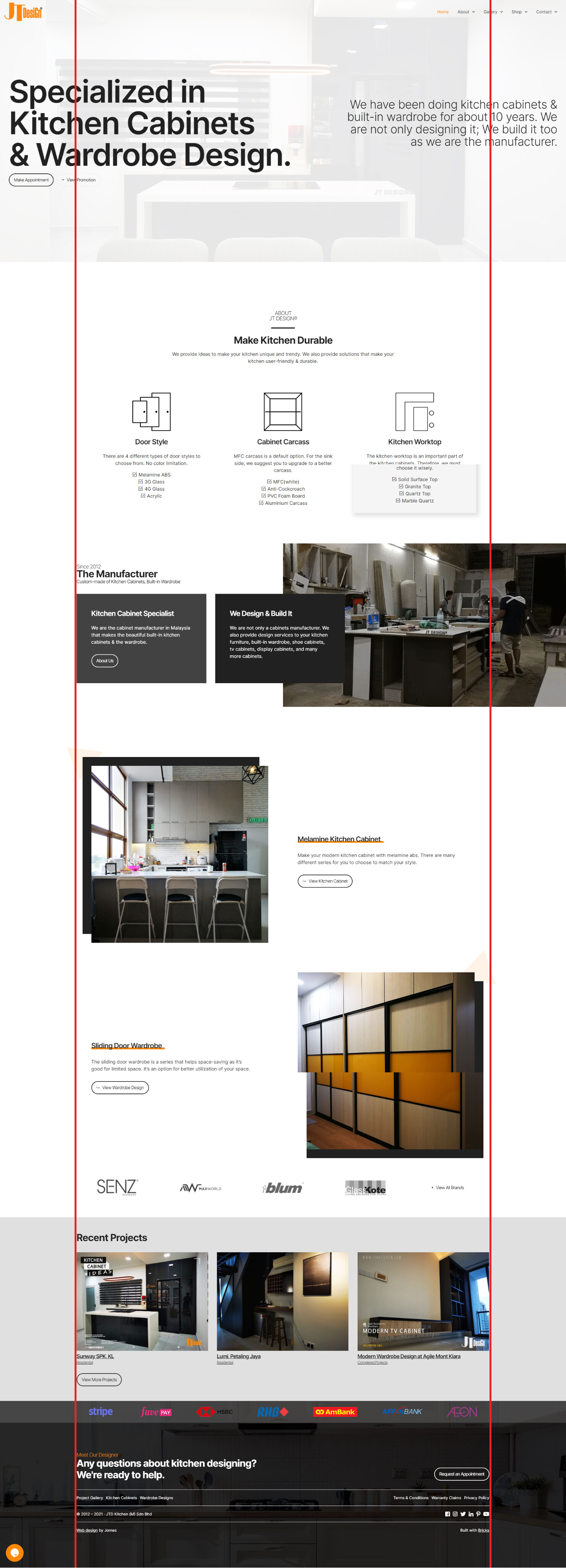
Actually, the hero and the header I made it full width because of there are some pages that have sections like this(refer to the screenshot).

The left and right sections.

I have my container inner width at 1400px. When I have this type of section, I don’t know how to bring the content(we’re passionate) same align with other content that is 1400px width. I’m still learning.

The CTA button
Yes! I agree with you. That way will looks better and make people want to click more.

The Menu
I have to agree with you that most of people will click on the Logo to back to home page. But, I’d love to leave the home button there in case those visitors really need the home button, they can still find it, make it easier for them. :slight_smile:

Whitespace concept
What will be the ideal gap for that? I have adjusted it to 200px(after your input).

Animate Effect is too many
Yes! I have to agree that the animate effects are too many. I will see which one to eliminate or…I’ll make them fadein instead of fadeinLeft or FadeInRight.

Logos
Logos in the footer section. The Stripe & FavePay are the payment gateway I used to collect payment from customers. Then, the logo of HSBC, RHB and the rest are the selected banks that I can use to offer my customer to pay my product by monthly installment plan.

Then the logos like SENZ, MaxWorld, Blum and GlassKote are the logos of my suppliers. I have a single page to display all the logos of my suppliers.
https://www.jtdkitchen.com/reliable-brands

Logos with Grayscale effect
I actually applied Grayscale effect to the banking logos.
I am just not sure why the Logo elements not working with grayscale and transform effect I set in Bricks. But it worked when I applying the effect using Custom CSS code. For now, I removed the CSS code for Luis(Bricks dev) to investigate this issue further. Maybe a bug.

The Background Image in Footer section
I wanted to go with solid colour without a background image too. But, I feel like it’s plain and boring. So I added it back. Maybe I will try again to remove the Background effect.

The Button of Request an Appointment
I agree with you. I will think of how to design that.

Chat Icon
I have already moved it to the right(after your input).

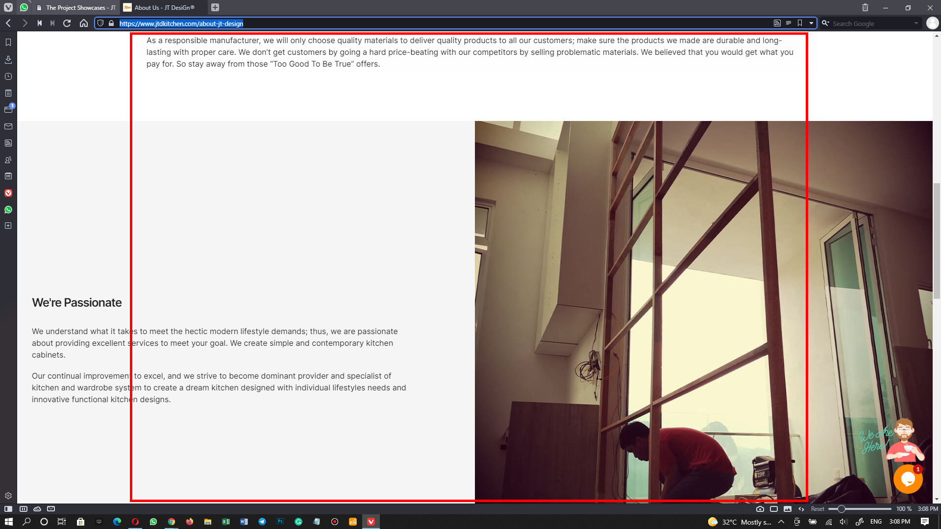
Tighten the Text Container
This one, I’m not really understand how to make it same width as the title. Would you mind sharing a guide?

Mobile Version

  • I’m checking it out. I check the menu is there at my end. Can you share me a screenshot? Thank you!
  • The animations, I will consider switching some of them to fadein instead of fadeinLeft, fadeInRight or something else. FadeIn only should works fine, correct?
  • Move footer’s content to the right instead of central, I’ll try that out.

I do appreciate for your kind feedback. I’m not a pro web designer but I am learning how to make a good website for my company. :slight_smile:

Again, Thank you very much for your inputs! :slight_smile:

@Michael
Hi Michael,

Thanks for your feedback! Yes. My main industry is kitchen design.

I have to agree with @lanzoni.nicola for some of his points. Helped to improve my site a lot. The home button on the menu, I will still leave it there, as there might be some visitors who love to click on the home button for returning to the home page.

I don’t think I can make it to become a web designer lol… :laughing:

Thank you for your compliment, Man!

Very nice website. I won’t repeat most of what others have written, but I would definitely keep Home for the reasons mentioned. If the animations have to stay, make them quicker – they are too slow from trigger to completion. Made me want to stop scrolling. Keep in mind that the audience for kitchen makeovers may be older, not as tech savvy, or may have vision issues.

2 Likes

@stphnwlkr

Hi!
Thank you for taking the time to visit my website and for the valued inputs!

Animate Items
Yes. I agree that some of the animations are too slow. I’m checking back to see which one to make faster.

By the way, the audience for kitchen makeovers in our market here(Malaysia) is age around 30-60+.
I agree, I must consider the older age audiences too. :blush:

Update:
The domain name of my website has been changed to jt.my.

1 Like

Updating my site to Bricks 1.3.7 from 1.3.3. The experience was good overall. :+1: :+1: :+1:

*Update: had a minor adjustment to the design of the site.

Updated my live site to 1.5-beta. I have tested and checked on every single page, and no issue was found. So, I dare to bring the 1.5-beta to my own production site.

2 Likes

Nice design.

I have a problem here.
How can I add the distance from the sub-menu to the top menu to keep the same level with the HERO container’s top border?

1 Like

Hi @naked2020
Thank you for checking it out!

It’s a simple fix. Don’t add padding to your header section. Just give the padding to the menu item instead, and then you will get what I get. :wink:

Hope it helps. :smiley:

1 Like

Thanks. It worked. :+1:

1 Like

Make sure you adjust the padding for mobile view, too.

1 Like

After Thomas introduced “Add element ID & class as needed”, I moved all the IDs styling to classes(still moving), and now I feel the site is much lighter and smoother than before.

Scroll up a little to find the link to my site.

The page has yet to be optimized(expect bad scoring if you check Google PageInsight). :grinning_face_with_smiling_eyes:

1 Like

I could not update my post, so I updated it by replying to it.
The website URL has changed to jtdesign.my. It was jt.my

@jornes I just changed the website URL for you to jtdesign.my

1 Like

Hey @thomas

Thank you! :blush:

It looks like you have taken some suggestions already. Overall this is a GREAT website. I see so many sites each day and this is better than many professional web design/development companies put out.

My only feedback is these little headers: Image 2023-03-06 at 12.28.1... - they don’t really match the rest of the style and it covers the actual text too much. My recommendation is to make these headings bigger and black like you did on “The Manufacturer” headline higher on the page.

I think the site is absolutely worthy of being listed on www.wpshowoff.com - if you want to submit the site, I will get it added!

Hey!
Thanks for the kind words! Yes. I’ve taken some good suggestions given above, including yours. Please take a look at the heading again.

Sure! I have no problem getting my site listed on your site. :wink:

Have a good day!