Fonts, colors, and animations are all super smooth. The mega menu might be my favorite.
What is your favorite and least favorite part of the site?
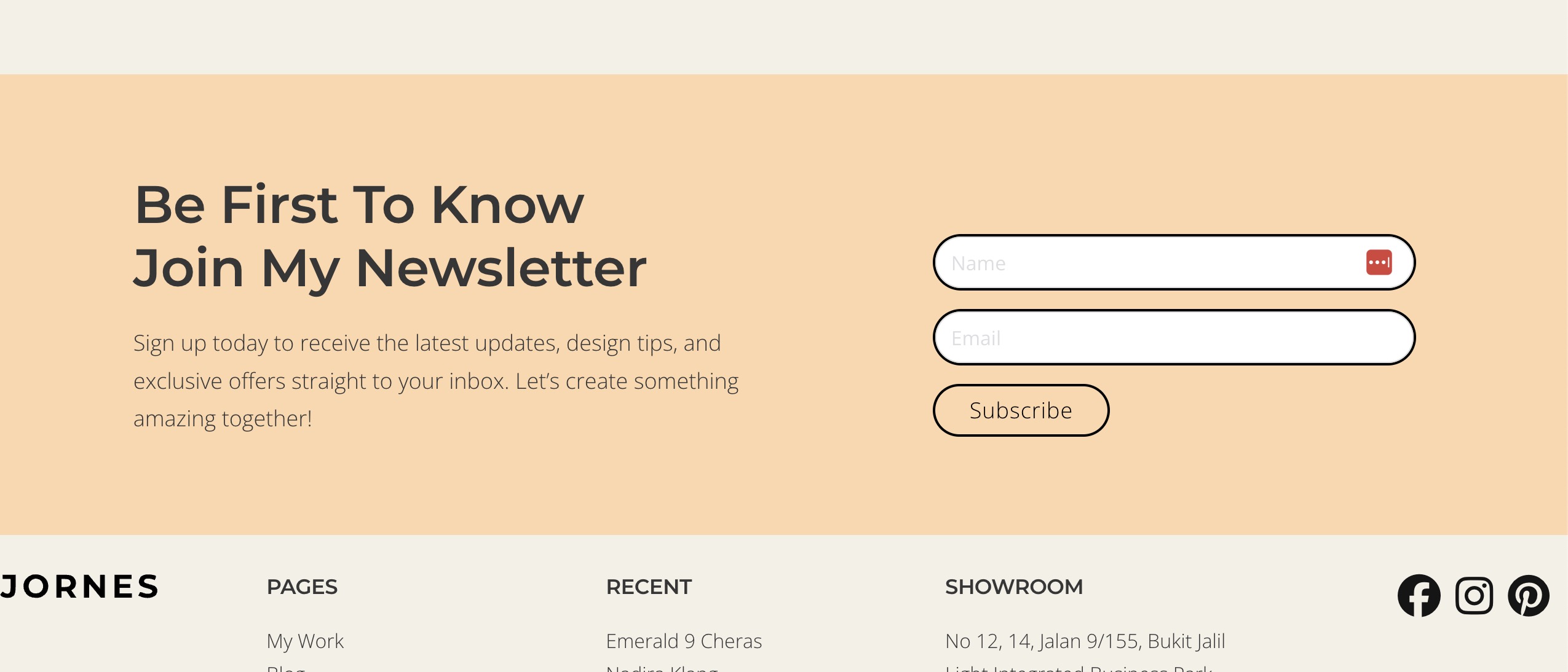
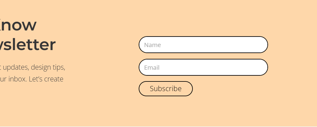
The only thing I can find to improve is the placeholder font color in the newsletter section. It could be quite hard for someone with eye problems to read. Maybe darken it by 50% or consider adding labels?
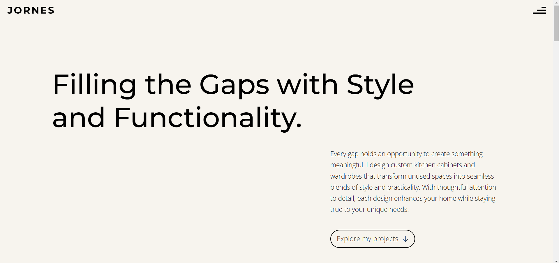
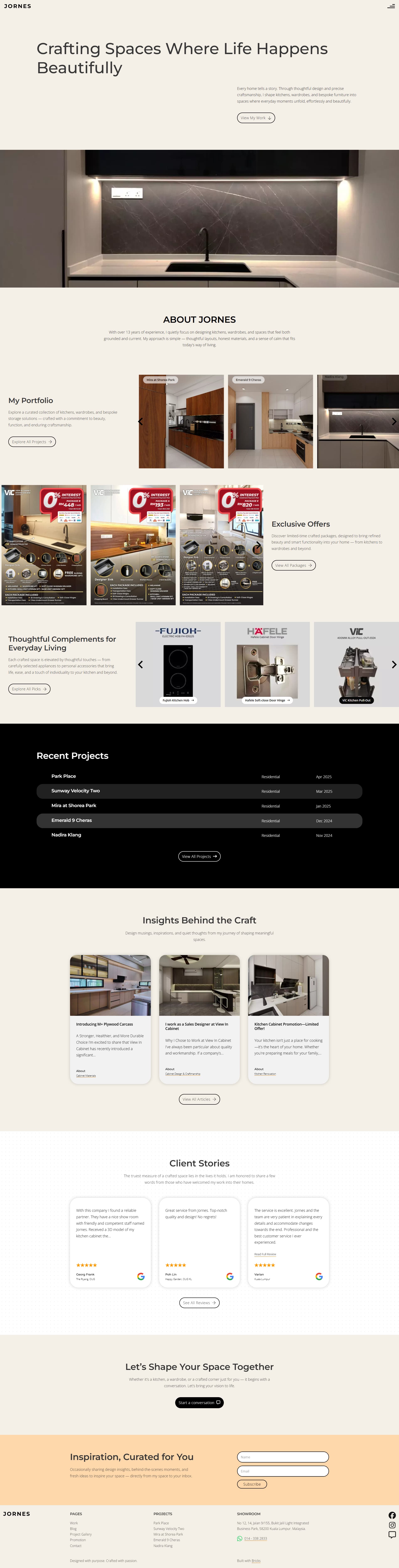
I think my favourite part is the grid layout I implemented on the site, the fonts(font family and the sizes) I use, and the custom-made hamburger icon I made. And also the projects display on this page (Works | Jornes).
I’m just curious, as a beginner, why you’re using the Yabe Webfont plugin for self-hosting your fonts. How is this different from using the built-in Bricks font upload?
I use Yabe Webfont because the plugin is very convenient. It allows me to select the font that I desire, next is to click import then the font will be bosted locally, that’s it. I don’t need to download the fonts from its source, and then upload them manually to make them hosted locally. Save the hassle. Hope it helps.
I’ve been using BricksForge on the first site I’m currently working on, which has a bulk font upload function. So I just use Google Webfonts Helper for a quick download, throw it in the BricksForge bulk upload and that’s it.