I’ve been reading through all your comments, and I think I can fill in a few knowledge gaps. It is relatively simple, but not if you miss a few things, and especially if you’re missing multiple things all at the same time, which from your comments i think you might be. Then it can all appear more difficult.
Let me first correct a few things that you said, so you have more understanding/context…
"setting the size - a dropdown gives you a set of hard coded dimensions - like a 100x100 woocommerce logo - These sizes are the images sizes coming from your WP install, not Bricks. The 100x100 is created by Woocommerce, the other sizes are the ones you can customise in the ‘media’ WP settings, thumbnail, medium, large etc. Whatever sizes you change these to, or add more, Bricks will show in the dropdown.
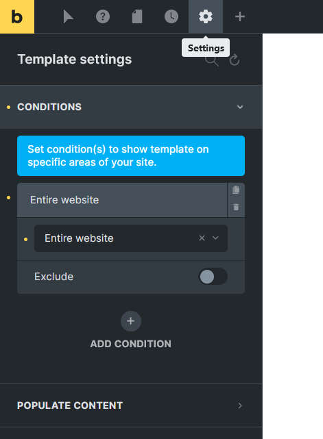
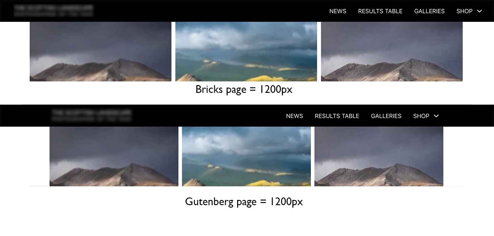
“In Bricks, the content container is wider and the Navbar is wider again” - I’m almost certain this is due to not setting the condition on the theme settings. You set the site width, container width etc inside the theme settings, but then need to actually apply those theme settings. Usually, you’d just set to ‘entire site’ unless it’s for specific pages only.
“…regarding the header template that Bricks inserts by default. It inserts a section with a nested container. If I remember correctly, this isn’t semantically correct for a nav element.” - This part isn’t true. by default the header template only outputs an empty ‘header’ tag, which is ideal. You can add any elements inside, it sounds like you added a ‘section’ element, which will always come with an inner container to contain the width, which is also correct (common way to do it). The section tag, as with any of the divs, block, can be changed to anything you want. Also, the inner container can be removed if you prefer. It’s a useful default as most people want the inner container within sections.
…adding a hover state to a text link for example. This is as basic as it gets and should be a 1-2 click operation. - It is a couple of clicks. changing the state to hover at the top in the builder, basically changes every style control into the hover state, so anything you change while that is active is being applied to the :hover version. This allows you to change a bunch of properties in one go, background color, text color, opacity, etc… then once you come out of that hover mode, everything then returns to styling the normal state. it’s the same for :focus styling, and any other puedo selector you need.
I’ll create a short screen recording in the next hour, showing creating a header, making it global. adding the global theme styles to get your width correct for all containers (and making sure to add the condition to make it apply site wide), and then adding the hover effect to both a button and menu links. This should address all the parts where I’ve think you’ve gone wrong so far from what you’ve written.
Recorded my screen - (hopefully 4mins of just watching somebody do it simplifies it more than the other videos you’ve watched)
https://support.bricksextras.com/recordings/zZdqDfttbin861Huh5FS
From there, any pages/templates you create will always fit the same container width, as long as you’re placing eveything inside sections. They’ll all use the same global header, unless you choose otherwise. You should be good to go.
What i missed in the video is that you’ll also need a default left/right padding on the section (not just top/bottom) in the theme settings to ensure the content doesn’t touch the sides on smaller device widths, but that’s the general gist of getting set up, the simplified version.