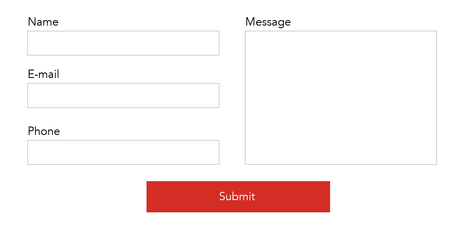
I’m looking for a way to divide the bricks contact form into 2 columns.
(example) left column: name, e-mail, phone / right column: message, submit button
Is there a way to do that with bricks native forms, or 3rd party plugin?
I’m looking for a way to divide the bricks contact form into 2 columns.
(example) left column: name, e-mail, phone / right column: message, submit button
Is there a way to do that with bricks native forms, or 3rd party plugin?
I think that the bricks fields have an option for width from what I can remember, just set the width to 50% or 49%
I’ve done the same thing here: B2B - Kokopelli
Thanks for the reply.
I tried your method, but it doesn’t quite accomplish what I want.
I’m trying to make something like this
Pro Forms
Thanks for the suggestion.
I’ll check it out.
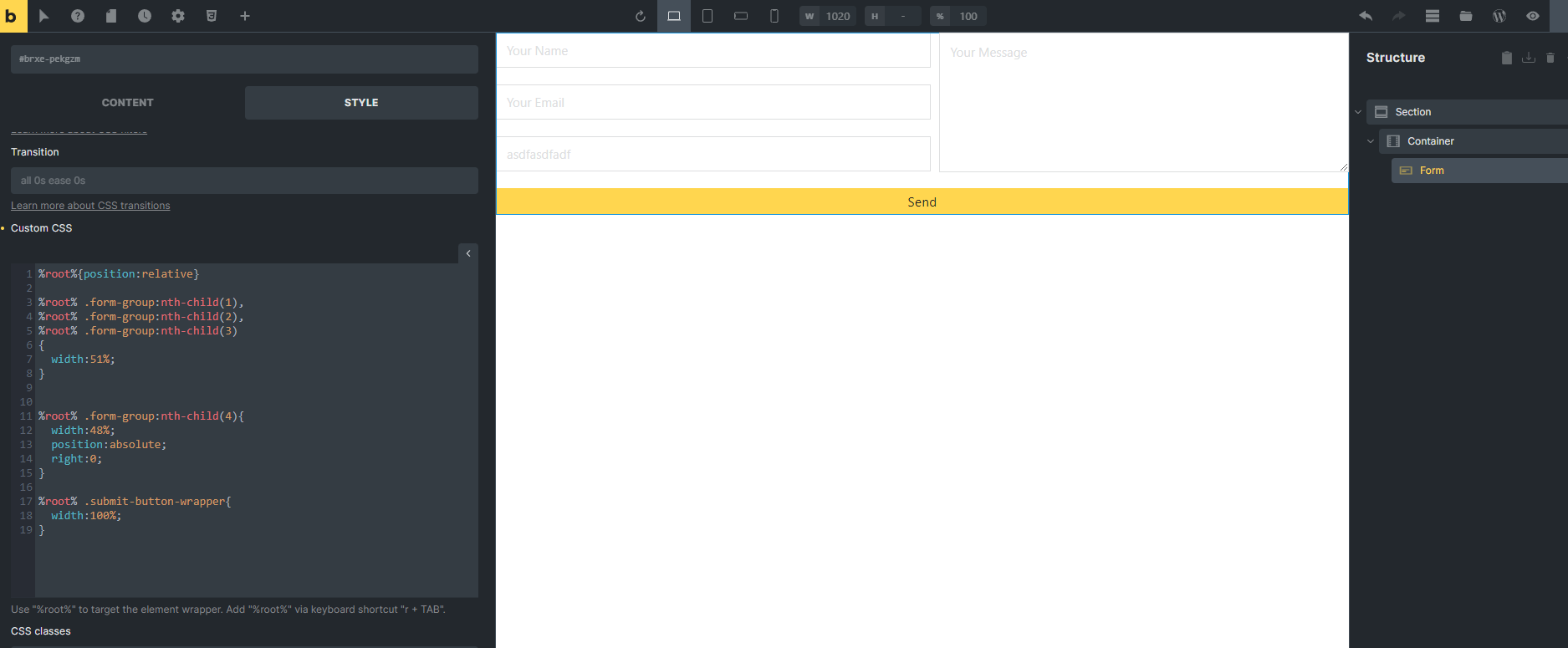
here its easy
here is the section copy/paste to editor 
{"content":[{"id":"vfduyf","name":"section","parent":0,"children":["wciscm"],"settings":{}},{"id":"wciscm","name":"container","parent":"vfduyf","children":["pekgzm"],"settings":[]},{"id":"pekgzm","name":"form","parent":"wciscm","children":[],"settings":{"fields":[{"type":"text","label":"Name","placeholder":"Your Name","id":"a11a0d"},{"type":"email","label":"Email","placeholder":"Your Email","required":true,"id":"3ea03d"},{"type":"text","label":"asdfasdfadf","placeholder":"asdfasdfadf","required":true,"id":"qtogoz"},{"type":"textarea","label":"Message","placeholder":"Your Message","required":true,"id":"1deee5","height":"187"}],"submitButtonStyle":"primary","actions":["email"],"successMessage":"Message successfully sent. We will get back to you as soon as possible.","emailSubject":"Contact form request","emailTo":"admin_email","fromName":"Dev","emailErrorMessage":"Submission failed. Please reload the page and try to submit the form again.","htmlEmail":true,"mailchimpPendingMessage":"Please check your email to confirm your subscription.","mailchimpErrorMessage":"Sorry, but we could not subscribe you.","sendgridErrorMessage":"Sorry, but we could not subscribe you.","_cssCustom":"#brxe-pekgzm{position:relative}\n\n#brxe-pekgzm .form-group:nth-child(1),\n#brxe-pekgzm .form-group:nth-child(2),\n#brxe-pekgzm .form-group:nth-child(3)\n{\n width:51%; \n}\n\n\n#brxe-pekgzm .form-group:nth-child(4){\n width:48%;\n position:absolute;\n right:0;\n}\n\n#brxe-pekgzm .submit-button-wrapper{\n width:100%;\n}"},"themeStyles":[]}],"source":"bricksCopiedElements","sourceUrl":"https://dev.sinanisler.com","version":"1.9.5","globalClasses":[],"globalElements":[]}
there is 3 text field here so that’s why there is 3 line on CSS for that increase or decrease as you need it and put the textarea on last always. and ofcourse if change the total fields change the textarea number too it is 4 right now. learn it. I kept the css very simple for you.
Thank you. It worked!
I have a question, if you have the time.
Is there a way to increase the gap between the two columns?
If I decrease the width from 51% it seems to break the layout.
that happens because I am moving the form group not the inputs. and hat not the input sizes it is the group sizes.
anyway here I made sizes on input not the groups this is better probably more control;
%root%{position:relative}


%root% .form-group:nth-child(1) input,
%root% .form-group:nth-child(2) input,
%root% .form-group:nth-child(3) input
{
width:50%
}


%root% .form-group:nth-child(4){
  width:48%;
  position:absolute;
  right:0;
}

%root% .submit-button-wrapper{
  width:100%;
}
This worked perfectly!
exactly what I was looking for.
Thank you very much.
Fantastic!
Is there a way to put this into a grid or column though as it becomes tricky if multiple items in the right side or when you start getting into different break points.
Thanks
what you ask not that easy
btu you can do this on the example I am giving 50% to all 3 input but you ca nselect as many input as you like and give whatever value you want. just separate them and do this;
%root% .form-group:nth-child(1) input{    width:30%    }
%root% .form-group:nth-child(2) input{    width:70%    }

%root% .form-group:nth-child(3) input{    width:50%    }
%root% .form-group:nth-child(4) input{    width:50%    }

%root% .form-group:nth-child(5) input{    width:40%    }
%root% .form-group:nth-child(6) input{    width:80%    }
Thank you. That makes sense.
Its the 51% vs 48% thing which i want to avoid though as its not center.
Also, is there a way to position the submit button along with the last child as its normal size (not full width)
this loads 500kb of stuff for a basic contact form