Maybe this only happens to me, but I think it could be a little UX improvement.
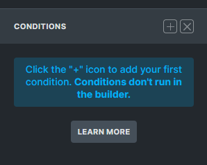
Right now in Interactions / Conditions panel the Learn more button stands out a little more than the plus sign, wich is the main interaction we use there.

Sometimes when I work fast I open the panel and instinctively click in the big prominent button expecting to create new interaction / condition, but its the Learn more button ![]() . Seems like nothing but it happend to me like 20-30 times since I use Bricks.
. Seems like nothing but it happend to me like 20-30 times since I use Bricks.
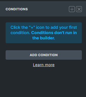
Something like this could work better:
