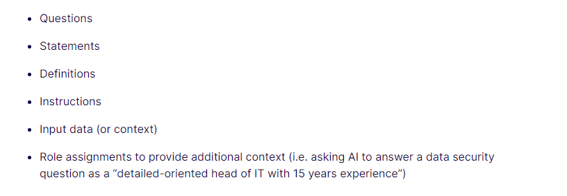
I would like to suggest an improvement for the List Element in Bricks Builder. Currently, when a List Item goes over 2 rows, the icon is centered between both rows, which can look awkward.
When I choose the “start” alignment option, it still doesn’t look right.
I suggest adding an option for the icon to be centered only in the first row, instead of both rows. This would make the List Element look more balanced and visually pleasing. This is how it should look like:
I hope this feature request can be considered, as it would greatly improve the design possibilities with the List Element in Bricks Builder. Thank you for your consideration.
Please note that this feature request has been submitted to the official Idea Board at Ideas – Bricks and can be upvoted and commented on there. Requests with the most upvotes will receive development priority. Thank you.