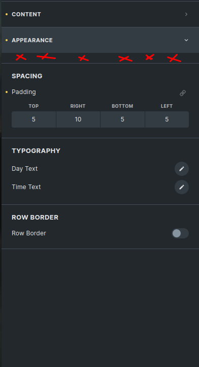
I think this area here is really unnecessary.
Note: This is for first separator only within a group. Because of the top border of the separator control, it looks a bit ugly to have space above it in the group. Maybe even the separator top border can be disabled in this exact case, besides the space.