Zion wouldn’t work for me because of the small area for variables and it could be too confusing for beginners. We have to remember that Bricks is positioned between Oxygen and Elementor so whatever the design it has to be simple to use for those new to website building but also capable of supporting experienced developers.
The vertical approach mocked up by grafikundso meets all needs (and I agree there is no need for right, left etc., icons are fine) . As DeanPhillips stated this would introduce a longer edit panel so what about being able to toggle between padding and margin?
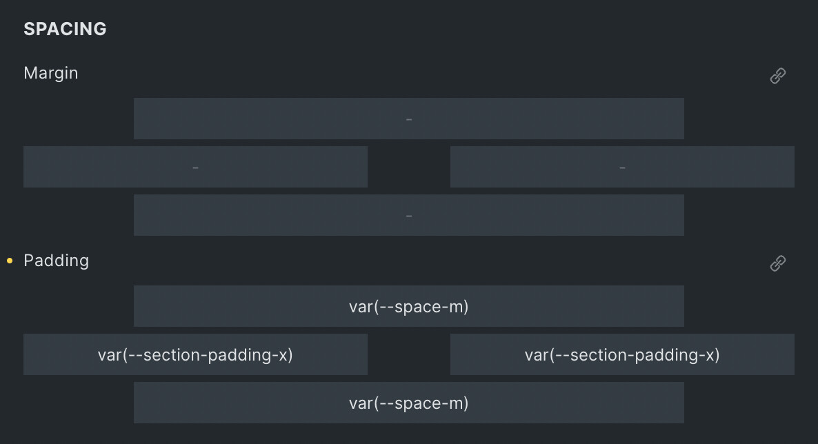
Default Zion UI
Add option in Setting. To toggle Vertical UI like Microthemer
if we really get zion option i will lose every faith in any serious dev. but we will see. 
Suggest a minor change to 1.5.1: repurpose the space in the middle of the margin control box. Just add 1/2 of the space to each of the left and right margin areas to support variable names. Add an icon next to the link icon (either ? or i) to show dropdown list of units.
1 Like
Feeling a little dramatic? 
I like this approach. You could potential hide the single variations if linked is active but might not be intuitive.
1 Like
Wow. This thread is the longest I’ve seen so far around here
This is good.
Anyway, I just wanted to say that I’ve played today with the new interface, and it seems to be ok. I got used to it fairly quickly.
Some feedback in this thread is also good, so there might be room for improvement.
4 Likes
I also think removing the unit was not an advantage in any way. Those that don’t need them that’s fine, but it acts as a prompt sometimes
2 Likes
Here’s my two cents: How about a compromise?
It’s not as pretty as the whole frame design with chamfered corners, but at least it has more room and still maintains the same functionality while also being more easy to visualize…
Just a thought…
10 Likes
@zeinnicholas I think that’s actually the best solution tbh.
If the unit dropdown is completely removed in v1.5.1, I’ll be using something like this…
I don’t think the controls need to be any more visual than that.
4 Likes
2 Likes
I really like that a lot. Best of all worlds.
You have space for CSS variables, and you still have the units.
1 Like
I think, actually the optimum would be exactly that (with the unit dropdowns there) but if you start typing var or calc, then it removes the unit automatically . Likewise, if you typed 10em, it detects the em and also removes the added unit.
Otherwise it’s always extra work using the dropdown if you’re quicker at typing. For me, typing 10rem is much quicker than typing 10 and then having to navigate the dropdown. But for others it’s different.
3 Likes
Oh yeah, no question, you should be able to type the units.
I’m just saying that the units should be there as a visual reminder for those that need them.
1 Like
I think after such a large response, I wouldn’t be surprised if the unit dropdown was made optional from the settings. Could be wrong though.
1 Like
I like this version but increased the height of inputs to be the same as the rest of Bricks inputs.
One thing to consider is increasing the width of number control for this to 100%, so when you stretch the Bricks left panel the input fields maximise the full width.
[data-control=spacing][data-type=spacing] [data-control="number"] {
    width: 100%;
}
Share the whole CSS when you have it, we can just keep improving on it. Crowdsource UI design 
3 Likes
[data-control=spacing][data-type=spacing] {
    height: 100px;
}
[data-control=spacing][data-type=spacing] .handle:before {
    display: none;
}

[data-control=spacing][data-type=spacing] .handle {
    background-color: var(--builder-bg-2);
    height: 30px;
}

[data-control=spacing][data-type=spacing] .handle.top ,
[data-control=spacing][data-type=spacing] .handle.bottom {
    margin: 0 20px
}

[data-control=spacing][data-type=spacing] .handle.left ,
[data-control=spacing][data-type=spacing] .handle.right {
    width: calc(50% - 30px);
    top: 35px
}

[data-control=spacing][data-type=spacing] [data-control="number"] {
    width: 100%;
}

[data-control=spacing][data-type=spacing] .label {
    position: absolute;
    top: -27px;
}
Nice. There’s just one tiny issue with the width when you make the control sidebar very small. Adding left and right of around 18% on the top and bottom handle solves it (rather than the current fixed 60px)