i am not sure if this guessing game for units is a good approach. feels like its some kind of a try to make the “var” users a special gift. but noone else get any benefit out of this.
3 Likes
There’s an elegant way to solve the design and usability problems for both types of users (pro and beginner) without being excessively biased towards one or the other (or shaming one or the other for their needs). It will just require some more research and development time. I’m sure the team will get there.
I have read most of the comments. I’m in favour of not bringing the units back. It’s not like there are so many that you can’t remember them. I look at it from the workflow and there it’s much faster to type e.g. 10rem, 10px, 5em, 15px (to fill all 4 fields - just as an example, not practical) than “10” and then still have to press at least Tab or even click with the mouse to determine the unit. This is very annoying, I think. So from my point of view it is best to leave it like this.
3 Likes
I can see that perspective as well.
Maybe they could have a tooltip “i” that triggers a small popup with all the possible units (as a visual reminder of what can be used).
That way it’s 100% optional and doesn’t get in the way of serious/experienced/pro users.
Best of all worlds. ![]()
4 Likes
For converting units, as I mentioned here - Loom | Free Screen & Video Recording Software | Loom having the units would be a huge help. I use this feature daily in Microthemer and hopefully something similar will come to Bricks one day ![]()
2 Likes
I still think what Zion did would work here. It covers most of the comments mentioned above:
The only thing that could do with improving would be using the middle as a way to display different info than margin-bottom, padding left etc. Maybe the full property name?
5 Likes
But how does this approach solve the problem of scanability when using CSS variables?
We need to be able to open up a page and clearly see what variables have been set for padding/margin, on all sides, at a glance.
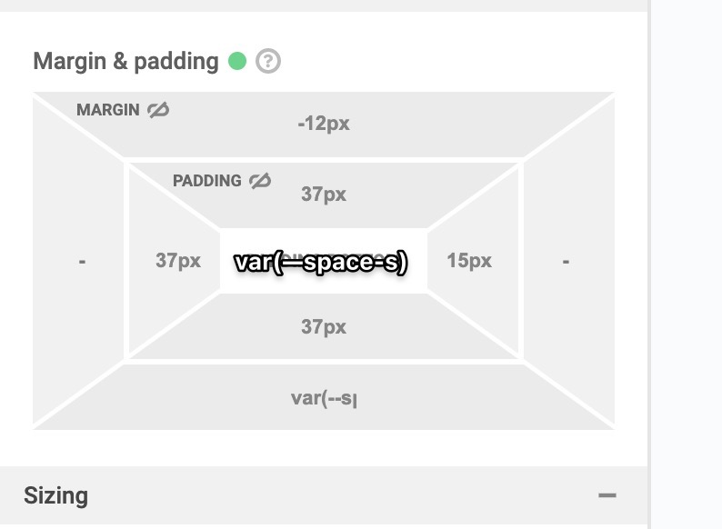
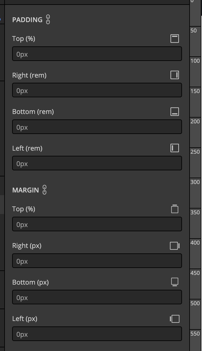
The current implementation of 1.5.1 RC is close, but the right/left sides need a little more room.
We also need to avoid excessive clicks, or the cramming of data fields (which requires hyper-precise clicking, which is annoying).
That said… I do think there is a lot to learn from what both Zion and Webflow have done… but neither have CSS variables or calc() functions in mind.
And for the record, I personally only care about CSS variables, but I sympathize with those who might be trying to use calc() functions as well.
@Deanphillips Too many excess clicks.
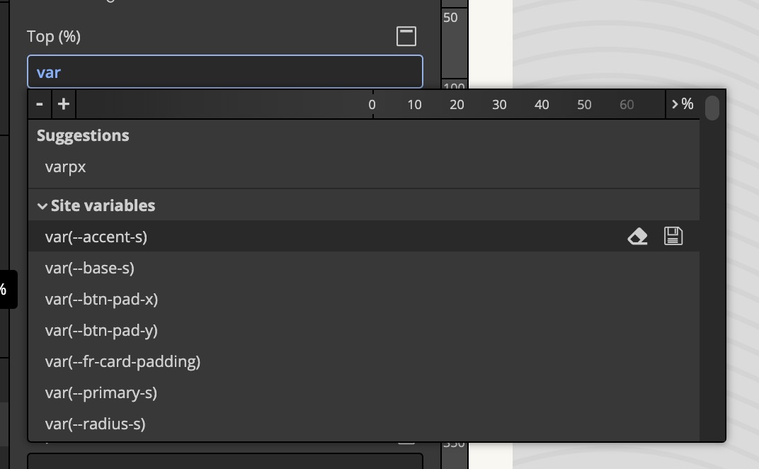
I think Thomas have something in his mind for sure. This changes are related to an upcoming feature. Set preferred unit. I think we will soon see a global option in theme styles + individual control per property in the theme style.
1 Like
In the previous version(also from the very first version), you don’t need to press TAB(or click the mouse) to determine the unit. You can directly type the unit in the field. For example, if you type 13px(your current unit is %). When you press enter after inserting 13px, the unit in % will automatically change to PX accordingly. No need to press TAB nor Click the Mouse. As I said, the Bricks unit is intelligent.
1 Like
I think Zion builder has nice UI.
Just display full property (10px ) in middle area not margin-bottom, padding left etc info as @Deanphillips mentioned.
No builder can happy 100% users.
Var and calc people are 5%. If they can type that long variable and calc function. Then why they can’t do one extra click.
No body check their padding and margin every day. User guess small and large padding and margin from canvas or frontend. Not from layout (spacing) tab.
And for some semantic variables and calc function the previous 1.4 and the current layout of 1.5.1 is also small.
I think to make (var and calc users) happy. Share code on bricks academy website. That code will give them some extra room.
1 Like
I think a proper solution is user defined layout even if that increases maintenance. Give 2-3 options to choose from.
1 Like
wow, this is worst UX possible.
1 Like
Even the old way didn’t allow seeing variables easily. I also don’t see a way to make them easy to scan with this style of layout neither?
The easiest way to see them is to just have them written out in the custom css section? Personally, I’d love the ability to write in both the GUI and Custom CSS and it reflects the changes in both area.
As someone who always has feedback on UX, what do you suggest they do? ![]()
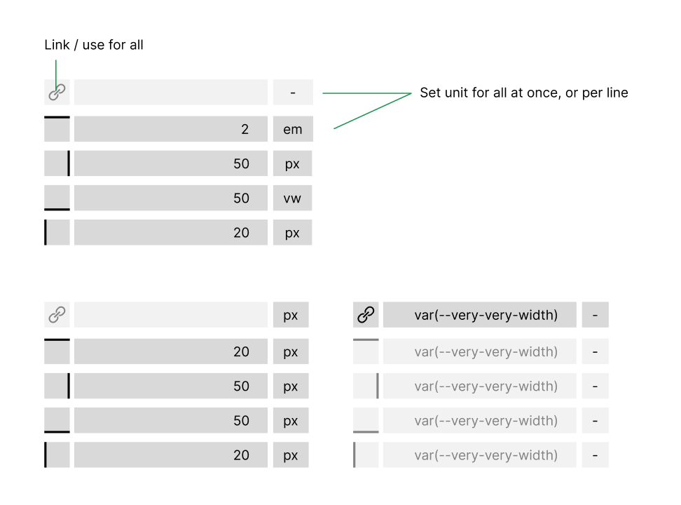
no real approach. but just an input. keep it split in 2 sections and when var is that important make it all in direction of var, without the cost of UX / UI problems. cause its ~90% impossible to solve the var problem with webflow kind of element. so for me some kind of vertical solution may be an option, splitted in 2 sections for padding / margin. with option to set units for all at once, or per side.
but again this is just an input…
8 Likes
I don’t have them all in my head.
And even if I do, just because I know them doesn’t mean the builder supports them.
2 Likes
I like the solution too. The 3 points as a unit menu can perhaps be questioned, but otherwise it actually picks up everyone. You have to click once anyway.
Looks in the dark theme also chic even if it has a little bit to less contrast.
Yeah, that vertical approach was my other thought too. I don’t love it because it’s so long, but it is the cleanest for variables.
Similar to Microthemer
1 Like
If you fit the labels in the input as prefix (visually divided of course) you’ll able to save a lot of height.
1 Like
yeah, if you just add infos on side you save 50% of vertical hight in your image. thats what i tried to solve with my approach. but again - its just a very fast draft / idea - and for me personal nearly the only way to go.
and i think it don’t need a “left, right,…” texst anywhere. this can be solved visual (like most are used from borders). an EM/VW/VH unit you cant solve visual.
1 Like