Hello beautiful people! 
I am coming from Oxygen and I don’t understand the breakpoints in Bricks, I hope someone can help me.
On Oxygen I have one for “Full screen” another for “Page container”, “less than 992”, “less than 768” and finally “less than 480” (meaning that I have four breakpoints).
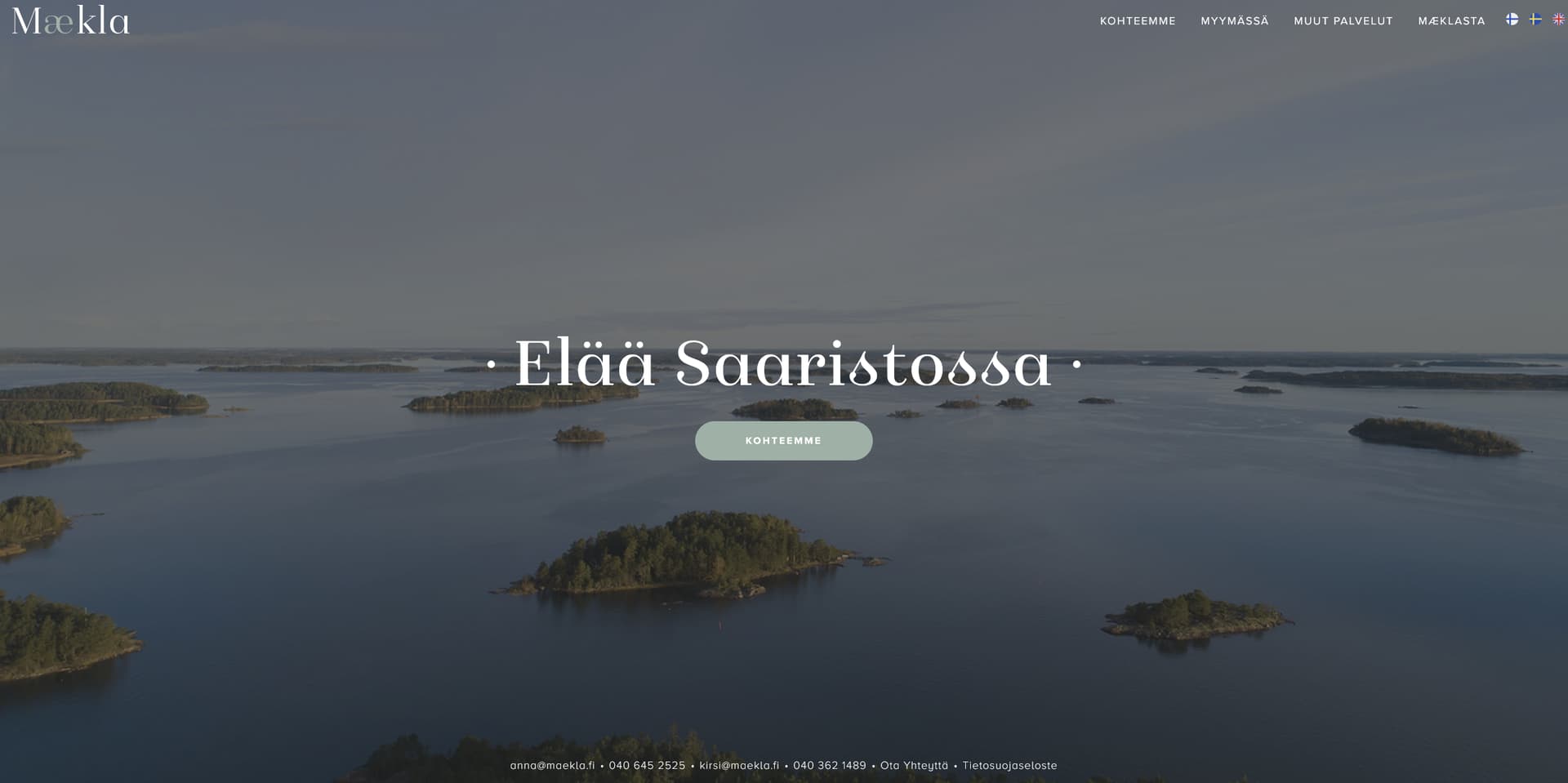
On Bricks I am missing one, the “Page container one” (in this case the container is set to 1366px) so I only have three breakpoints. This means that from Desktop to 991 I can’t do any adaptation, so the webpage I am building breaks on Tablet landscape, and I don’t have any way to fix it.
How do I adapt the site to the container width 1366px?
I have read the article about Responsive edit on Bricks builder academy.
-
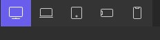
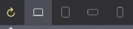
Breakpoints on Oxygen
-
Breakpoints on Bricks
-
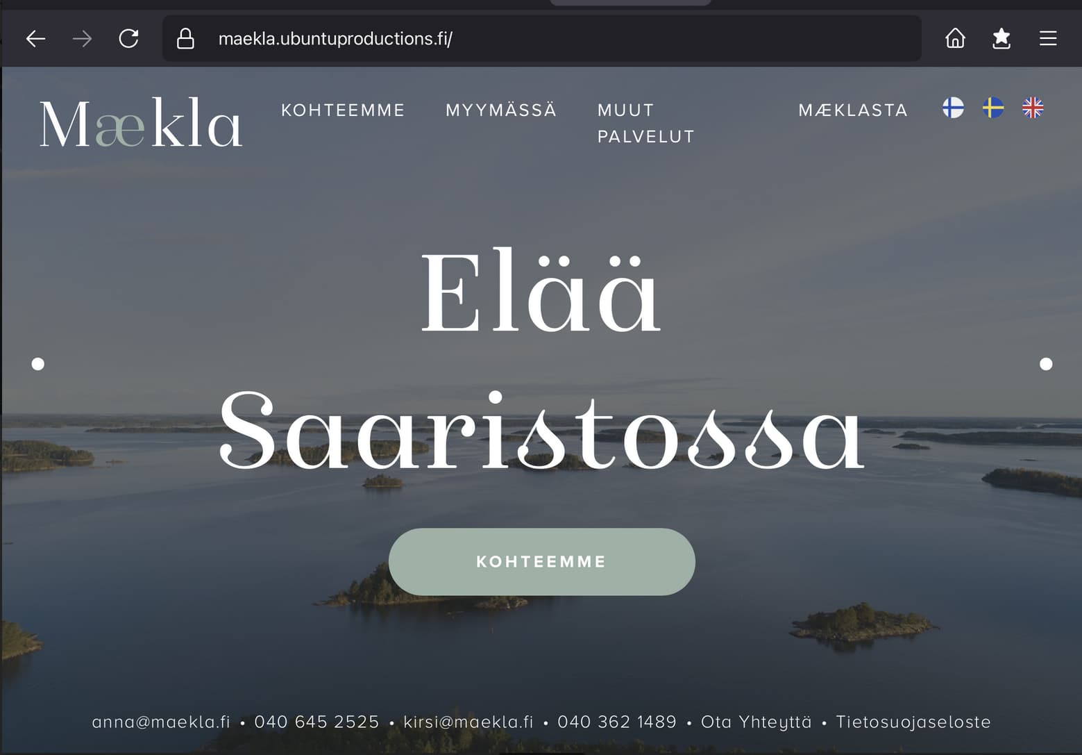
Tablet portrait with broken layout I can’t fix
Love!
 I was using the wrong approach.
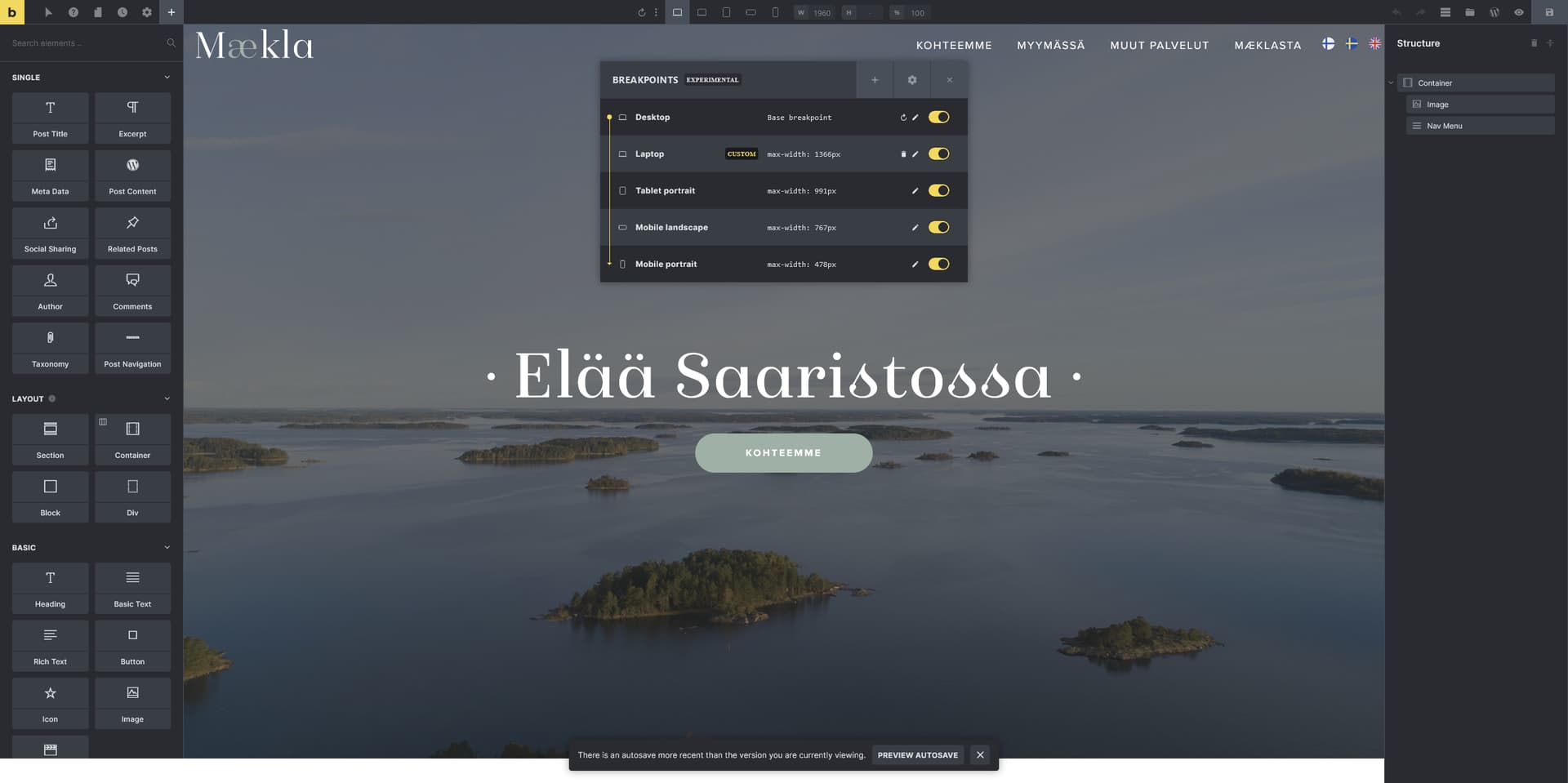
 that middle container width breakpoint is super helpful to target smaller laptops zoomed 150% and also tabled Landscape.