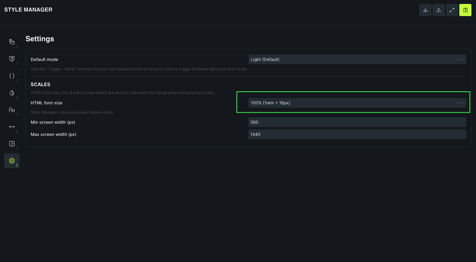
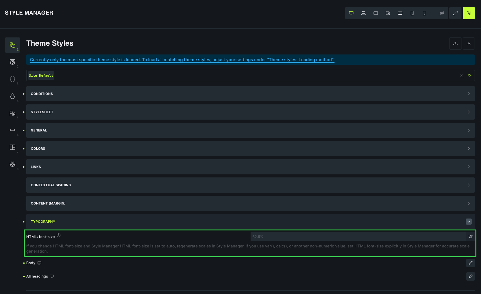
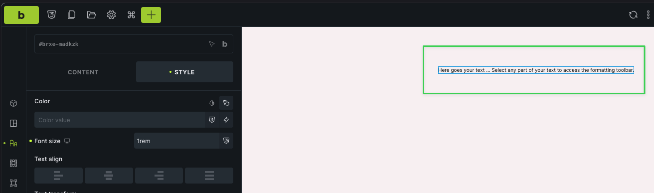
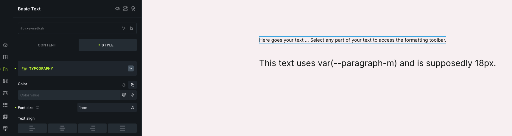
If I go back to Theme Styles → Typography and explicitly set the HTML font-size to 100%, then 1rem correctly becomes 16px, but my entire typography/spacing scales suddenly become much larger.
How are these two HTML font-size settings supposed to work together? Is there a way to have:
Style Manager/scales calculated using 100% / 16px
1rem in the builder actually equal 16px
without causing all of my existing typography and spacing scales to become oversized?
It feels like Style Manager is calculating the scales with a 16px root while the actual site/builder is still using a 10px root. Am I misunderstanding how these settings are intended to sync?
The Style Manager setting and the Theme Styles HTML font-size setting affect different parts of the workflow.
Style Manager’s HTML font-size is used as the calculation base for generated typography/spacing scales. Theme Styles > Typography > HTML font-size is the value that actually gets output as CSS on the site/builder canvas.
So if Theme Styles outputs html { font-size: 62.5%; }, then 1rem equals 10px in the browser. Setting Style Manager to 100% does not override that CSS root value by itself. To make 1rem equal 16px, the actual HTML font-size output by Theme Styles also has to be 100%.
The scale jump you are seeing is expected if your existing typography/spacing values were originally built against a 62.5% root. Changing the real root from 62.5% to 100% changes every rem-based value across the site.
In practice, choose one root strategy and keep both settings aligned:
Use 62.5% if the site was built around the 10px-style rem workflow.
Use 100% if you want standard browser rem behavior where 1rem is 16px.
There is no CSS-safe way for 1rem to equal 16px while the actual html font-size remains 62.5%. If you switch an existing site from 62.5% to 100%, the existing scale values need to be adjusted/regenerated to match the new base.