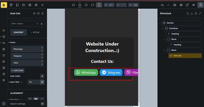
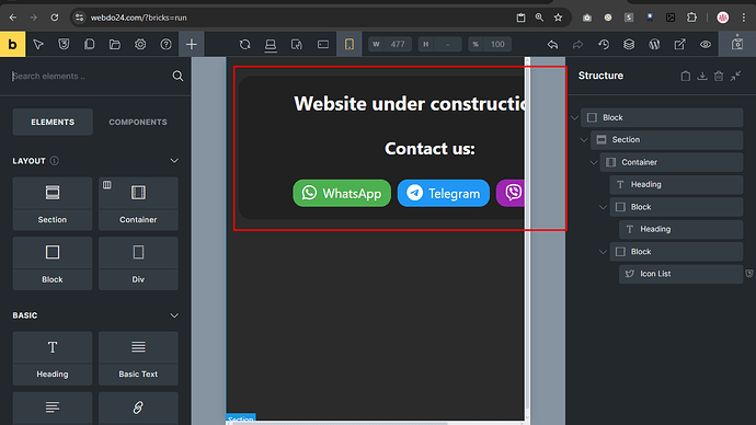
I don’t find the option to wrap the icon list when it is mobile device.
Right click the element in the structure tab. There should be an option to wrap the element inside block, container or DIV
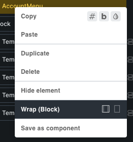
It will probably wrap it for all devices.
I have applied it, but not solved.
add:
flex-wrap:wrap;
to the css of the ul element
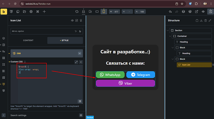
try %root% {flex-wrap:wrap;} on the element css
or add it by class
see image
maybe %root% ul {flex-wrap:flex;}
try the browser inspect tool to find the right selector by adding it to it
Your section being wrapped inside a block is not a best practice method.
Are there any constrains on the icon list parents block limiting its size, preventing it to wrap?
Does it also do this on the real page?
Is the css still attached to the icon list?
Custom css solved the problem.
Please suggest me the best practice for nesting elements.
Start with a section as it takes full width, then a container or block element inside the section.
A DIV will always take the minimum space it needs. So its stops right after the end of lets say your text.
I always do: section, container, block
Thank you very much ![]() .
.
every element in bricks has display controls including icon list element
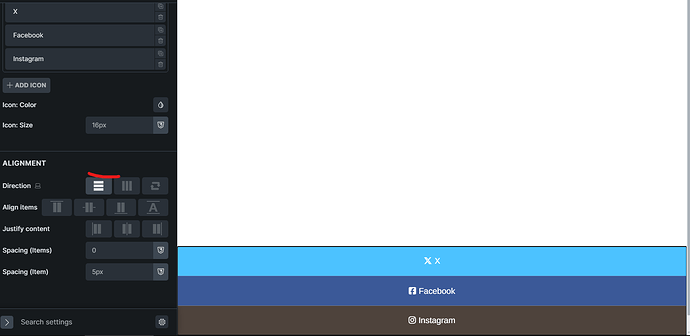
on mobile break point just select vertical
yes wrap doesnt exist here but if the buttons are big and wide stacking them under each other way to go thats how I do it usualy
Thank you. I applied it but not works. So, I have solved it by custom css.
