Hello all,
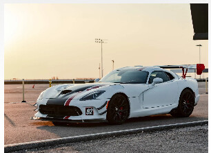
I’ve struggled getting photos to look quite right on my website for a bit but I’ve made some progress. I’ve tried to follow the forums recommendations and I’m using EWWW and have implemented the custom image sizes from here.
Everything on my website has gone through EWWW. If I select “Original-1920px” for the resolution it looks great on desktop and tablet, but for mobile it’s obvious it’s been shrunk and is overly sharp.

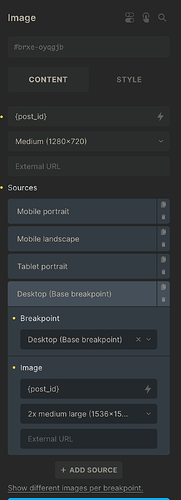
My solution was just “oh I’ll set the ‘image size’ setting to ‘original-960px’ and it will apply just for mobile like all the other bricks settings” but that is not the case. Even if I click on mobile and set it in the builder it applies to all the breakpoints.
I’m still learning web development but my understanding is that with srcset you can define what resolution an image will be served at based on various screen size breakpoints. Since I am defining what size the image is in the builder, where do I go to define what size the image should be served at when on mobile?
Thank you for your time,
Levi

