I want to make small Zigzag as shape divider.
I set the width 479px.
But the problem is I see on option to repeat-x the shape divider.
I try to find ways through CSS but have no idea since it is HTML SVG and not regular background.
I want to make small Zigzag as shape divider.
I set the width 479px.
But the problem is I see on option to repeat-x the shape divider.
I try to find ways through CSS but have no idea since it is HTML SVG and not regular background.
Hi Brandon,
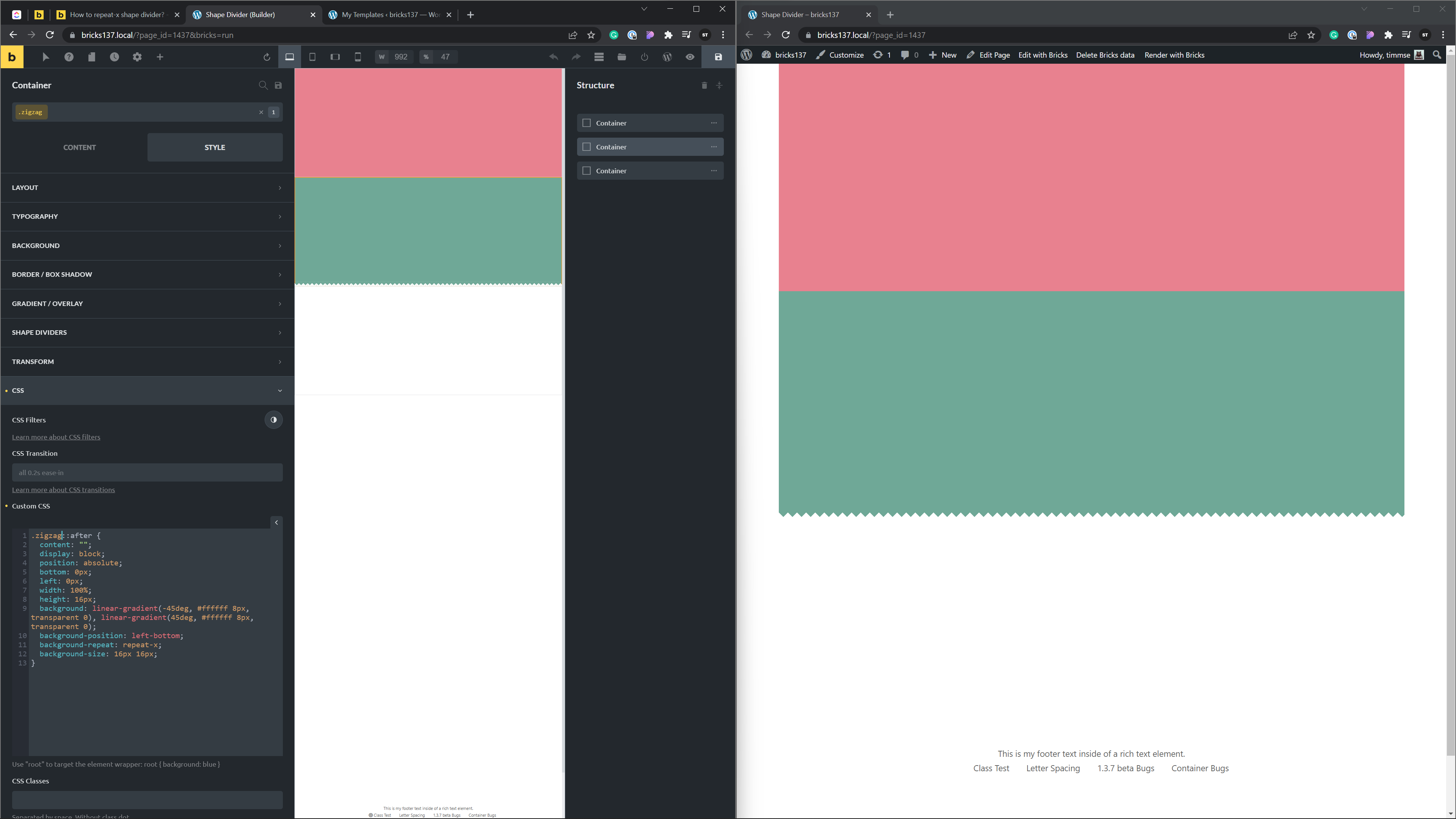
right, the shape dividers aren’t simple background images, they are html elements by itself. That’s why you can’t repeat them infinitely, as you can with background-repeat, for example.
But can use use linear gradients to create the zigzag effect pretty easily without the need for an image or svg. Create a class like .zigzag, go to CSS and paste the following custom CSS:
.zigzag::after {
  content: "";
  position: absolute;
  bottom: 0;
  left: 0;
  width: 100%;
  height: 16px;
  background:
    linear-gradient(-45deg, #ffffff 8px, transparent 0),
    linear-gradient(45deg, #ffffff 8px, transparent 0);
  background-position: left-bottom;
  background-repeat: repeat-x;
  background-size: 16px 16px;
}
Change the color to your needs and play around with the height, the px values inside of the gradients, and the background size. As you might notice, the height is always equal to the background-size and the gradient values are always the height or background-size value divided by 2.
Looks a bit odd on the canvas, but great on the frontend!
You can create stunning patterns with gradients as well. Check out the CSS3 patterns gallery.
Best regards,
timmse
Great thanks a lot for your feedback.