I know this falls more into the category of a feature request but is there a work around for this. On desktop, I want to show 8 posts but on mobile I only want 4. Can someone please guide me how can I tackle this?
Create a loop for desktop and another loop for mobile. And use css display none on the various breapoints.
No brainer but not so neat that way. I was thinking more like maybe a snippet that could change the value on the basis of the breakpoint.
3 Likes
Yup definitely agree that this should not be the way to go about it. Hoping for this nice little feature in the future 
Hey guys,
although I personally would just fetch the larger number of posts and hide some of them if needed on smaller screens you could use Bricks’ bricks/posts/query_vars hook in combination with WordPress’ wp_is_mobile function.
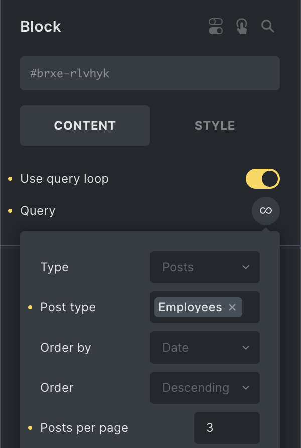
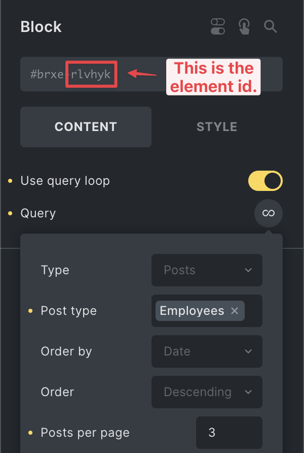
In my example I set the query loop to fetch 3 posts per page by default:
Using the hook I set the loop to only fetch 2 posts per page on mobile devices:
add_filter( 'bricks/posts/query_vars', function( $query_vars, $settings, $element_id ) {
    if ( $element_id === 'rlvhyk' && wp_is_mobile() ) {
        $query_vars['posts_per_page'] = 2;
    }

    return $query_vars;
}, 10, 3 );
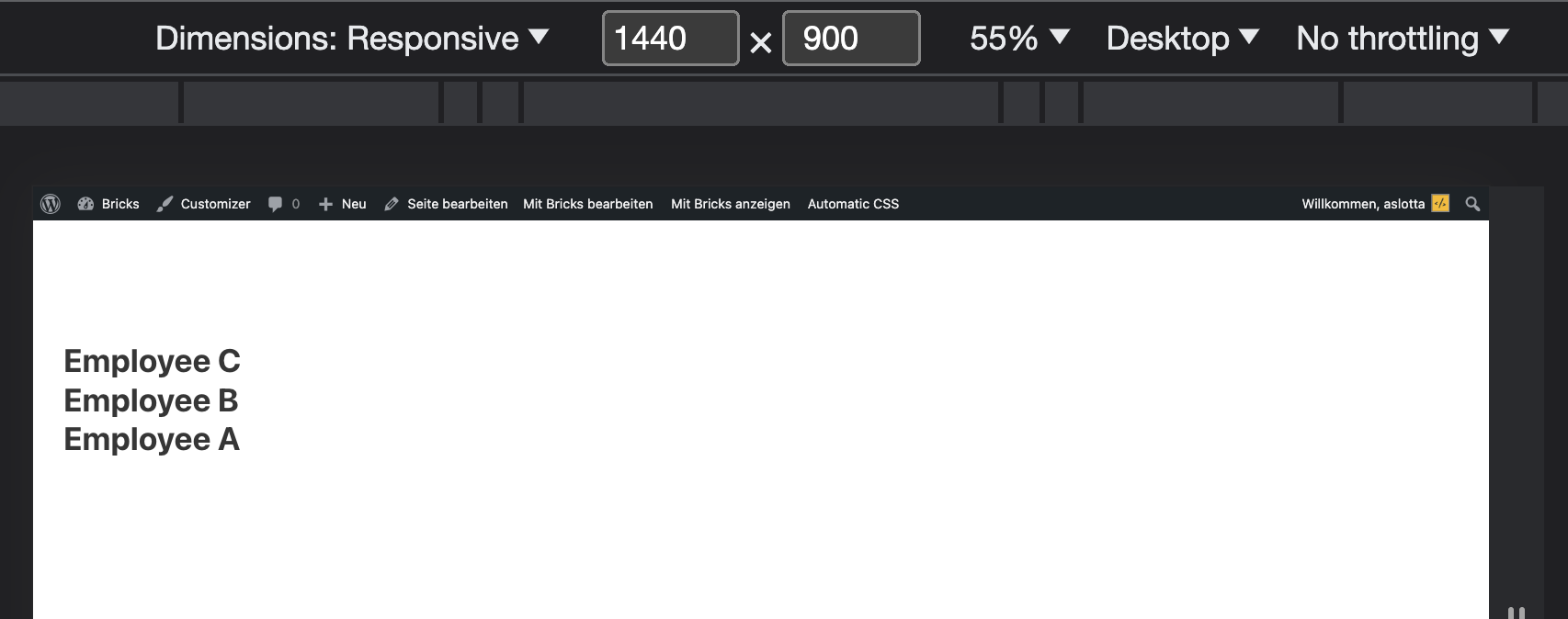
Frontend (Desktop):
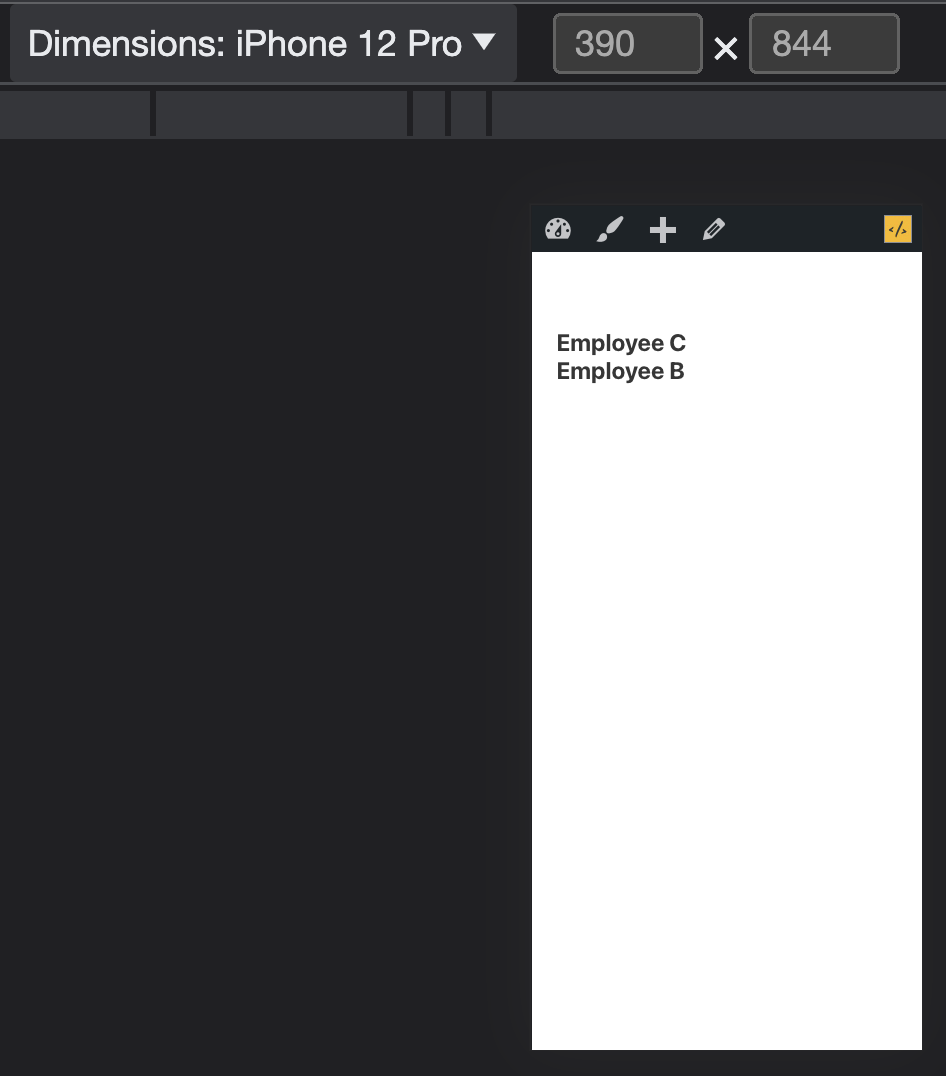
Frontend (Mobile):
Let me know if that helps.
Best,
André
8 Likes
It is quite amazing, how powerful this filter / hook is.
Cheers
Patric
can you please tell me how to implement this hook?
Hey Pawan,
the code I posted in my previous reply is all it takes. You can add the code to your functions.php (if using a child theme) or to a code snippet plugin of your choice.
Make sure to change the $element_id to the element id you’re using the query loop on.
Best,
André
2 Likes
Hi Andrè…. Just wonder if there is the possibility to set the number of the post displayed in the query according with your breakpoints instead just the generic “mobile”. I mean 8 post on base breakpoint, 4 in tablet portrait and 10 in mobile portrait… do you think this is possible? Thanks in advance 
It wouldn’t be possible to do that because breakpoints are a client-side concern whereas fetching content is server-side. The server-side code does not know which breakpoint you are at.
Worth mentioning also that if you are using a full page caching solution, the server-side mobile detection (which uses the browser’s user agent string) will not work properly.
Generally the way to achieve this is fetch the maximum number of items and show/hide them in CSS depending on breakpoints.