how to improve my custom css?
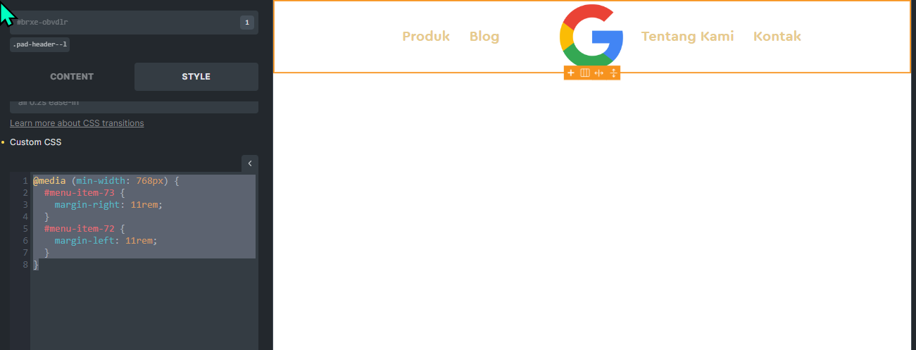
what we look blog position to much to the left
nb:
sorry if my english is bad, i hope anyone can understand what i mean
how to improve my custom css?
what we look blog position to much to the left
nb:
sorry if my english is bad, i hope anyone can understand what i mean
Not 100% sure but maybe you can margin-left and margin-right: auto or maybe put insidenthe section 3 columns, left and right side menu items and the middle column for the logo.
It seems that the great @Sridhar was listenning ![]()
Please find below a tutorial (published today) to achieve your goal.
Be careful, the tutorial is only accessible for pro members.
Have a great day,
Thomas
Maybe something like this can give you an idea:
(1686) How to Create a Dynamic Centered Logo Menu in Bricks (w/ SCSS) - YouTube
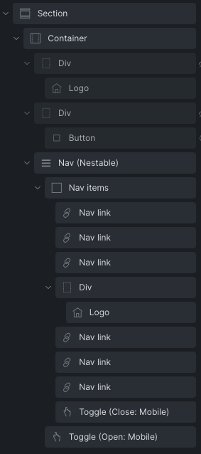
I figured out a clean & easy way to do this while making it look sharp on mobile as well. Let me know if you can follow the screenshot. I put the “mobile” logo in its own div and set its display to ‘none’ on desktop and tablet. Then, in the nested menu, I put another logo in its own div and set display to ‘none’ on mobile. (this screenshot also features a cta button on mobile).