Hi! Newbie here.
I would like blocks to “flow” or “wrap” horizontally, so they naturally break into rows, depending on the width of the blocks.
Please see short video showing my attempt: Bricks Builder > Making rows flow
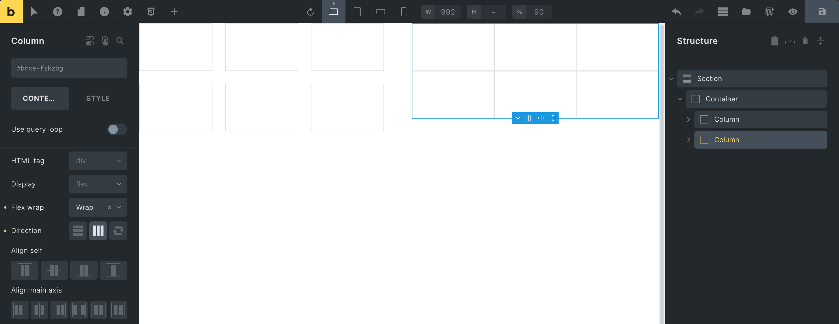
As shown in the video, intuitively, I tried putting the container to horizontal, and then assign a width of 33% to each block, anticipating that they would arrange themselves in 3 column rows (on desktop).
My plan was to change that to eg 49% width when on mobile so they would naturally break to 2 “columns.”
However that failed… all six blocks all just somehow magically still fit inside the container, even at 33% width! 
You can see my example from my video here:

And for clarity, here is basically what I’m going for (mock up):

That is the desktop look; on mobile they would naturally wrap into rows of 2 blocks, because their width would be 50%…
Thanks for helping me figure this out.