Hi there,
I am having a few troubles when layouting for mobile phones.
My headings have linebrakes on smaller screens and the buttons have text that flows out of the button. How can I fix this?
Hi there,
I am having a few troubles when layouting for mobile phones.
My headings have linebrakes on smaller screens and the buttons have text that flows out of the button. How can I fix this?
Hi Clickhorse,
Dealing with long words and huge font sizes has always been a problem in HTML/CSS.
As for font sizes, there are several options you can use:
I prefer using the clamp functions because they only have to be set up once and work across all viewports.
Dealing with long words
I come from Germany, and if we have one thing, it’s very, very long words like “Arbeiterunfallversicherungsgesetz” or “Donaudampfschifffahrtselektrizitätenhauptbetriebswerkbauunterbeamtengesellschaft” (  ).
).
Watch this video beforehand: https://vimeo.com/653360377/103cb978e2
As you can see, the word breaks as soon as the space gets too small. This is because Bricks generally already applies a word-wrap: break-word; to the body tag. If this tag were missing, this much too-long word would cause an overflow.
We can have hyphens added automatically using CSS. Since the problems mostly arise with headings, we can either apply the styles directly to the headings or create a .hyphenate class, and then add this class to all critical headings:
.bricks-heading {
  overflow-wrap: break-word;
  word-wrap: break-word;
  -ms-word-break: break-all;
  word-break: break-word;
  -ms-hyphens: auto;
  -moz-hyphens: auto;
  -webkit-hyphens: auto;
  hyphens: auto;
}
or
.hyphenate {
  overflow-wrap: break-word;
  word-wrap: break-word;
  -ms-word-break: break-all;
  word-break: break-word;
  -ms-hyphens: auto;
  -moz-hyphens: auto;
  -webkit-hyphens: auto;
  hyphens: auto;
}
The problem is: sometimes it works, sometimes not.
The third possibility is to insert so-called soft hyphens. To do this, you add the following at the places where the word should be separated:
­
Arbeiterunfallversicherungsgesetz might then look like this:
Arbeiter­unfall­ver­si­che­rungs­gesetz
I hope that I could help you a little.
Best regards,
timmse
Hi!
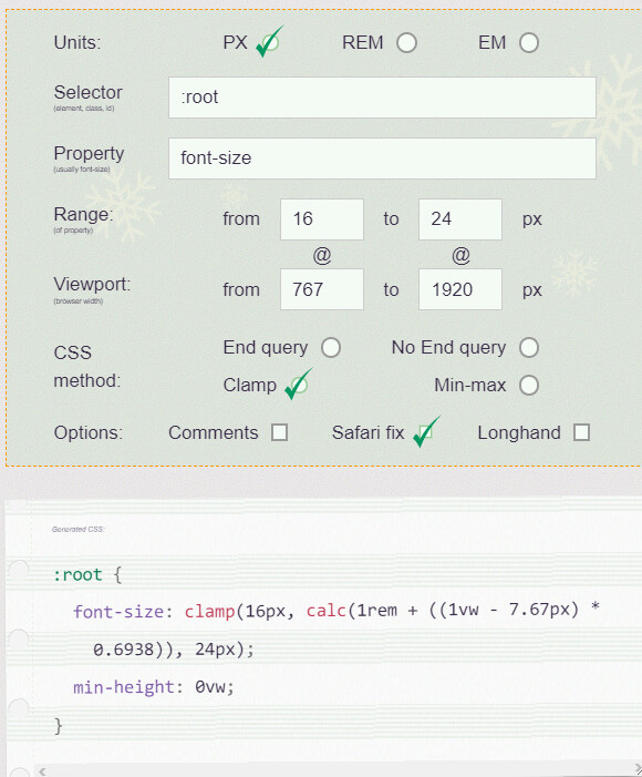
As I’m working with 3440px respectively a 3840px ultra-wide monitors, I like the idea of clamp very much. With the instructions of the mentioned video (Point 3. in @timmse’s answer) and with the help of Fluid-responsive font-size calculator(used in the video) you get some cool results like this:
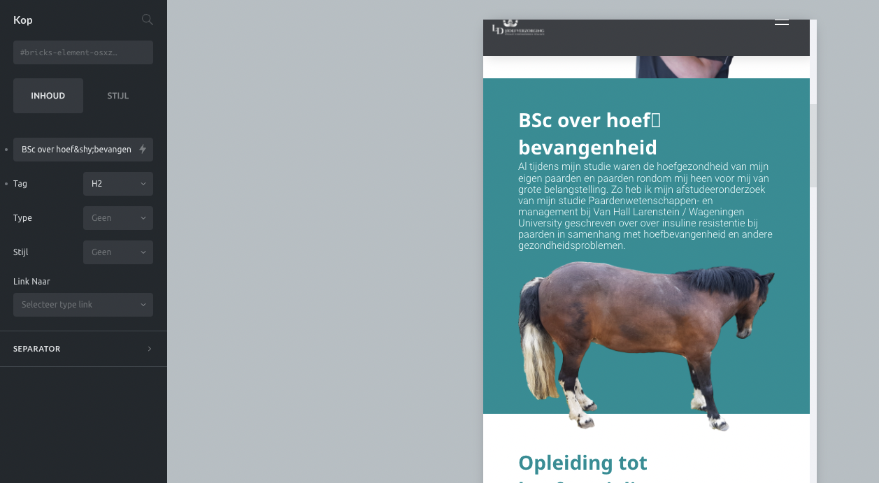
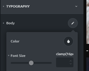
In Oxygen you can edit the font-size quite comfortable (screenshot of the video):
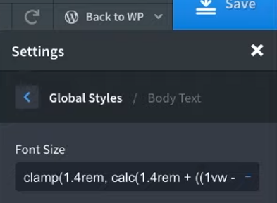
But when you add i.e. clamp(16px, calc(16px + ((1vw - 7.67px) * 0.6938)), 24px) to a Font Size input field in Bricks, it jumps to the unit area like this:
So I would prefer an built-in clamp calculator. Is this something for the Ideas List?
As I’m also German and being the only Webdev with 5 Webdesigners at my workplace, the word-wrap of long words is a very common case. For us almost anytime ­ is the best solution because the browsers can’t handle German hyphenation absolutely correct, yet.
Hi flex,
That’s true because the field is much broader. But if you’ve set up the function correctly, you probably never touch it again  And if you need to change it, you should use the generator anyway to be on the safe side.
Built-in clamp calculator
In principle, this is undoubtedly worth an entry in the Idea Board, I’m just thinking about how to accommodate it 
Hi there, I love the clamp function! Thanks a lot for explaining this!!
However now I am trying to fix the longer words with the however I get this
 I am sure I am doing something wrong. Where do I put this?
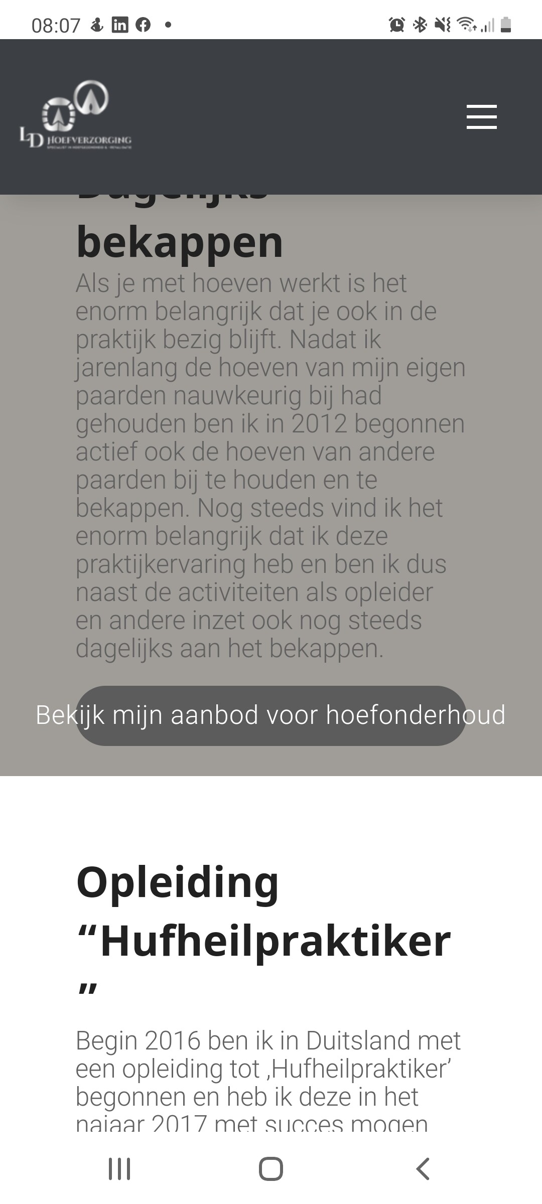
Sorry if I am being a bit thick But we did not solve this issue with clamp yet. How to proceed here? I very much would like the text to stick within the button
Hi Clickhorse,
the hyphenation looks good at my side, no problems on desktop nor mobile 
The button is a bit more complicated. I think the best solution is to add a class of .btn-wrap to it and override it’s default settings with custom CSS. After you’ve added the .btn-wrap class to the buttons with long text, add this to Bricks » Settings » Custom Code » Custom CSS:
.btn-wrap .bricks-button span {
  line-height: 1.6;
  white-space: normal;
}
You can adjust the line-height to your needs. The white-space: normal overrides white-space: nowrap, so the text will wrap to the next line if the viewport gets too tight.
Best regards,
timmse