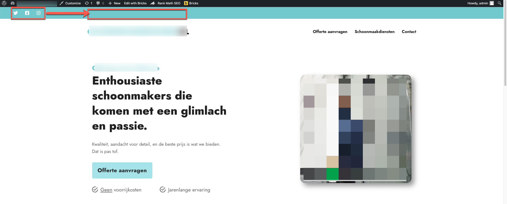
For a few days now, I have been struggling to get the social media icons in the top bar of the navigation header to align on a large screen. I also want the top bar to have a different colour, blue in this case.
On a small screen like the screenshot below, it all aligns nicely.
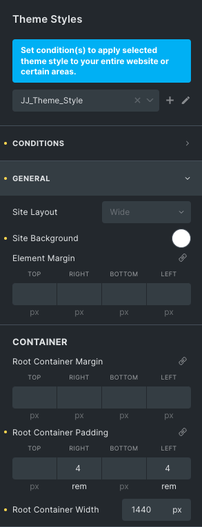
I use a root container width of 1440 px, so theoretically everything should stay within this 1440 px. Correct me if I am wrong.
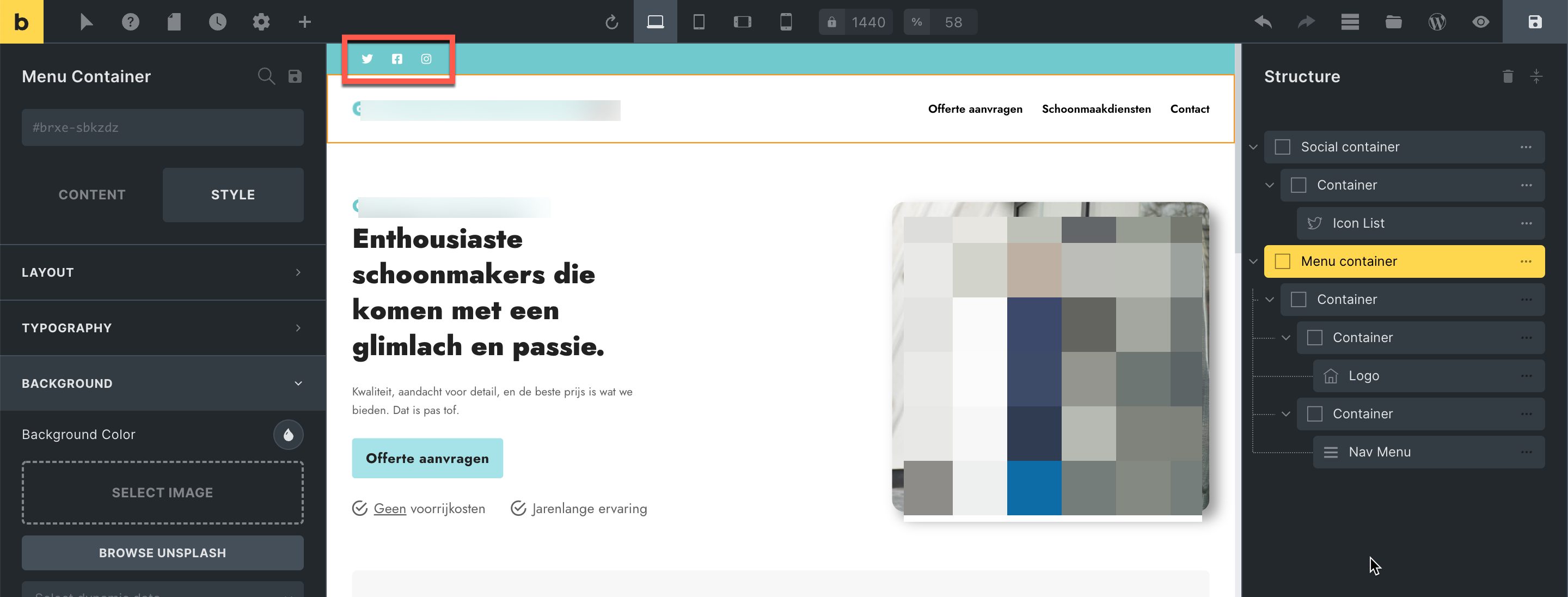
If I put the outer container on stretch, the blue top bar does go from edge to edge, but so do the social media icons.
I have tried method 3, which Timmse demonstrates in this thread, and it works to some extent, but is not responsive. SOLVED: Header and footer always full-width Below you can see that it works on a large screen.
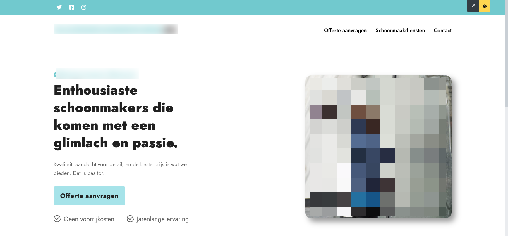
Below, you can see that when I make the screen smaller, the icons disappear on the left side of the screen.

I don’t know what I can do to solve this problem and make the top bar also responsive and keep the content within the root container width of 1440px.
Any help is welcome  .
.