I have a question regarding the use of blog post messages. As you can see below, the mobile version is not good.

I want to get the mobile version of ‘‘grid’’ so that it goes well, but then the desktop version also changes. How can I solve this?
I have a question regarding the use of blog post messages. As you can see below, the mobile version is not good.
I want to get the mobile version of ‘‘grid’’ so that it goes well, but then the desktop version also changes. How can I solve this?
Hi Jorn, sorry, but I don’t get what you’re going for 
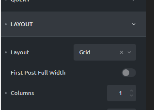
Leave the layout set to grid, switch to mobile editing and then increase the number of columns.
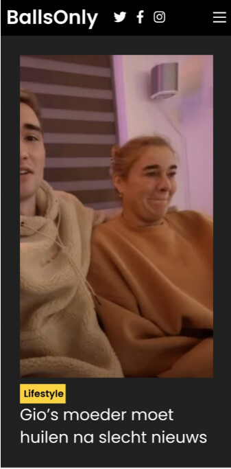
@timmse As you can see from the images, the image is good on the desktop version, but as soon as you view this image on mobile you only see a part of the image.
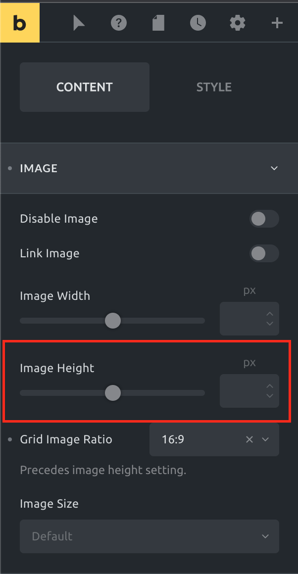
You need to use a different height for the image on mobile.
I can sign off on that 
I’ve tried everything but it just doesn’t work. The mobile version does not look good.
For mobile I want to use ‘‘Masonry’’ for the blogs and for the desktop I want to use ‘‘Grid’’. Is that possible?
And what do you mean by height adjustment? I really can’t do anything with that. I tried everything.
No, unfortunately not.
Set a height on the image at smaller breakpoint so it’s not that tall anymore.
@timmse that just wont work. Is it possible for you to check it on my website?
Maybe u understand what i mean if you take a look.
@JDK I’d be happy to take a look for you if you’d like, but @timmse is correct—setting a defined height at mobile breakpoint will fix this and make the image a similar aspect ratio as at desktop sizes.
Already done @ainom 
@JDK I don’t know how you want it in detail, but I do know that all square images are now true squares and that they are no longer squashed. Please take a look at the image settings and adjust them to your needs.
You can also set an aspect ratio of 4:3 or 16:9 and adjust the heights… just play around and see what fits best to your likings.