Hey guys I am looking to make a responsive table or any other possible workaround will be very appreciated.
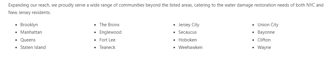
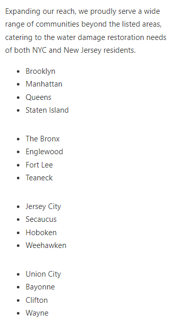
So I have a list in bullet points that takes up too much space if I just list them down so I currently have it set in four different blocks to create different columns. However, when I view it in mobile (see below), columns create extra spacing which makes the site look really bad.
That being said I am looking to create 4x4 table that can stretch across the full width of the section and when viewed in mobile, to shrink into a single list.
Thank you in advance.
Easy solution: You could use a media query to remove padding/margin-bottom on columns for mobile.
Table solutions:
You can have a div as your row, set 1px border for row div, flex dir row - with 4 divs inside as ‘cells’. Divs inside with flex basis 20%, grow 1 shrink 1, gap 2%, minimum width 200px (or whatever suits). Set this to flex/column on mobile-landscape.
Or use the built in Flex Grid: CSS Grid Layout – Bricks Academy
2 Likes
Hey @LukeKahng,
have a look at the column-* properties and their columns shorthand here.
I recorded a quick screencast to demonstrate it.
Hope it helps.
Best,
André
7 Likes
That’s a great usecase for columns! Thanks André! =)
1 Like
Random, uninformed question. Isn’t this bad for accessibility, not to use the table HTML element? Or does everyone just use the ARIA role “table” for table-like data now?
Hey @GrowPlugins,
I am far from being an accessibility expert, but from my point of view, this is a flat list in terms of data, not a table.
Best,
André
2 Likes
Kevin Powell recently posted a video about this here How to create a responsive HTML table - YouTube
He is well worth watching if you want to increase your knowledge of CSS
2 Likes