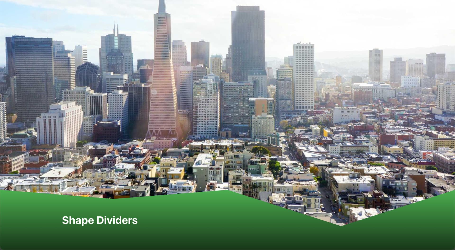
I would like to have two images, or two sections with different contents to connect with a shape divider. Basically filling the white spots with the image above.

Is this possible?
Thanks,
Johannes
I would like to have two images, or two sections with different contents to connect with a shape divider. Basically filling the white spots with the image above.
Is this possible?
Thanks,
Johannes
What about having the image as a background of a parent element, and then have the content sections ( shape divider being on the second one) be children of that?
The shape divider needs a set color for it. In my screenshot it’s set to white. Setting it to transparent will make the shape divider disappear. Therefore it won’t work.
Hey Johannes,
I think this is hard to achieve with shape dividers since you are also working with a gradient background instead of a solid one – which makes it even harder.
In this case I’d use a clip-path on the bottom section (instead of a shape divider). I created a small screencast demonstrating the setup.
This is the custom CSS I use in the video:
root {
  --shape-height-left: 2vw;
  --shape-height-right: 8vw;

  --divider-height: max(var(--shape-height-left), var(--shape-height-right));

  clip-path: polygon(0 0, 25% var(--shape-height-left), 50% 0, 75% var(--shape-height-right), 100% 0, 100% 100%, 0 100%);
  margin-top: calc(var(--divider-height) * -1);
}
And this is Clippy – the tool I used to create the initial clip-path.
Result:
Hope it helps.
Best,
André
Wow, thanks so much @aslotta
I really appreciate your effort in providing me with this very helpful answer!
I will do it as you suggest.
Have a great day!
Johannes
Nice solution!
I think that why page builders doesn’t implement this kind of tools too.
Thanks for the idea. I could use and adapt it. I wanted to have a Shape divider with a gradient background.
Set the background of the block with a linear background and added
%root% {
clip-path: polygon(0 0, 0% 100%, 100% 0);
}