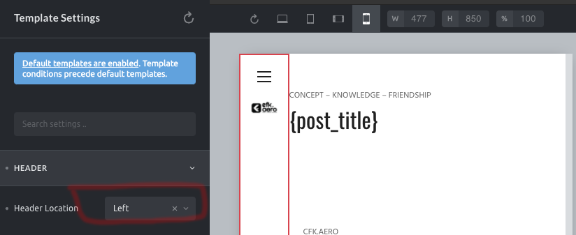
Header location can change in all devices in Template settings, but how to change only for mobile ? Please advise if any css tricks or inbuilt features.
Hi @manikantanpg,
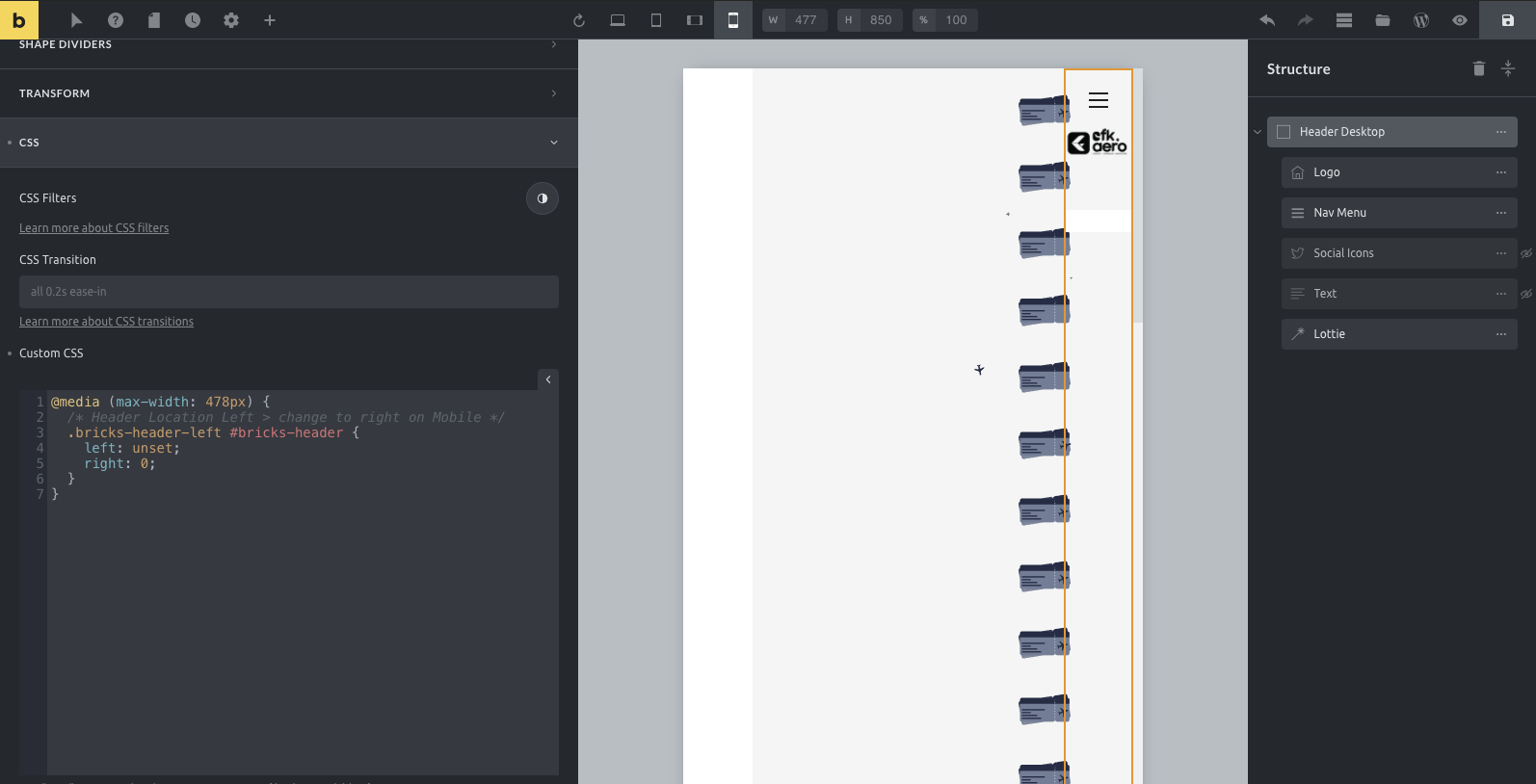
this can’t be done within the options, but with a simple media query like:
@media (max-width: 478px) {
  /* Header Location Left > change to right on Mobile */
  .bricks-header-left #bricks-header {
    left: unset;
    right: 0;
  }
}Thanks timmse!
when i put the code into the custom code section of the Header container, the mobile menu moving to right. I just wanted to be top. could you provide the exact code for this area. I have to finish this project asap.
Hi,
just change the top, left, right and bottom values (to e.g. 100px or something) to see and understand what happens on mobile.
@media (max-width: 478px) {
  /* Header Location Left > change to top on Mobile */
  .bricks-header-left #bricks-header {
    top: 0;
    left: 0;
    right: 0;
    bottom: unset;
  }
}
Hi,
can you please provide a live link? It’s more than hard to guess what you’re trying to achieve, based on a screenshot 
Hi,
here is a “starter template” with a fixed navbar on the left and a fixed top navbar on screens <= 991px without styling (just some paddings) as a starting point.
Edit: I replaced the file from yesterday, because bricks seems to load forever trying to get the logo image, which isn’t available (because it is located on my local, not public server) so i removed it from the template.
 but one more thing. in the mobile view its overlapping the content.
@timmse was looking for the exact same solution i.e left header on desktop and a top header on mobile.
The file you’ve shared works. Just wanted to understand how it works. In the template file you’ve shared above the header settings are in default yet the container appears to the left, how is this achieved?
Hi Dushyanth,
Welcome to the forum!
I’m glad it works for you as well 
Select the outer container in the structure panel, go to Style > Layout, switch the breakpoint to Tablet / Portrait and see how the values under layout change (width, height, top, left). That’s it
Best regards,
timmse
Got it, thanks.
Just noticed that the page content container overlaps the container (header) in both desktop and mobile. This issue however is not present when the location under header settings is set to left. But in this option the header remains on left even in mobile.
Yeah, it is just a starter template, not a bulletproof solution - but without custom CSS.
To fix the overlapping problem, you would have to override the behavior of #bricks-header, #bricks-content, and #bricks-footer with custom CSS… and then it gets tricky quickly (for people who don’t know CSS well).
Maybe I’ll do that soon 
Maybe if we have an option to set a condition to exclude a (left) header in tablet/ mobile and exclude a top header on desktop…i.e conditions to include breakpoints as well
Hi,
I’ve already suggested an advanced header, but it will take some time to implement it. We’re currently working on some other great features for the next release 
1 Like
After updating to 1.3.7 the left side header has a few issues.
For some reason the hamburger icon won’t display the navigation on mobile.
Navigation menu doesn’t work on left side header on desktop
Hi Dushyanth,
can you provide a live link?
Is there any updated method to add a left sidebar header (on desktop) in 1.4 ? Just want to avoid layout breaking up every time i update bricks
Hey,
nope, nothing changed:
Best regards,
timmse
Hey guys,
It seems to me that this topic was opened in 8/2021 and almost reaching 2024 it seems to me that the bricks menu remains the same.
The correct thing would be when the vertical menu hits the breakpoint to switch to the menu at the top, but I have the impression that bricks won’t have this adjustment anytime soon.
So my solution will be to create the side menu as default and remove it at the breakpoint, and on each page I will place a menu at the top, mobile configuration, I don’t think it’s the best way to do it but it works.
However, when using the side menu, I apply display:none to the breakpoint to remove it, the menu disappears, but the menu’s white space continues, I have already tried editing in several classes and IDs that appear in the console but this white menu margin does not disappear .
Could anyone tell me how to remove the white space from the vertical menu?
Grateful for the attention.
1 Like