How to add :active :hover :focus correctly with the new nestable menu

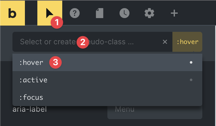
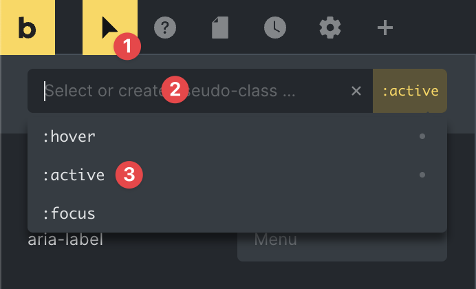
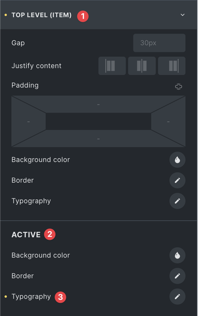
I’m going crazy here. I try to add hover color, focus color and active color on the new nestable menu for the top menu elements.

  • Where would you add the colors?
  • How would you add the colors?

I tried now almost everything, but it does not work for every single link the same. The dropdown top link always behaves differently. And I have no idea why.

What would I like to have?

  • on hover → text color blue
  • on click → text color for a short moment red
  • when on the page → the text color gray

Like this: Screen Recording 2023-06-29... (This was created with the normal nav menu)

How would you do that with the nav nestable menu?

Hey Tobias,

it’s hard to see what’s going on in your video tbh. It would help a lot more to see a demo of your settings and / or a link to your actual site.

However, you have to use the following settings:

1. Hover

Switch to the pseudo classes, choose :hover and set the color under TOP LEVEL (ITEM) > Typography.

2. Click

Switch to the pseudo classes, choose :active and set the color under TOP LEVEL (ITEM) > Typography.

3. Click

Make sure to not have a pseudo class selected and set the color under TOP LEVEL (ITEM) > ACTIVE > Typography

I created a small screencast to demonstrate.

Best,

André

1 Like

Thank you so much for your awesome explanation. That is exactly how I did it. Unfortunately, it seems the automaticcss classes for links are overwriting the styles. But only for the dropdown links. The icons are fine. And the direct links are also fine. Screen Recording 2023-06-30...

This comes from acss:

body a {
color: var(–accent);
font-weight: 400;
-webkit-text-decoration: none;
text-decoration: none;
}

Hey Tobias,

in this case you should talk to the ACSS support and ask how you could handle this. Looks like the selector ACSS uses is too specific in this situation.

Best,

André