With the release of the new menu nav element, I’ve been trying to target the active element - it seems the builder doesn’t use the standard pseudo selector :active, nor does it add any classes to the active element, yet it is still able to target the active element by adding an active border.
How can I also target that same element to add my own custom CSS to the active menu element? Am I missing something?
The fact that is needed (the javascript patch for this issue) tells me that Bricks is not ready for use on production sites.
I am new/just learning it and there’s a lot I like about it but I was hoping I could rebuild my company’s site with it and actually use it in the wild.
It only needs the JS if you want to target ACTIVE for some alternative purpose. You can set background color, text color and outline for active with native Bricks.
I guess then I am not seeing how in native bricks to style the background color of the nav menu item with aria-current=“page” since there is no :active pseudo class added when the page is active. Thats what brought me to this thread.
You don’t. You style it in the bricks builder like you style any other link. You can target by aria for other purposes if you have them, as said elsewhere this isn’t the best way, just a possible way.
The OPs question is my question as well: “How can I also target that same element to add my own custom CSS to the active menu element? Am I missing something?”
In this thread, this has so far gone unanswered, and others have echoed the same question. The workaround to style the accessibility tag was offered and also rejected as not best practice. Then some javascript was offered to add an active class, followed by “hope” that we’ll get a built in solution “at some point”. Your most recent response was to say 'you style the active state of the nav item like any other state". I know how to style the :active pseudo class with or without Bricks making it convenient for me. The problem is that it doesnt work. When visiting the active page, the nav link should reflect the :active styles but it does not.
As someone else noted, “Making a :focus psuedoclass works, but not a :active psuedoclass.”
You replied with “You can set background color, text color and outline for active with native Bricks.” - that is what I am trying to do: set the text color and background gradient for the main nav active page just like I did for the hover state, which works perfectly. “Am I missing something?”
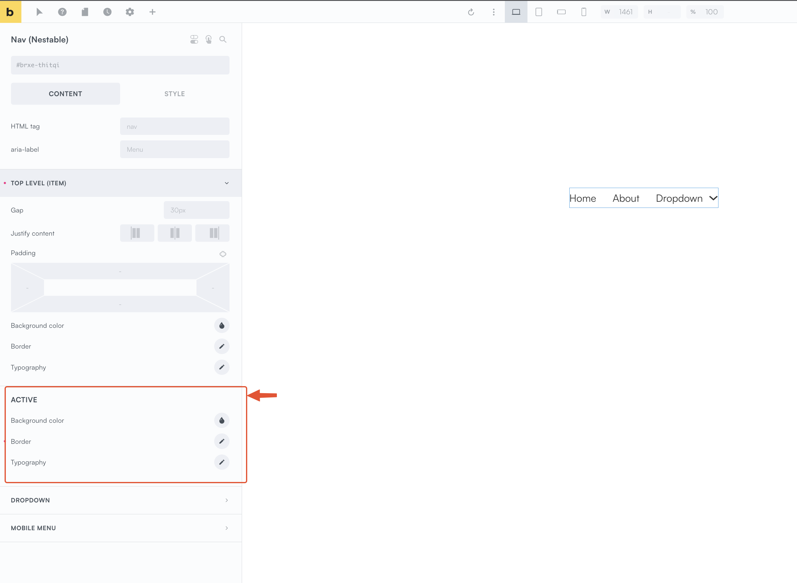
They’re saying that Bricks’ already has style controls for the current page link, in the nav nestable settings under ‘top level item > active’. (see image below for settings, it’s not the psuedo class dropdown)
it’s perfectly fine to use attributes other than classes for styling, that’s actually how Bricks’ are targeting them themselves. It’s not against best practises at all.
In short, :active is the wrong way to target (nothing Bricks related, it’s just not what that does).
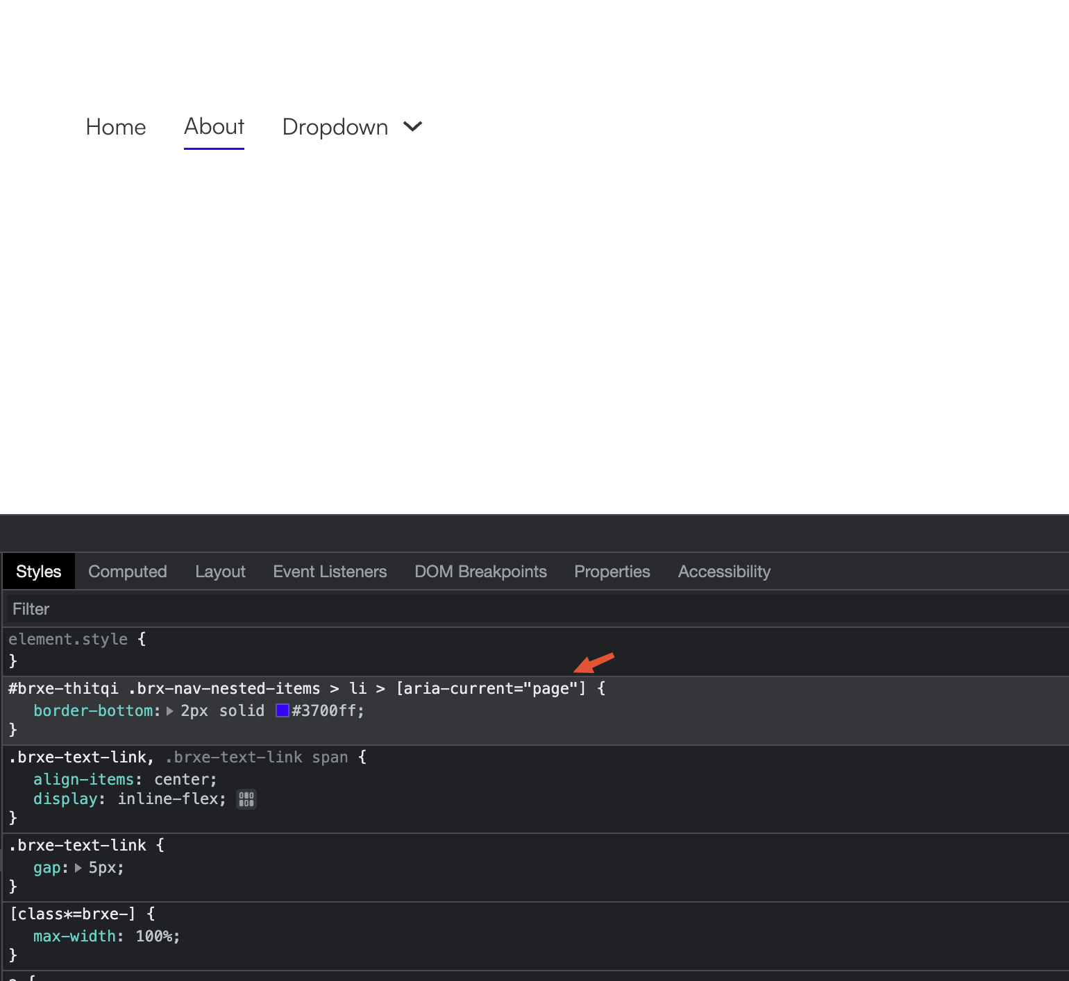
[aria-current=“page”] is the correct way to target (if you need to add styles outside of the settings) as that’s the attribute that is added to the menu item that links to the current page (unless you want to add your own class as was shown by adding the JS, but this step is unneccessary).
Thank you @wplit this does clear it up for me as well. Is this covered anywhere in documentation? I’ve been searching the docs and watching seemingly hours of youtube videos (looking for needle in haystack) and have yet to see this addressed.
This is perhaps a nit but, strange to me that the styles for the Active state of the Nestable Nav are not under the Style tab but under the Content tab of the element. I certainly wasn’t looking for them there.
This also makes me wonder if it would be beneficial to be able to save a gradient to a color palette as one selectable option - e.g. in the ‘background color’ setting we can select a solid color only. If the color palette could store gradients as well perhaps that would simplify some things? Off topic for sure.