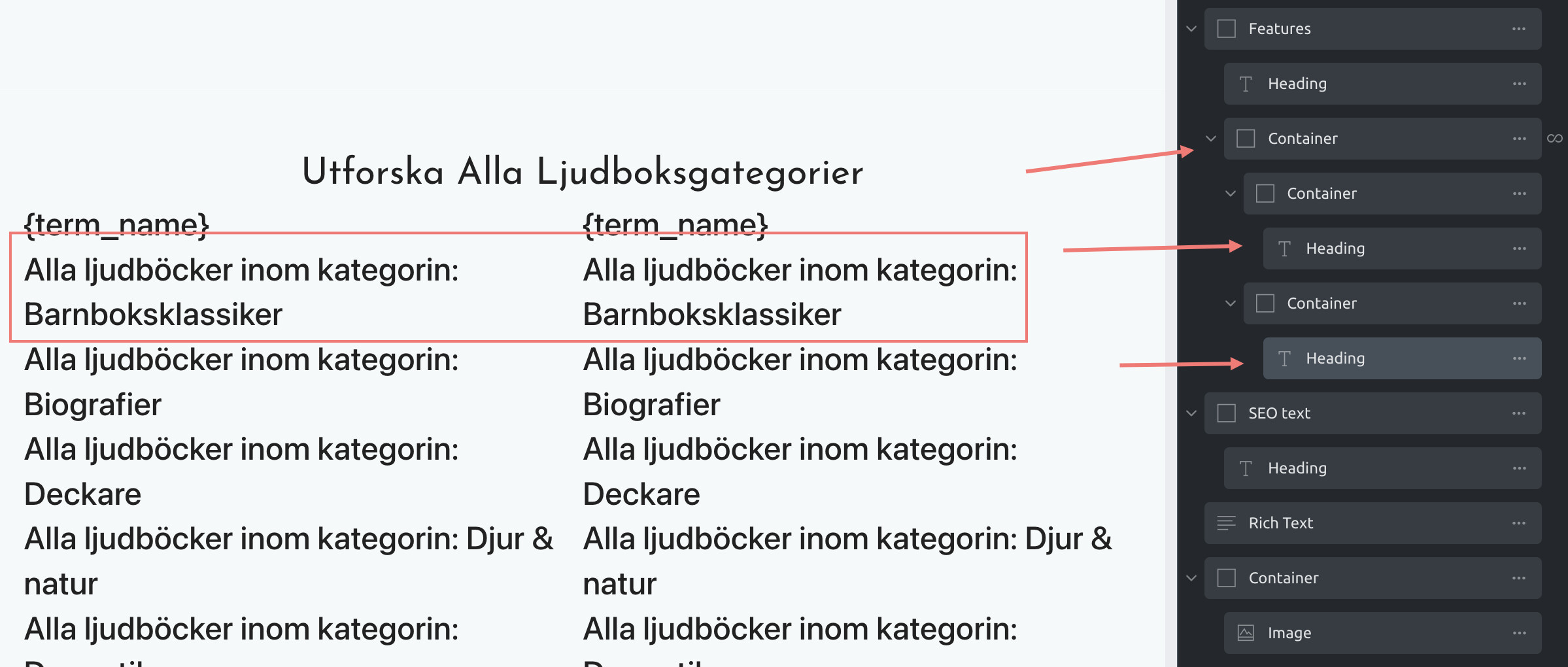
Trying to make 2 columns with a single query loop. The idea is to list all categories under a certain parent category, and list it as cards in 2-3 columns.
No matter how I try i get it like this… like the query loop doesnt understand that it should continue in the second container but rather starts from the start of the list… if that makes sense?
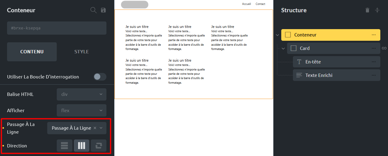
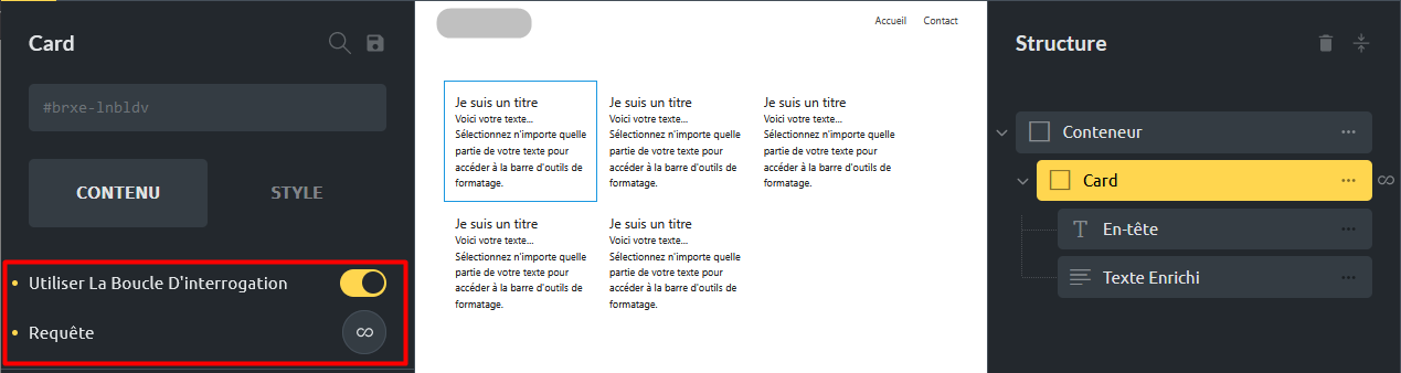
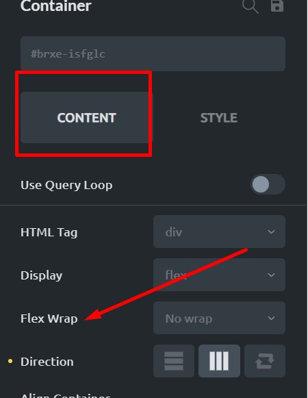
The best thing to do is first just create the card. Do not worry about the query loop. Get the card styled and designed the way you want it. Then when you are happy turn it into a query loop. You will also need to wrap the query loop in a container if you want to use flexbox and set it horizontally.
Hi Erik,
There are a couple of ways to achieve this. Take a look at this template (created with Bricks 1.4beta), which uses max-width for the cards (32%, 48%, 100%) and flex-wrap: wrap and justify-content: space-between (to create a gap without calculating the column width).
Alternatively, you can of course use the technique omega mentioned in his link (which works for flex-basis, width, or max-width as well).
Brilliant so the next thing to do is add a container (parent) and then move the query loop inside it. It might be worth turning off the query loop again when doing this.
Set the ‘parent’ container to direction:horizontal.
Then set the width of the query loop to 30%
I would also normally set the parent container to - align main axis: space between.
Then switch the query loop back on and have a look at the spacing to make sure its not to wide/narrow between the cards etc.
Sorry to interrupt but I think you over complicate things in this video.
One container is enough to achieve any particular design:
container: flexbox with wrap option or CSS grid;
div, card, or any element (including containers, of course): check query loop and set a max-width if using flex (grids don’t even need this), and that’s it
Using an intermediary container brings complexity in design and future CSS rules.