Hello, Bricks Community!
I’d like to create a table, that would list 4 categories; ITEM, QUANTITY, PRICE, DATE OF PURCHASE. On desktop, that’d be fine it’d display in 4 rows. However on mobile, they’d be displaying one below the other including the category names.
My solution here is to create 2 different tables for mobile and desktop, and hiding the mobile one on desktop and vice versa. However I am wondering, if there is a better more optimal way to do this?
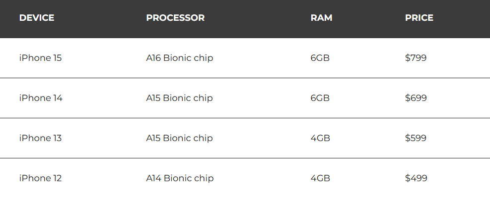
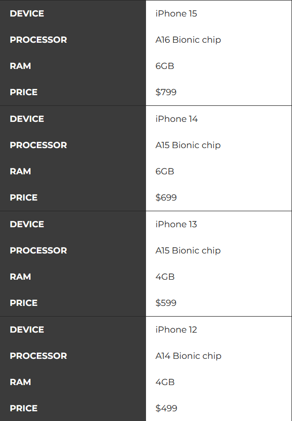
Adding photos for reference of what I am trying to achieve below:
DESKTOP:
MOBILE:
Thank you very much!
Tia