Rohan
December 29, 2022, 4:47am
1
This is probably a very dumb question, but I am new to building websites and CSS and such so please bear with me.
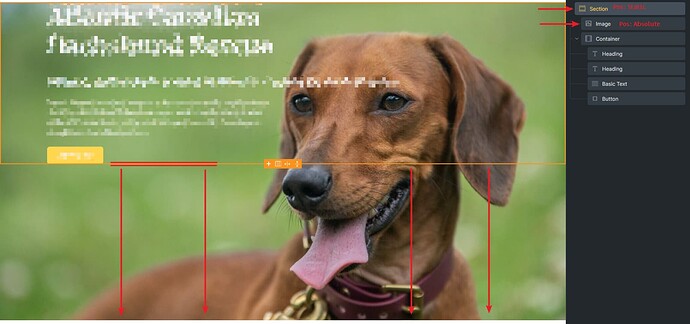
Why is my section not stretching to fit the image that it contains? As a result, the container seems to remain only as big as the section.
I am depending on the section being as tall as the image, responsively, in order to properly position the various elements in the container.
Only changes made:
Position = Absolute
Min. width = 100%
Object fit = Cover
Any help or insight would be appreciated.
Note: I cannot link you the site, unfortuately, as it is locally hosted.
jornes
December 29, 2022, 4:50am
2
Try
Instead of min-width.
Rohan
December 29, 2022, 4:52am
3
I just made that change, but unfortunately, no luck
Thank you for responding though!
jornes
December 29, 2022, 4:54am
4
The section change to position relative and see?
Rohan
December 29, 2022, 4:55am
6
I tried that as well and no dice
jornes
December 29, 2022, 4:57am
7
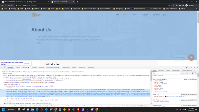
This is what I set for my hero image.
It does well.
Rohan
December 29, 2022, 4:59am
8
Hmm, I’m not sure why it’s not working for me. I must be doing something really silly.
Maybe I need to come back to this tomorrow with fresh eyes. Thank you so much for taking the time.
jornes
December 29, 2022, 5:00am
9
If your site is online, feel free to share the URL, so I try to see if it works fine here.
Rohan
December 29, 2022, 5:03am
10
It’s currently locally hosted but I will move it online tomorrow and add a link here. Thank you!
1 Like
You probably forgot to set section’s position to relative.
Ok. Then he needs to set the section position relative and image position not set and container position to absolute (with right, left, top and bottom to 0).

