Header location change responsively

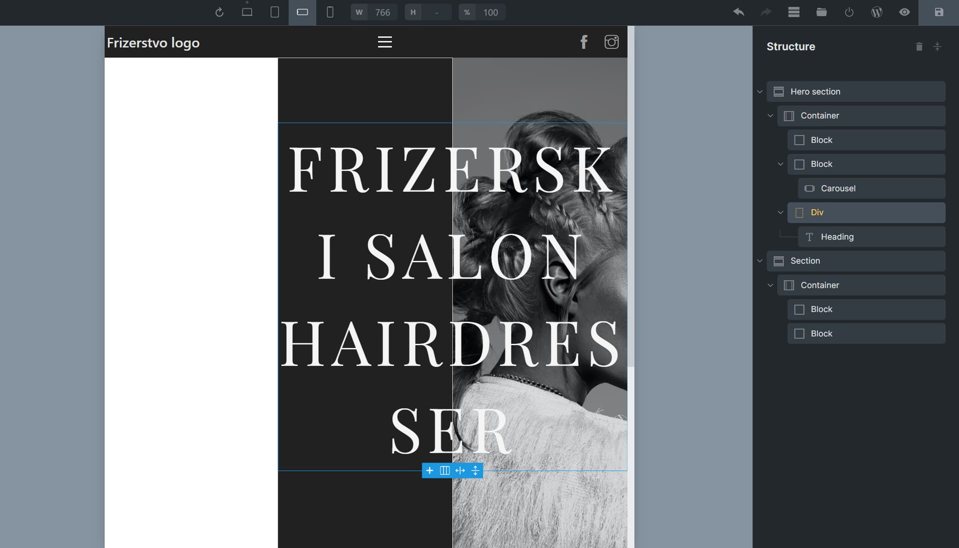
Hi @timmse, maybe you know the answer my quetsion. :smiley:

I started to play with left side header, but i cant figure out, how can i change it to the classic top header in mobile view.
I cant find any specific css code in chrome dev, and dont have any option solutions in Bricks Settings section too. :slight_smile:

Original Desktop view:

Mobile view:

Try:

{
position:fixed;
top:0;
left:0;
bottom:auto;
width:100%;
}

If​ you want it at the top but not sticky then change fixed to absolute

No, its not good.
The left side stay there and not strech 100% the with. On the other hand in publis side, cant see any from menu.

can u share a link? otherwise it becomes a guessing game :wink:

In principle, you just have to reverse or reset the settings for .brx-header-left and the inner container/block with a couple of lines of CSS.

CleanShot 2023-03-29 at 12.51.49

1 Like

Thanks, but what do i have to see in your json file? :slight_smile:

Import it as a template so you can see which settings he used…

1 Like

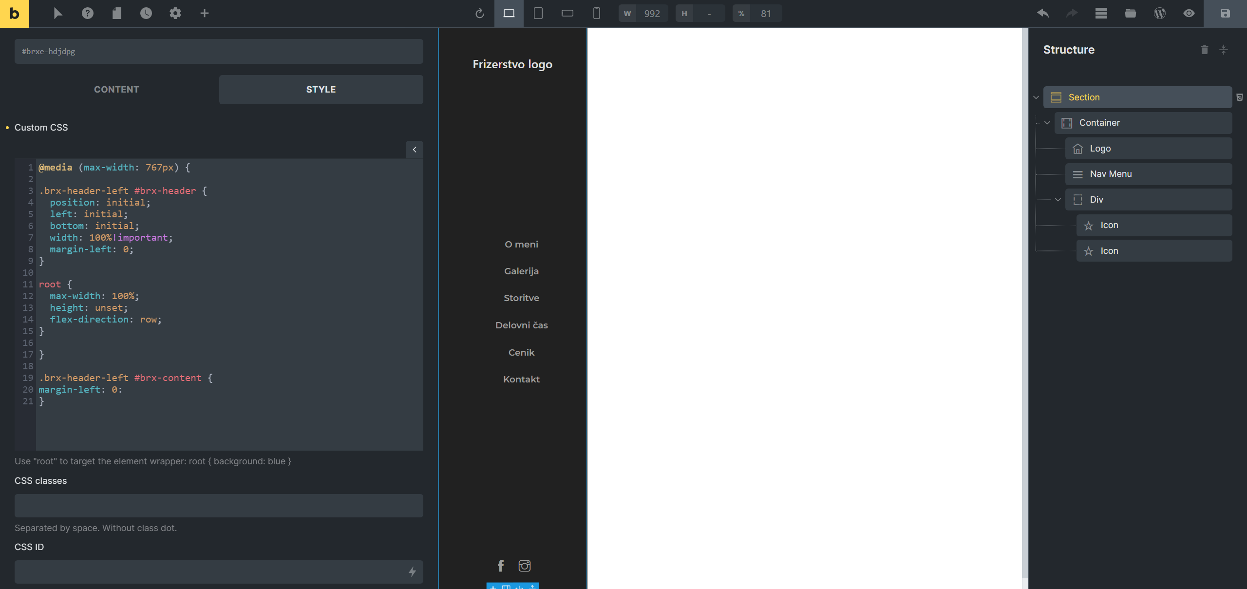
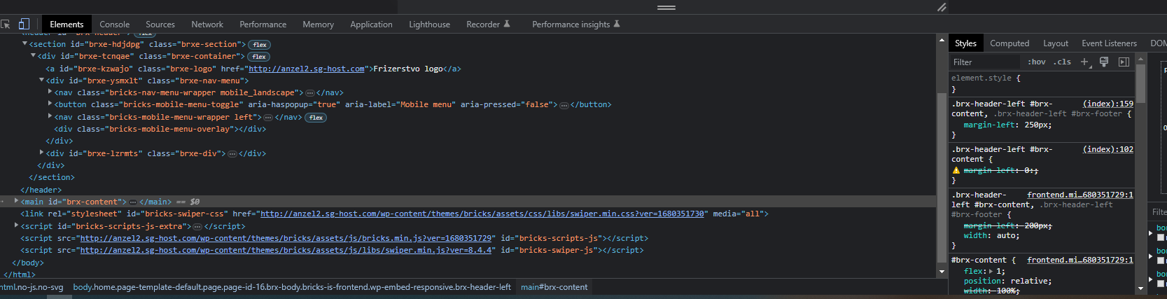
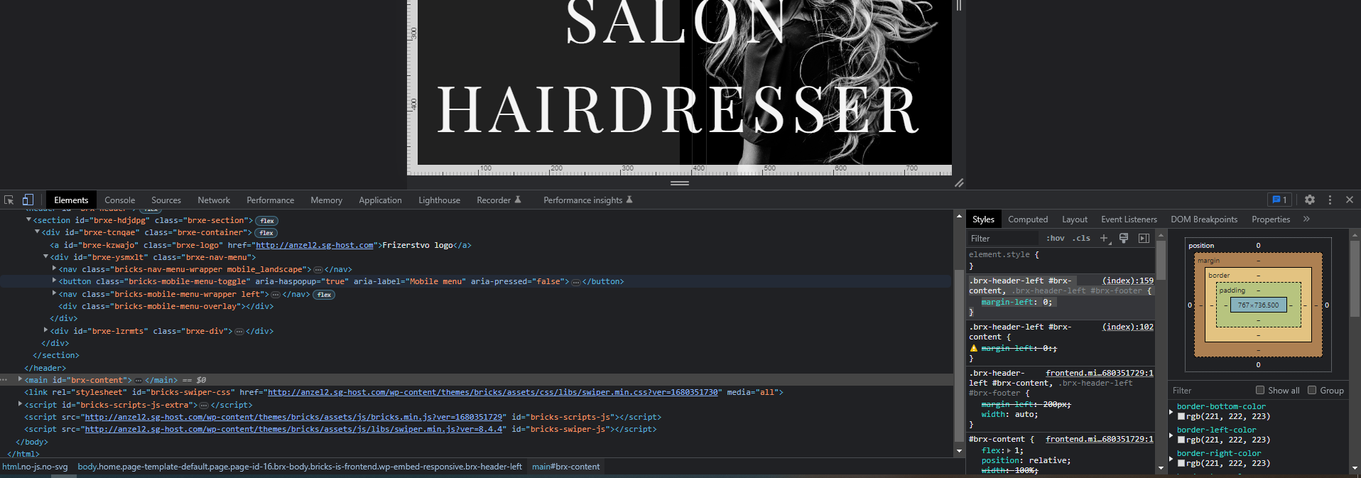
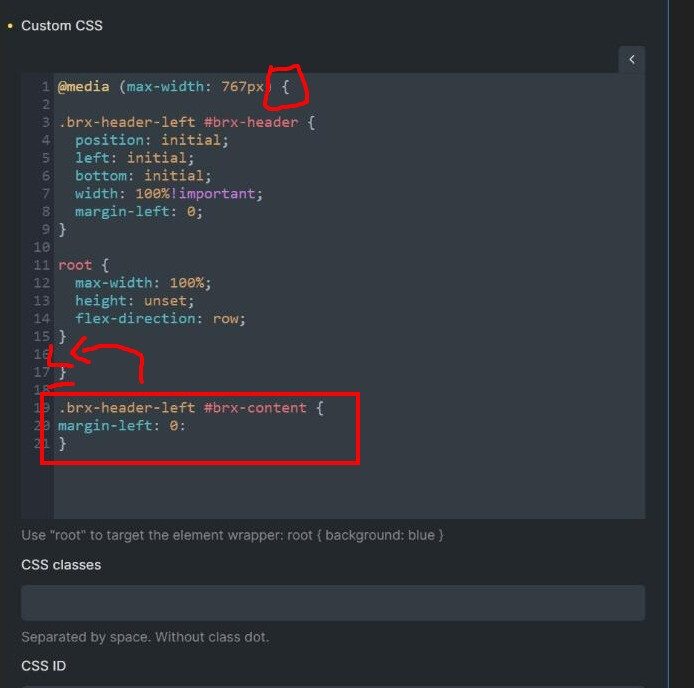
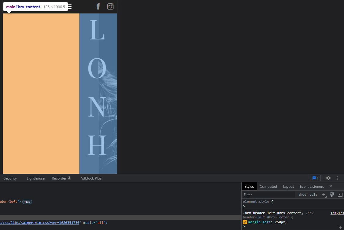
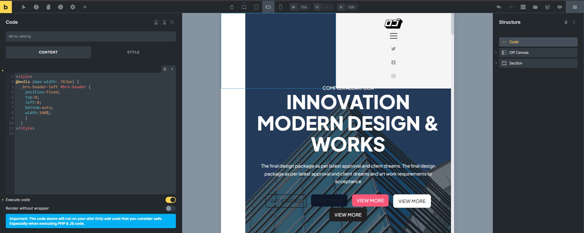
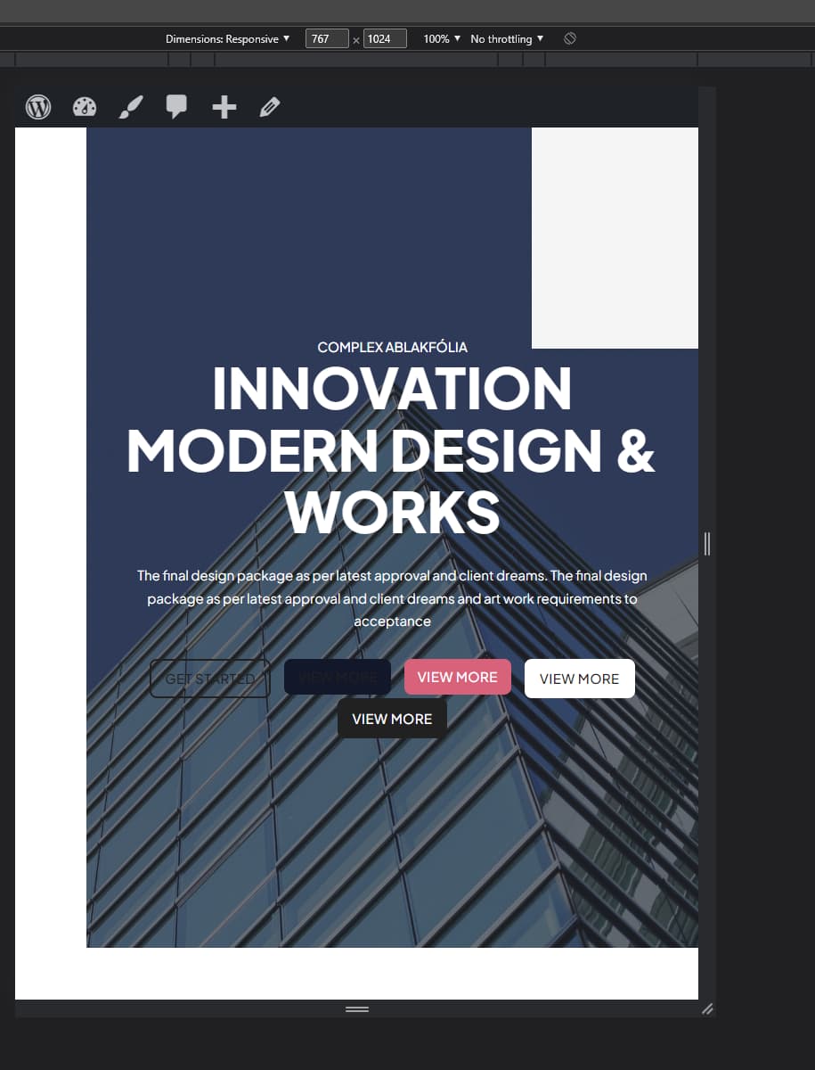
Hello. I copied the code and it changed mobile header to top position but now I have another problem. The content beneath the header has white space where header used to be… Any advice how I can put content back to 100% width. I tried putting width to 100% in layout and it did nothing. Even if I add new section right now, there will be empty white space where header used to be.

Could be some flex settings or a lot of other things. Can you share a link so we can take a look via inspector?

1 Like

Because the solution was incomplete. You have to use in Custos CSS margin-left 0.

.brx-header-left #brx-content {
margin-left: 0:
}

1 Like

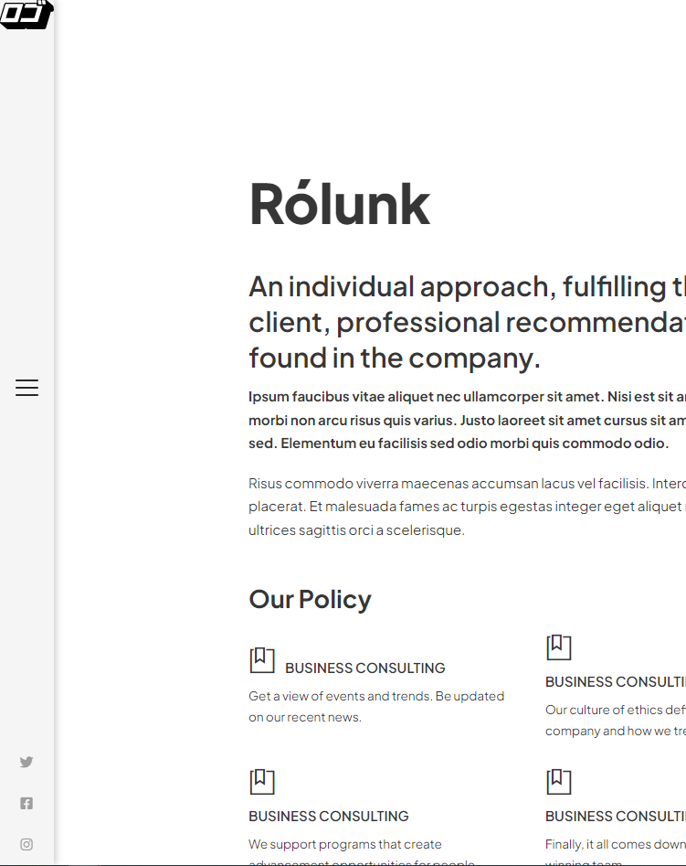
http://anzel2.sg-host.com/ This is the website.
I tried adding what you wrote to the code and it didn’t do anything. Maybe I am doing something wrong completely, I am very new to CSS.

Because you have to put it between the @media… codes and not after.

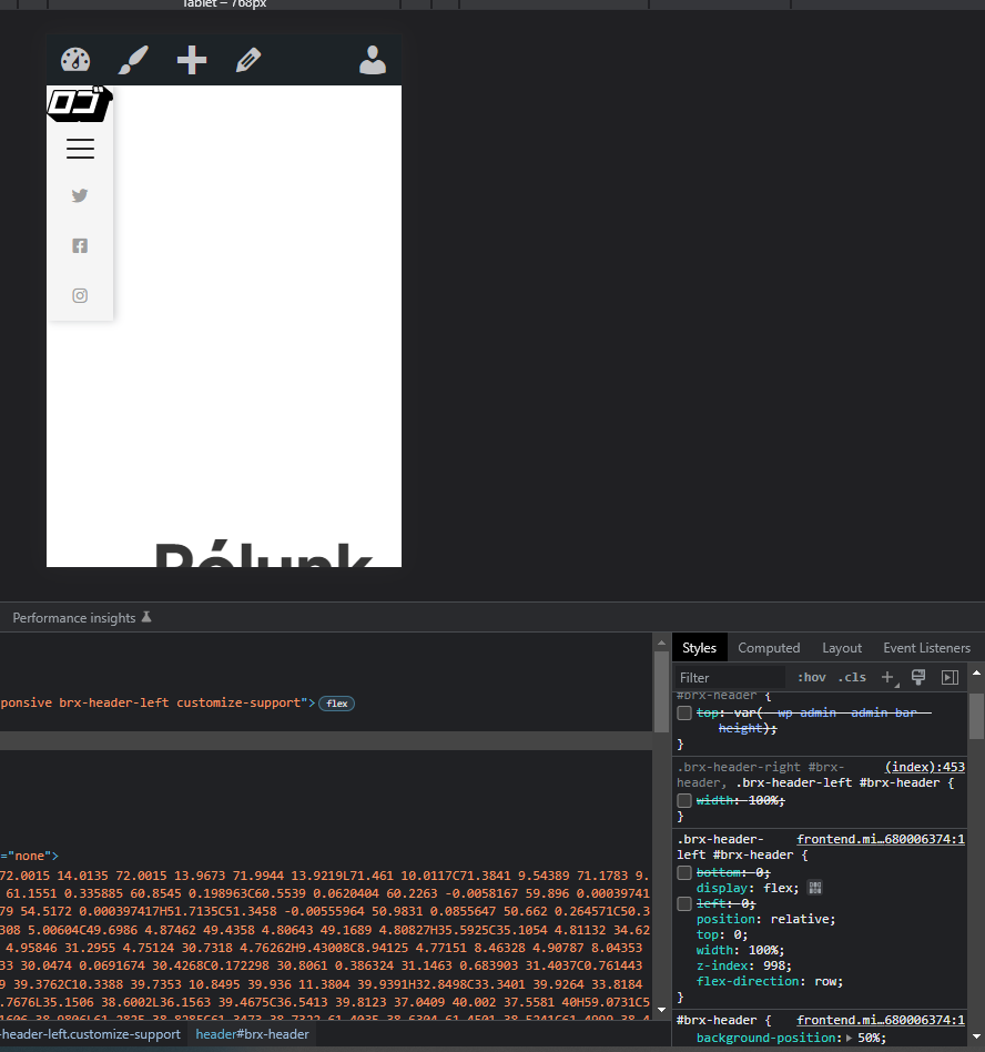
I did as you said, btw that":" after 0 is suppose to be: “;” right? I set it like that and it now works in Bricks builder (the white space is gone when i switch to mobile view) but it still doesn’t work when I actually visit the website on my phone. I purged the cache and it didn’t help. btw, thank you for your help.

yep after 0 should be a “;”. you’ve still got margin-left set to 250px somewhere:

1 Like

Every end of line in CSS you have to use “;” and not “:”!!!
Example:
margin-left: 0;

1 Like

Yes, I had header width set as 250px. I changed it to 0 on mobile view and the white space is gone now. Thank you for your help!